# workhorse packages
library(tidyverse)
library(tidyquant)
library(timetk)
library(readxl)
library(janitor)

# data sources
library(fredr)
library(riingo)

# vis specific
library(gt)
library(plotly)
library(scales)Housing
Introduction
In this chapter we will briefly touch on a subject that has garnered many news headlines lately: home prices. This is an important macroeconomic area that for many years did not enjoy such widespread attention. Home prices had a “steady-as-she-goes” quality during the 1980s and 1990s, but all that changed in the run-up to the financial crisis of 2008 and then we the housing sector had another jolt after COVID-19.
When we want to analyze home prices, the first challenge is how to measure them. Every home in the U.S. has a theoretical price, but for most it is unobservable because homes trade infrequently. The Federal Housing Finance Agency (FHFA) provides one of the most comprehensive house price indexes for the U.S. constructed from repeated transactions of the same property (that is, a home that is resold or a mortgage that is refinanced). Importantly, the FHFA only considers single family homes and its information is sourced from Fannie Mae and Freddie Mac, thus it reflects mortgages under the conformable limit.1 The FHFA house price index is available at the national level plus all 50 states since 1975 at the quarterly frequency. We will use the state level data to construct a new type of chart called a choropleth map.
We should note there are other home price indexes available; in particular, the S&P CoreLogic Case-Shiller index is a very popular one. However, this index does not have such a long time series (it starts in 1987) and is available only for the largest 20 metro areas in the country. For this reason, we will stick to the FHFA index for this chapter.
With that, let’s get into housing.
Here are the packages we will be using in this chapter:
Home Prices Over the Years
As an initial step let’s pull the FHFA home price index for the whole country and visualize how prices have behaved over time. We pull this index from FRED and get its whole history starting in 1975.
house_prices <-
  "USSTHPI" %>%
  tq_get(
    get = "economic.data",
    from = "1980-01-01"
  )
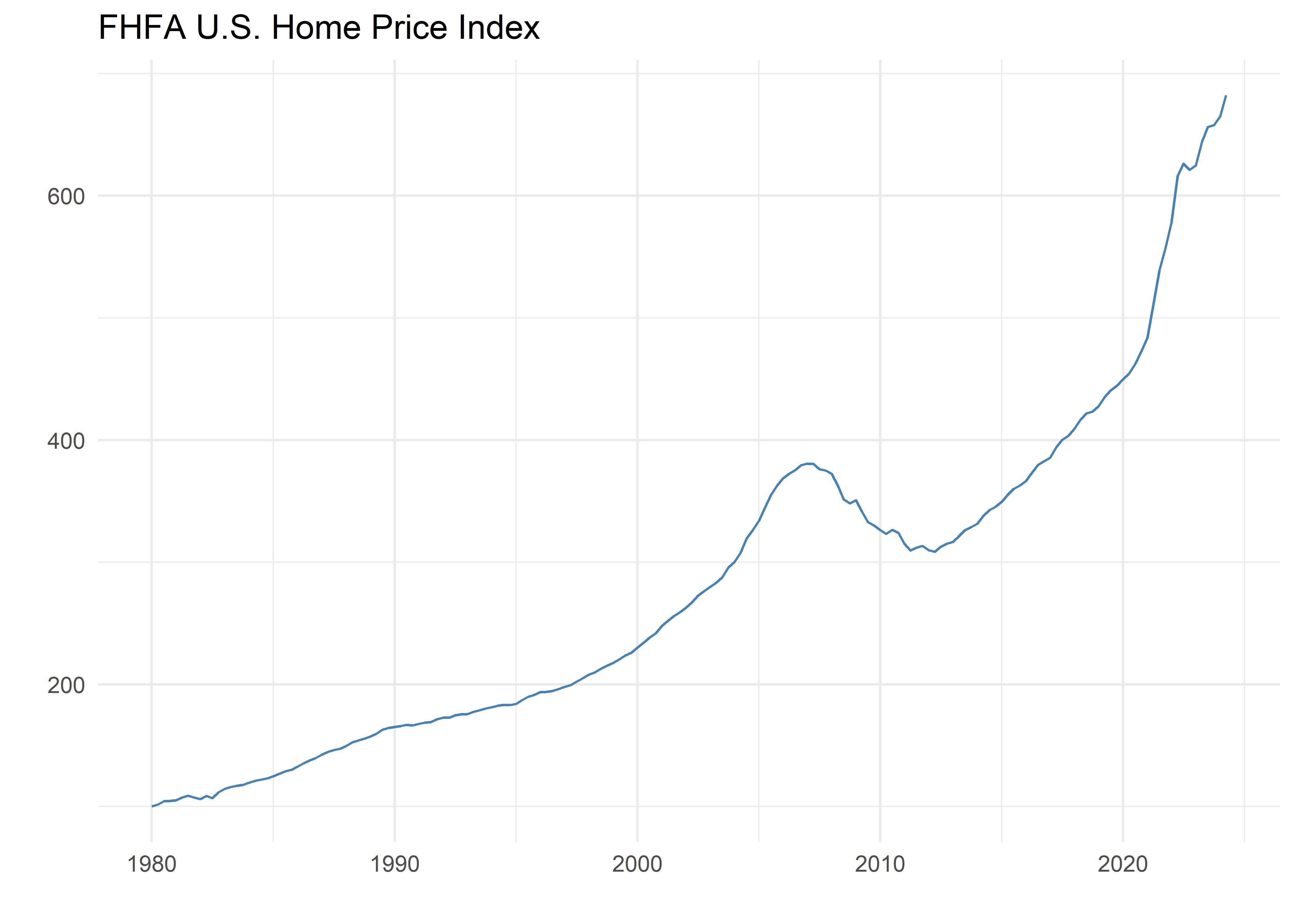
Let’s plot the index itself and observe the upwards trend in housing prices since the 1980’s - housing inflation does not appear to be a new phenomenon.
house_prices %>%
  ggplot(aes(x = date, y = price)) +
  geom_line(color = "steelblue") +
  labs(x = "", y = "", title = "FHFA U.S. Home Price Index") +
  theme_minimal()
We can see the low and steady increase in the index since its beginning in 1975 until the early 2000s when it starts to increase faster until 2007 when we then observe a severe downturn in home prices; this was the run-up to the financial crisis and its aftermath. It takes about a decade for home prices to get back to their level just before the crisis, and during the 2020s, after the Covid-19 shock, the increase in prices is quite steep.
Let’s now take a look at the rate of change in prices, what we normally call inflation. Recall that this data is quarterly, so annual inflation is the four quarter change.
house_prices_yoy <-
  house_prices %>%
  mutate(yoy_change = price / lag(price, 4) - 1)
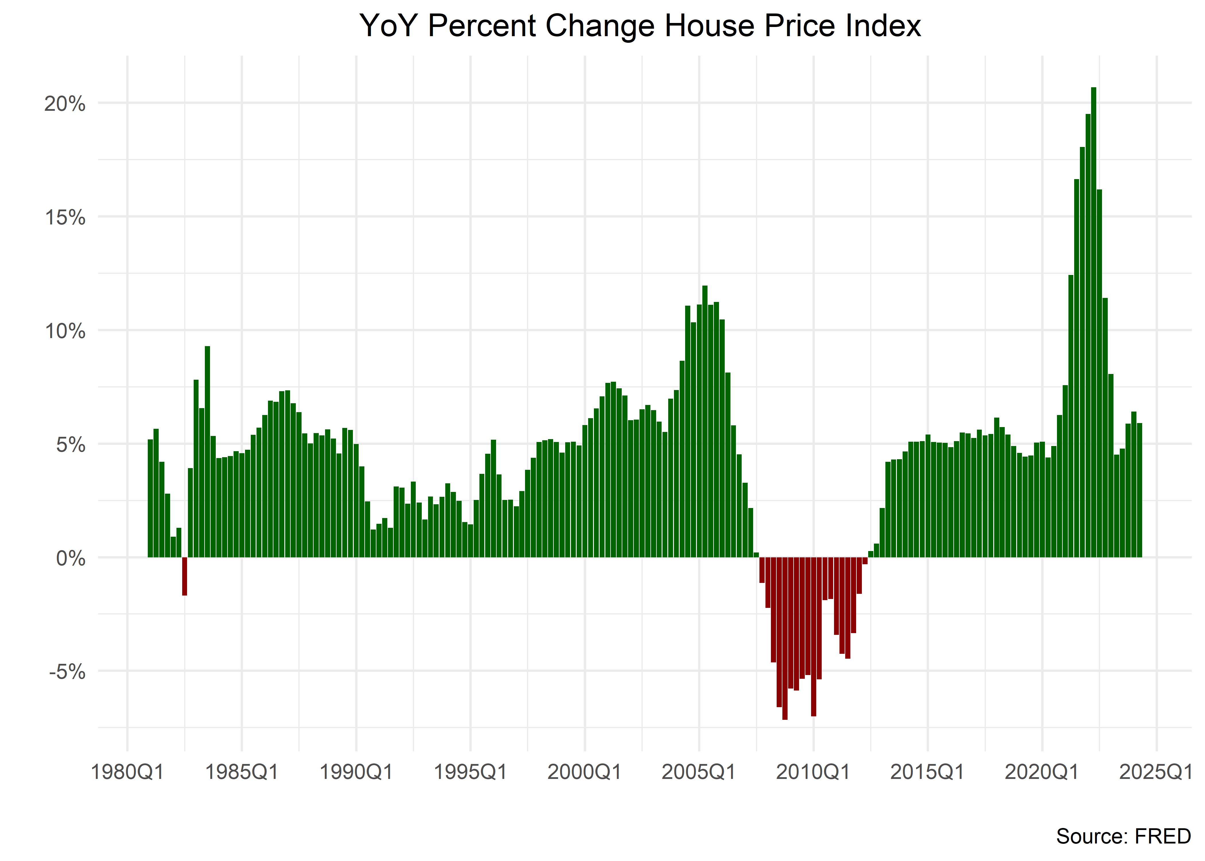
Let’s visualize annual home price inflation and use a similar template to one we used for GDP. We will make a bar chart with different colors for positive and negative inflation.
house_prices_yoy %>%
  # filter(date > "2000-01-01") %>%
  mutate(color_column = yoy_change > 0) %>%
  ggplot(aes(x = date, y = yoy_change, fill = color_column)) +
  # geom_line()
  geom_col(
    show.legend = F
  ) +
  # not scale_fill_manual
  scale_fill_manual(
    values = c("darkred", "darkgreen")
  ) +
  labs(
    title = "YoY Percent Change House Price Index ",
    y = "",
    x = "",
    caption = "Source: FRED",
    fill = ""
  ) +
  scale_y_continuous(
    labels = percent_format(accuracy = 1),
    breaks = pretty_breaks(n = 10)
  ) +
  scale_x_date(
    labels = function(x) zoo::format.yearqtr(x, "%YQ%q"),
    breaks = pretty_breaks(n = 10)
  ) +
  theme_minimal() +
  theme(plot.title = element_text(hjust = .5))
This chart make clear the two big shocks of our sample: the financial crisis, where we see annual home price deflation for four years, and the Covid-19 period, where annual inflation reaches a staggering 20%.
Mortgage Interest Rates
Conclusion
Footnotes
More information on this index can be found at https://www.fhfa.gov/Media/PublicAffairs/Pages/House-Price-Index-Frequently-Asked-Questions.aspx.↩︎

