library(tidyverse) # includes tidyr and dplyr and ggplot
library(tidyquant) # includes lubridate
library(timetk)
library(readxl)
library(scales)
library(fredr)
library(riingo)
library(janitor)GDP
Introduction
Welcome to our introductory chapter on Gross Domestic Product (or GDP), a term with which our readers are probably familiar. GDP is widely considered to be a measure of The Economy - when pundits remark that the economy is slowing or at risk of recession, they are referring to the change in GDP.1
The official definition of GDP is “the value of goods and services produced in the United States”. That might sound like a difficult thing to encapsulate in one number and indeed it is. An important word to call out in the definition of GDP is the word ‘value’. We numerically measure the value of goods and services, of course, with their price. However, when we consider whether the economy has grown or not, we typically mean real growth, not growth that reflects an increase in prices only.
The distinction between ‘real growth’ and ‘price growth’ is reflected in two different measures of GDP: Nominal GDP and Real GDP. As those names imply, Real GDP is adjusted for increases in price, whereas Nominal GDP is not.
Before we get to our analysis, let’s spend a few minutes on our immediate goals, tools and R packages.
By the end of the next section on downloading GDP data via excel spreadsheet, you will be able to locate data on the internet, import it via spreadsheet and work through some complex wrangling to get the data into a nice, tidy format. There is no theory in this section. It’s meant to help you learn some excel wrangling tips and tricks, and to see a concrete example of tidying data.
We also get a chance to review the foundational data wrangling functions that will cover around 90% of our work in tidying data. Remember that data scientists and quants spend at least 50% of their time wrangling and cleaning data. These functions and concepts will stay with us for our entire career and even though we saw most of them in previous chapters, it doesn’t hurt to review them in a new context.
By way of brief level setting, here’s a list of those fundamental functions.
From the dplyr package:
- select() to choose columns
- rename() to rename columns
- filter() to choose rows based on values
- mutate() to add new columns
- slice()  to choose rows based on position
- distinct() to get unique row values
- arrange() tochange the order of rows
- group_by() to group data within data frames
From the lubdridate package:
- parse_date_time() to change strings to dates
- ymd() to put dates into better format
From the tidyr package:
- pivot_longer() to make data tidy and longAnother important function is the pipe function, which is this thing: %>%. You will notice that throughout our code even though it looks funny right now. It’s called a pipe because we use to pass data from function to another, line by line, until we are done manipulating the data. Read more about the pipe here.
Let’s load our packages and get to work importing a messy spreadsheet of economic data.
Real v. Nominal GDP
Both Real and Nominal GDP are reported on a quarterly basis by the Bureau of Economic Analysis (the BEA) and consist of four sub-components: Net Exports, Consumption, Government Spending and Investment. Those four sub-components consist of several sub-sub-components, and those sub-sub-components further consist of of several components. When we analyze or discuss GDP, we are referring to the sum of these components. We could analyze those sub-components individually, for example if we were particularly interested in personal consumption (we’ll discuss this in our Inflation Chapter).
For those who are interested in a deep dive into how the BEA calculates Real v. Nominal GDP, the New York Fed has research on that available here: https://www.newyorkfed.org/medialibrary/media/research/current_issues/ci1-9.pdf.
Let’s take a quick peek at a chart of Real v. Nominal GDP.
gdp_nom_real <-
  tribble(~ symbol,    ~ name,
          "GDPC1", "real_gdp",
          "GDP",    "nominal_gdp") %>%
  tq_get(get = "economic.data", from = "1979-01-01") %>%
  group_by(name) %>%
  mutate(yoy_change = price / lag(price, 12) - 1)

gdp_nom_real %>%
  filter(date >= "2000-01-01") %>%
  ggplot(aes(x = date, y = price, color = name)) +
  geom_line(show.legend = T) +
  geom_label(
    aes(x = date,
        label = str_glue("${round(price/1000)}T")),
    data = . %>% filter(date == max(date)),
    show.legend = F
  ) +
  geom_textvline(
    xintercept =
      as.integer(ymd("2017-06-01")),
    label = "Base Date for Real Indexing",
    hjust = 0.1,
    linetype = 2,
    size = 3,
    vjust = 1.3,
    color = "darkred"
  ) +
  scale_color_manual(values = c("darkgreen",
                                "darkblue")) +
  scale_y_continuous(labels = dollar_format(scale = 1 / 1000,
                                            suffix = "T"),
                     breaks = pretty_breaks(15)) +
  scale_x_date(date_breaks = "2 years",
               date_labels = "%Y") +
  theme_minimal() +
  labs(
    x = "",
    y = "",
    title = " Real v. Nominal GDP",
    color = ""
  ) +
  theme(
    plot.title = element_text(hjust = .5),
    plot.margin = margin(0.1, 1, 0.1, 0.1, "cm"),
    legend.position = c(.5, .8),
    legend.text = element_text(size = 12)
  )
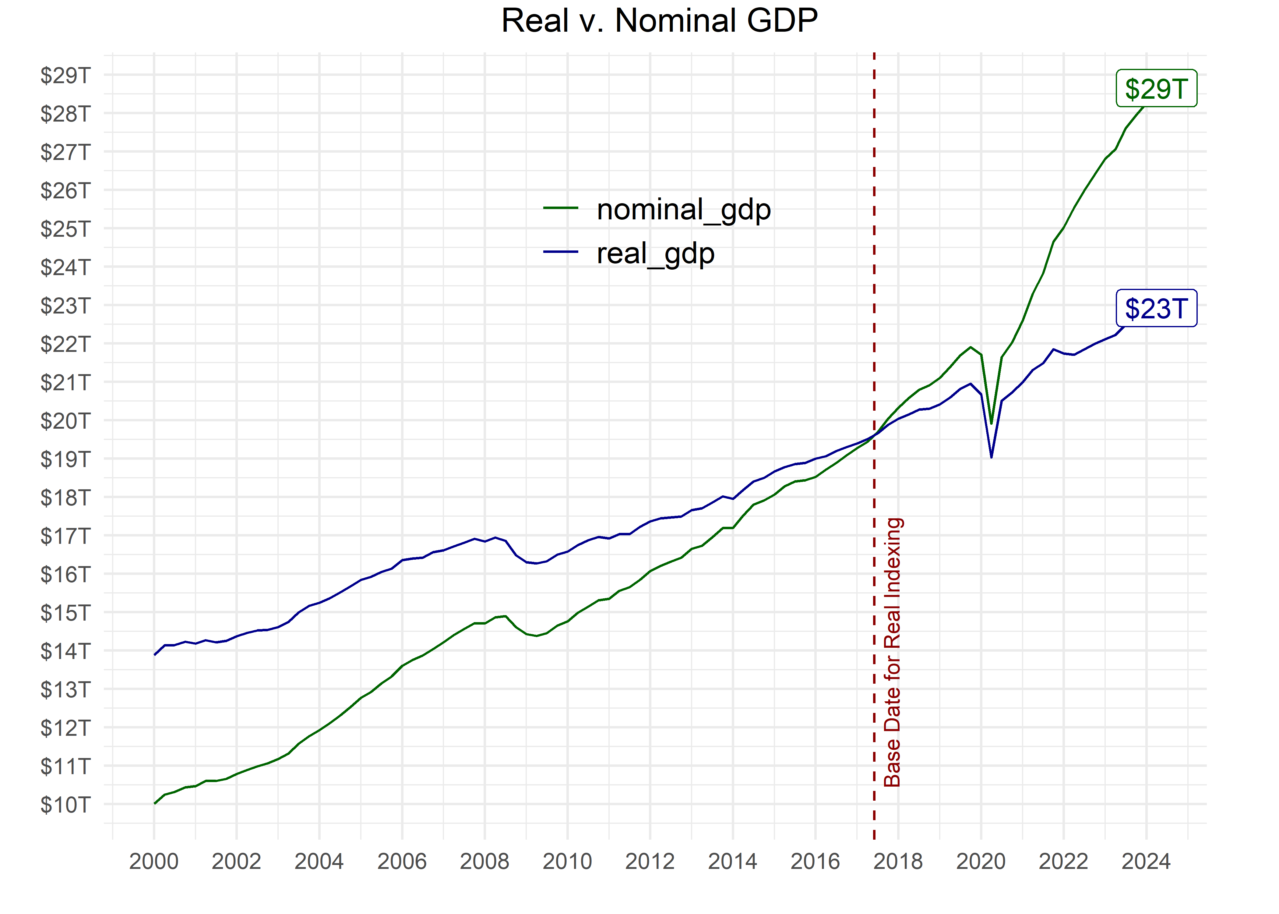
That chart shows us a few interesting points. The most recent readings of Real and Nominal are separated by about $6 Trillion. If someone asks, what’s the GDP of the United States, is the answer $28 Trillion or $22 Trillion? It depends if we or they mean Real or Nominal.
Also, have a look at the red line that we have labeled “Base Date for Real Indexing”. That line occurs at June of 2017, and it’s year at which Real and Nominal GDP are exactly equal to each other, and that’s due to how Real GDP is indexed against Nominal GDP as of this writing. 2017 is the indexing data for the latest iteration of Real v. Nominal - notice how quickly Nominal GDP has outstripped Real GDP since then.
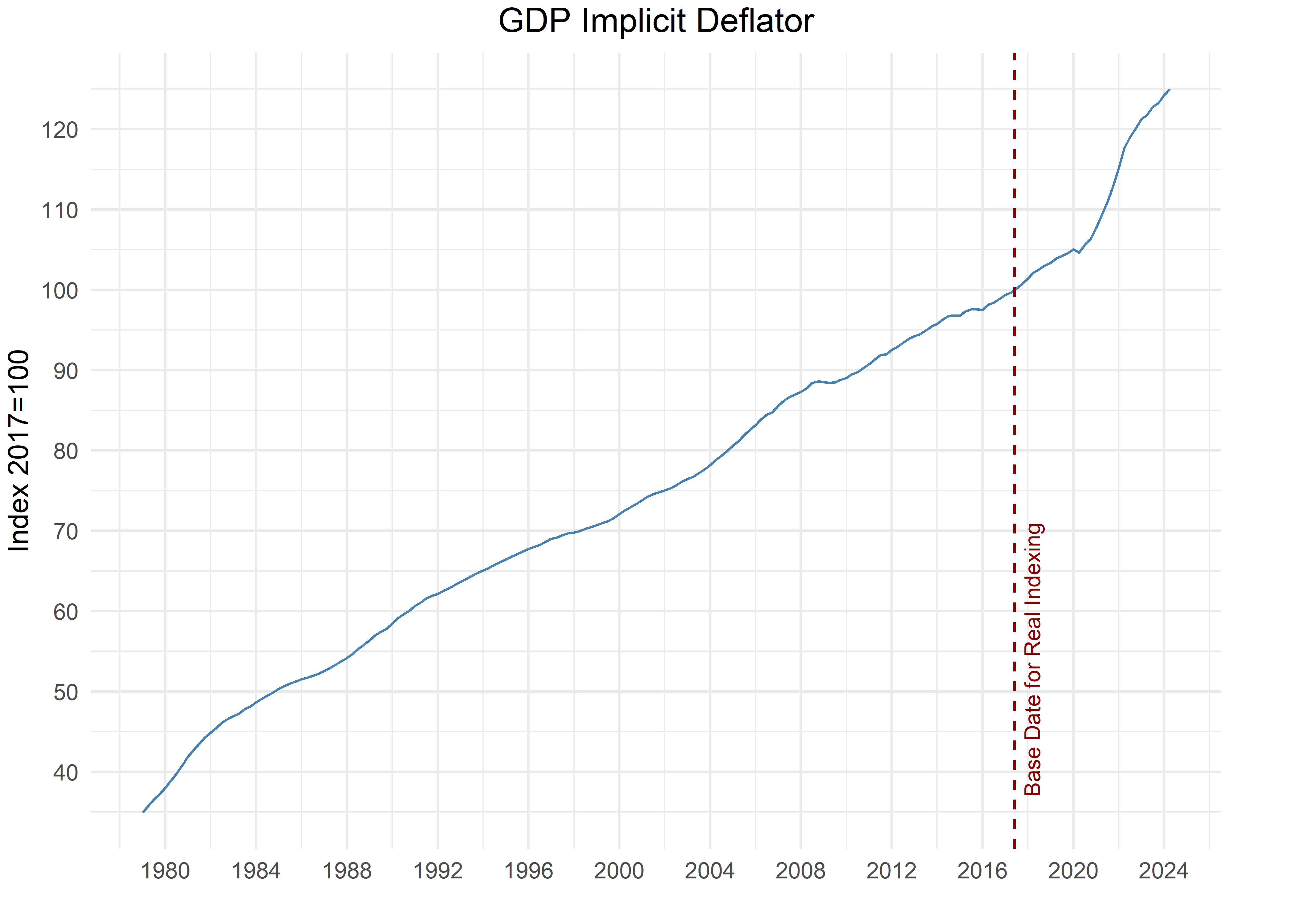
The difference between Real and Nominal GDP is called the Deflator, and it’s defined as: Nominal GDP divided by Real GDP multiplied by 100.
Visually, here’s how that looks:
gdp_nom_real %>%
  select(-symbol, -yoy_change) %>%
  pivot_wider(
    values_from = price,
    names_from = name
  ) %>%
  mutate(deflator = (nominal_gdp/real_gdp) * 100) %>%
  ggplot(aes(x = date,
             y = deflator)) +
  geom_line(color = "steelblue") +
   geom_textvline(xintercept =
                   as.integer(ymd("2017-06-01")),
                 label = "Base Date for Real Indexing",
                 hjust = 0.1,
                 linetype = 2,
                 size = 3,
                 vjust = 1.3,
                 color = "darkred") +
  scale_y_continuous(breaks = pretty_breaks(10)) +
  scale_x_date(date_breaks = "4 years",
               date_labels = "%Y") +
  theme_minimal() +
  labs(x = "", y = "Index 2017=100",
       title = "GDP Implicit Deflator",
       color = "") +
  theme(plot.title = element_text(hjust = .5),
        plot.margin = margin(0.1, 1, 0.1, 0.1, "cm"),
        legend.position = c(.5, .8),
        legend.text = element_text(size = 12))
Notice how the GDP deflator is equal to 100 in 2017 - that’s not a coincidence. It will always be equal to 100 in the indexing year.
Messy Data from the Bureau of Economic Analysis
We want this book to mirror reality, and the reality is that our first task (and many many subsequent tasks) in industry is usually to work with a tangled, messy, impenetrable spreadsheet. Luckily, the BEA provides one such spreadsheet where they report on GDP data.
Starting with a messy spreadsheet will also be our chance to introduce foundational data wrangling functions that will cover around 90% of our work in tidying data.
It’s not the fun stuff, but we want to start with spreadsheet work and data wrangling.
By way of brief level setting, here’s a list of those fundamental functions that we’ll need to clean the BEA spreadsheets and organize data on the change in Real GDP.
From the dplyr package:
- select() to choose columns
- rename() to rename columns
- filter() to choose rows based on values
- mutate() to add new columns
- slice()  to choose rows based on position
- distinct() to get unique row values
- arrange() tochange the order of rows
- group_by() to group data within data frames
- tibble() to create a dataframe, also called a tibble in R
From the lubdridate package:
- parse_date_time() to change strings to dates
- ymd() to put dates into better format
From the tidyr package:
- pivot_longer() to make data tidy and longRetrieving GDP data from the Bureau of Economic Analysis (the “BEA”) requires a trip to the BEA website to figure out the exact URL where the data is stored.
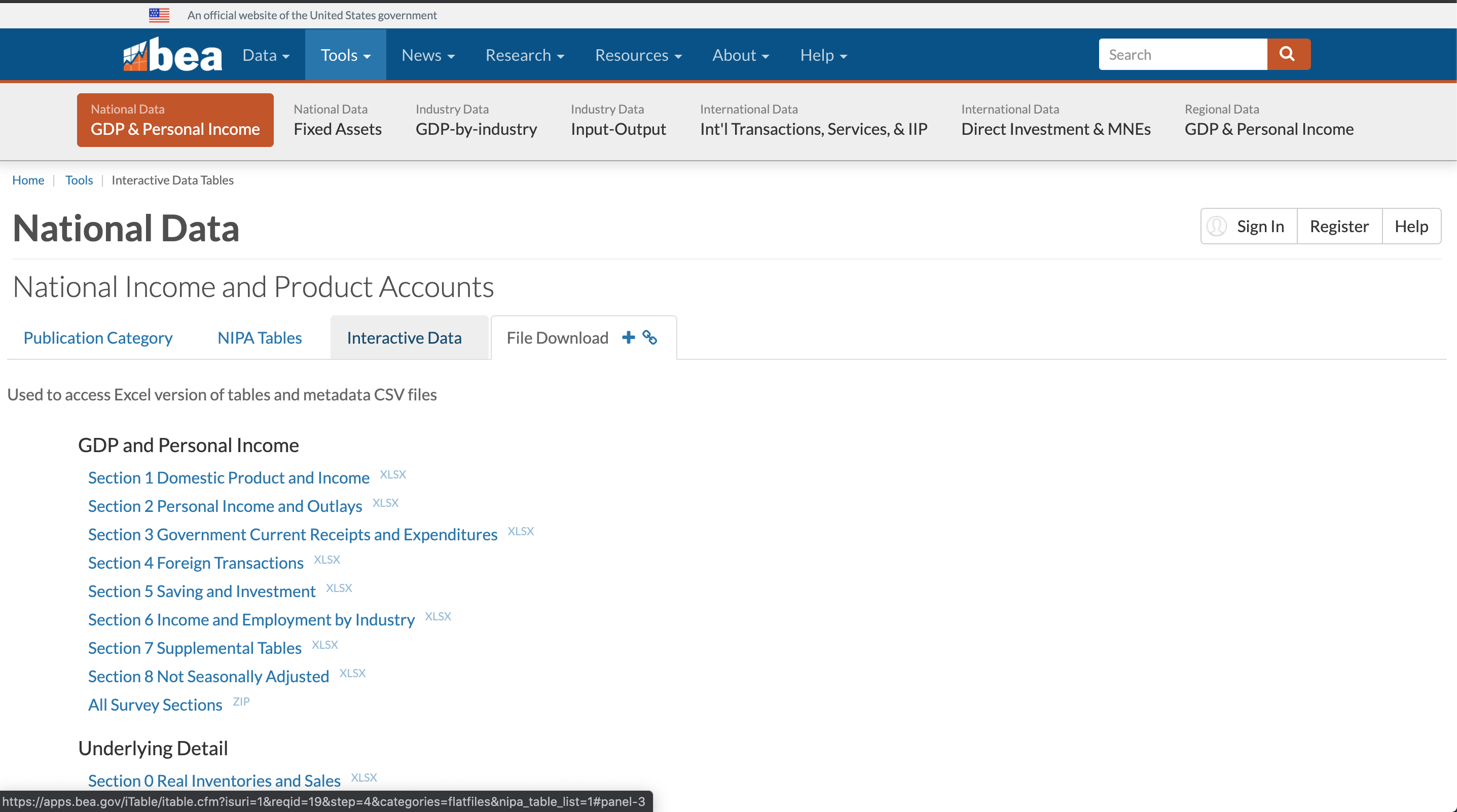
We navigate to this URL https://apps.bea.gov/iTable/itable.cfm?isuri=1&reqid=19&step=4&categories=flatfiles&nipa_table_list=1, which shows the following:
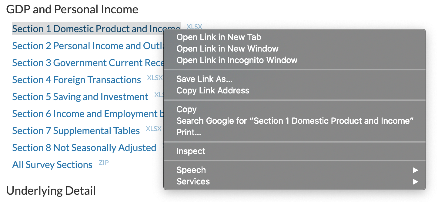
The first list is Section 1: Domestic Product and Income. If we right click on that link, we see this image:
Next click on Copy Link Address, navigate back over to RStudio and paste that URL into a code chunk. We will assign this to a variable called url.
url <- "https://apps.bea.gov/national/Release/XLS/Survey/Section1All_xls.xlsx"We just copied the exact URL where the BEA houses it’s GDP data.
To download the entire data set, we use the following code:
destfile <- "Section1All_xls.xlsx"
curl::curl_download(url, destfile)
After we run that code snippet, we have downloaded the Section 1 data from the BEA and it’s now sitting in a location called destfile on our computer. That’s the end of our need for an internet connection. We could disconnect from Wifi and get on an airplane for the rest of this section.
The downloaded excel file has more than one sheet (another popular industry trick is to hide data in different tabs or sheets within one excel workbook), and unless we already know which one we want, we can view the available sheets with the excel_sheets() function from the readxl package. We pipe the results of excel_sheets(destfile) to the tibble() function so we can store the results in a data frame. We can pipe to the head() function to peek at the first few rows.
excel_sheets(destfile) %>%
  tibble() %>%
  head(3)
# A tibble: 3 × 1
.
<chr>
1 Contents
2 T10101-A
3 T10101-QHow many sheets are available? We can use count() to find out exactly.
excel_sheets(destfile) %>%
  tibble() %>%
  count()
# A tibble: 1 × 1
n
<int>
1 107There are over 100 sheets available, and the first one is called Contents. That’s a good place to start to find out what’s in this data. Not all spreadsheets will have a Contents sheet, but the BEA has been kind enough to include one We can look at the Contents sheet by calling read_excel(...., sheet = "Contents"), and then piping the results to gt() for a quick table.
contents <-
read_excel(destfile, sheet = "Contents")

contents %>%
  head() %>%
gt()| Code | Title |
|---|---|
| NA | NA |
| T10101 | Table 1.1.1. Percent Change From Preceding Period in Real Gross Domestic Product |
| T10102 | Table 1.1.2. Contributions to Percent Change in Real Gross Domestic Product |
| T10103 | Table 1.1.3. Real Gross Domestic Product, Quantity Indexes |
| T10104 | Table 1.1.4. Price Indexes for Gross Domestic Product |
| T10105 | Table 1.1.5. Gross Domestic Product |
There are two columns in this sheet, Code and Title. The Title column will let us know the names for each data set. The Code column provides the same information if we have memorized the table codes for our data sets.
We can see at that the first row contains an NA and the second contains the information for Percent Change From Preceding Period in Real Gross Domestic Product. How many possible Title entries are there. We can count() them and make sure.
read_excel(destfile, sheet = "Contents") %>%
  select(Title) %>%
  count()
# A tibble: 1 × 1
n
<int>
1 58There are 58 rows or titles in Contents here but we have 107 sheets, as we saw when we ran excel_sheets(). What’s going on?
Those data codes and titles are both subdivided into annual and quarterly data. 58 titles, but annual and quarterly for each. Have a look back up to when we ran the excel_sheets() function and notice how A and Q are appended to the codes, standing for “Annual” and “Quarterly”. We will need to deal with this when we decide exactly which data set to extract from this spreadsheet.
Quarterly Change in Real GDP
We can see in the table above that the first sheet, 10101-Q, holds data on the quarterly change in Real GDP, expressed as a percentage. That tends to be the headline GDP number reported in the media so let’s work with that data (NB: when the media report on change in GDP, they report on change in Real GDP, not nominal GDP).
Remember, we have already downloaded the spreadsheet with 107 worksheets to our machine - we grabbed a huge excel file from the BEA. Now we want to move just one of the sheets to our R environment and ultimately we want the resulting data to look like this:
read_excel(destfile,
           sheet = "T10101-Q",
           skip = 7) %>%
  select(-1)  %>%
  rename(account = 1, code = 2) %>%
  mutate(
    across(c(-account, -code), as.numeric)
  ) %>%
  pivot_longer(-account:-code, names_to = "date",
               values_to = "percent_change") %>%
  mutate(date = parse_date_time(date, orders = "Yq") %>%
           ymd(),
         percent_change = percent_change/100) %>%
  arrange(desc(date)) %>%
  relocate(date, everything()) %>%
  filter(account == "Gross domestic product") %>%
  head(3)
# A tibble: 3 × 4
date account code percent_change
<date> <chr> <chr> <dbl>
1 2024-04-01 Gross domestic product A191RL 0.03
2 2024-01-01 Gross domestic product A191RL 0.014
3 2023-10-01 Gross domestic product A191RL 0.034We want 3 columns: date, account and percent_change. Note that we chose the word account as a good title for the column holding the description of this data. You might disagree or think there’s a better a column name and we will cover how to change that.
The first step is to move data from that huge spreadsheet into our RStudio environment and that means a call to the read_excel() function from the readxl package. If the data is perfectly formatted, that’s the only step we’ll need. Let’s give it a shot:
read_excel(destfile,
           sheet = "T10101-Q") %>%
  head(3)
# A tibble: 3 × 312
Table 1.1.1. Percent C…¹ ...2 ...3 ...4 ...5 ...6 ...7 ...8 ...9 ...10
<chr> <chr> <chr> <chr> <chr> <chr> <chr> <chr> <chr> <chr>
1 [Percent] Seasonally ad… <NA> <NA> <NA> <NA> <NA> <NA> <NA> <NA> <NA>
2 Quarterly data from 194… <NA> <NA> <NA> <NA> <NA> <NA> <NA> <NA> <NA>
3 Bureau of Economic Anal… <NA> <NA> <NA> <NA> <NA> <NA> <NA> <NA> <NA>
# ℹ abbreviated name:
# ¹`Table 1.1.1. Percent Change From Preceding Period in Real Gross Domestic Product`
# ℹ 302 more variables: ...11 <chr>, ...12 <chr>, ...13 <chr>, ...14 <chr>,
# ...15 <chr>, ...16 <chr>, ...17 <chr>, ...18 <chr>, ...19 <chr>,
# ...20 <chr>, ...21 <chr>, ...22 <chr>, ...23 <chr>, ...24 <chr>,
# ...25 <chr>, ...26 <chr>, ...27 <chr>, ...28 <chr>, ...29 <chr>,
# ...30 <chr>, ...31 <chr>, ...32 <chr>, ...33 <chr>, ...34 <chr>, …Have a look at the first 3 rows above, and notice that we don’t need the first 7 rows. They contain meta data about when this file was created that is interesting but we don’t want that to be part of our analysis. Let’s add skip = 7 to the read_excel() call.
read_excel(destfile, sheet = "T10101-Q",
           skip = 7) %>%
  head(3)
# A tibble: 3 × 312
Line ...2 ...3 `1947Q2` `1947Q3` `1947Q4` `1948Q1` `1948Q2` `1948Q3`
<chr> <chr> <chr> <chr> <chr> <chr> <chr> <chr> <chr>
1 1 Gross domes… A191… -1 -0.8 6.4 6.2 6.8 2.29999…
2 2 Personal co… DPCE… 6.8 1.3 0.1 2 4.7 0.6
3 3 Goods DGDS… 7.4 2.7 1.5 0.6 3.7 -0.4
# ℹ 303 more variables: `1948Q4` <chr>, `1949Q1` <chr>, `1949Q2` <chr>,
# `1949Q3` <chr>, `1949Q4` <chr>, `1950Q1` <chr>, `1950Q2` <chr>,
# `1950Q3` <chr>, `1950Q4` <chr>, `1951Q1` <chr>, `1951Q2` <chr>,
# `1951Q3` <chr>, `1951Q4` <chr>, `1952Q1` <chr>, `1952Q2` <chr>,
# `1952Q3` <chr>, `1952Q4` <chr>, `1953Q1` <chr>, `1953Q2` <chr>,
# `1953Q3` <chr>, `1953Q4` <chr>, `1954Q1` <chr>, `1954Q2` <chr>,
# `1954Q3` <chr>, `1954Q4` <chr>, `1955Q1` <chr>, `1955Q2` <chr>, …That looks much better, but the first three columns have small issues. The first column is called Line and seems unnecessary. Let’s remove it with select(-Line). select() is from the dplyr() package and is used to choose columns. If we wish to remove a column called Line, we use the negative sign.
read_excel(destfile,
           sheet = "T10101-Q",
           skip = 7) %>%
  select(-Line) %>%
  head(3)
# A tibble: 3 × 311
...2 ...3 `1947Q2` `1947Q3` `1947Q4` `1948Q1` `1948Q2` `1948Q3` `1948Q4`
<chr> <chr> <chr> <chr> <chr> <chr> <chr> <chr> <chr>
1 Gross do… A191… -1 -0.8 6.4 6.2 6.8 2.29999… 0.5
2 Personal… DPCE… 6.8 1.3 0.1 2 4.7 0.6 3.2
3 Goods DGDS… 7.4 2.7 1.5 0.6 3.7 -0.4 2.7
# ℹ 302 more variables: `1949Q1` <chr>, `1949Q2` <chr>, `1949Q3` <chr>,
# `1949Q4` <chr>, `1950Q1` <chr>, `1950Q2` <chr>, `1950Q3` <chr>,
# `1950Q4` <chr>, `1951Q1` <chr>, `1951Q2` <chr>, `1951Q3` <chr>,
# `1951Q4` <chr>, `1952Q1` <chr>, `1952Q2` <chr>, `1952Q3` <chr>,
# `1952Q4` <chr>, `1953Q1` <chr>, `1953Q2` <chr>, `1953Q3` <chr>,
# `1953Q4` <chr>, `1954Q1` <chr>, `1954Q2` <chr>, `1954Q3` <chr>,
# `1954Q4` <chr>, `1955Q1` <chr>, `1955Q2` <chr>, `1955Q3` <chr>, …That looks better but the names of the first two columns are ...2 and ...3. With rename(), we can assign new names by position or by the original name. By position means we can tell the function to rename the first column, with rename(new_name = 1). By original name means we can assign new names by referring to the original name, with rename(new_name = ...2). Let’s use the position method, and rename the first two columns as account and code.
read_excel(destfile,
           sheet = "T10101-Q",
           skip = 7) %>%
  select(-1)  %>%
  rename(account = 1, code = 2) %>%
  head(3)
# A tibble: 3 × 311
account code `1947Q2` `1947Q3` `1947Q4` `1948Q1` `1948Q2` `1948Q3` `1948Q4`
<chr> <chr> <chr> <chr> <chr> <chr> <chr> <chr> <chr>
1 Gross do… A191… -1 -0.8 6.4 6.2 6.8 2.29999… 0.5
2 Personal… DPCE… 6.8 1.3 0.1 2 4.7 0.6 3.2
3 Goods DGDS… 7.4 2.7 1.5 0.6 3.7 -0.4 2.7
# ℹ 302 more variables: `1949Q1` <chr>, `1949Q2` <chr>, `1949Q3` <chr>,
# `1949Q4` <chr>, `1950Q1` <chr>, `1950Q2` <chr>, `1950Q3` <chr>,
# `1950Q4` <chr>, `1951Q1` <chr>, `1951Q2` <chr>, `1951Q3` <chr>,
# `1951Q4` <chr>, `1952Q1` <chr>, `1952Q2` <chr>, `1952Q3` <chr>,
# `1952Q4` <chr>, `1953Q1` <chr>, `1953Q2` <chr>, `1953Q3` <chr>,
# `1953Q4` <chr>, `1954Q1` <chr>, `1954Q2` <chr>, `1954Q3` <chr>,
# `1954Q4` <chr>, `1955Q1` <chr>, `1955Q2` <chr>, `1955Q3` <chr>, …The column names are more informative now, but look closely at the columns that hold the actual percent change values and notice that <chr> is written underneath the column names. That tells us that the column has been read in as a character rather than as a double or something numeric. That was probably caused by the periods and negative signs. We want to change those to numeric columns.
To do so, we use the mutate() function, which allows us to change an existing column’s content or add a new column.
Let’s change just the column called 1947Q2 to numeric. To do so, we call mutate("1947Q2"= as.numeric('1947Q2')).
read_excel(destfile, sheet = "T10101-Q",
    skip = 7) %>%
  select(-1)  %>%
  rename(account = 1, code = 2) %>%
  mutate(`1947Q2` = as.numeric(`1947Q2`)) %>%
  head(3)
# A tibble: 3 × 311
account code `1947Q2` `1947Q3` `1947Q4` `1948Q1` `1948Q2` `1948Q3` `1948Q4`
<chr> <chr> <dbl> <chr> <chr> <chr> <chr> <chr> <chr>
1 Gross do… A191… -1 -0.8 6.4 6.2 6.8 2.29999… 0.5
2 Personal… DPCE… 6.8 1.3 0.1 2 4.7 0.6 3.2
3 Goods DGDS… 7.4 2.7 1.5 0.6 3.7 -0.4 2.7
# ℹ 302 more variables: `1949Q1` <chr>, `1949Q2` <chr>, `1949Q3` <chr>,
# `1949Q4` <chr>, `1950Q1` <chr>, `1950Q2` <chr>, `1950Q3` <chr>,
# `1950Q4` <chr>, `1951Q1` <chr>, `1951Q2` <chr>, `1951Q3` <chr>,
# `1951Q4` <chr>, `1952Q1` <chr>, `1952Q2` <chr>, `1952Q3` <chr>,
# `1952Q4` <chr>, `1953Q1` <chr>, `1953Q2` <chr>, `1953Q3` <chr>,
# `1953Q4` <chr>, `1954Q1` <chr>, `1954Q2` <chr>, `1954Q3` <chr>,
# `1954Q4` <chr>, `1955Q1` <chr>, `1955Q2` <chr>, `1955Q3` <chr>, …That worked, notice how <dbl> is now written under the column name. We want to convert all except the first two columns to numeric but we don’t want to type out the names of each. Fortunately, we can use across() inside of mutate() to accomplish this. With across(), we can apply a function across multiple columns. Here we will tell across() to apply the as.numeric() function to all of our columns except the account and code columns. The full call is mutate(across(c(-account, -code), as.numeric)).
read_excel(destfile, sheet = "T10101-Q",
    skip = 7) %>%
  select(-1)  %>%
  rename(account = 1, code = 2) %>%
  mutate(
    across(c(-account, -code), as.numeric)
    ) %>%
  select(account, contains("Q")) %>%
  head(3)
# A tibble: 3 × 310
account `1947Q2` `1947Q3` `1947Q4` `1948Q1` `1948Q2` `1948Q3` `1948Q4`
<chr> <dbl> <dbl> <dbl> <dbl> <dbl> <dbl> <dbl>
1 Gross domestic… -1 -0.8 6.4 6.2 6.8 2.3 0.5
2 Personal consu… 6.8 1.3 0.1 2 4.7 0.6 3.2
3 Goods 7.4 2.7 1.5 0.6 3.7 -0.4 2.7
# ℹ 302 more variables: `1949Q1` <dbl>, `1949Q2` <dbl>, `1949Q3` <dbl>,
# `1949Q4` <dbl>, `1950Q1` <dbl>, `1950Q2` <dbl>, `1950Q3` <dbl>,
# `1950Q4` <dbl>, `1951Q1` <dbl>, `1951Q2` <dbl>, `1951Q3` <dbl>,
# `1951Q4` <dbl>, `1952Q1` <dbl>, `1952Q2` <dbl>, `1952Q3` <dbl>,
# `1952Q4` <dbl>, `1953Q1` <dbl>, `1953Q2` <dbl>, `1953Q3` <dbl>,
# `1953Q4` <dbl>, `1954Q1` <dbl>, `1954Q2` <dbl>, `1954Q3` <dbl>,
# `1954Q4` <dbl>, `1955Q1` <dbl>, `1955Q2` <dbl>, `1955Q3` <dbl>, …E voila! We just converted 294 columns to numeric.
But look at how much of the columns are dates - that’s a wide format that spreadhseety people like but data scientists typically don’t. We prefer long, tidy data to wide data and it’s not just personal preference. We are missing an important column here that should be called date. That missing column means this data is not tidy, which means more than just clean. It has a definition in the world of data science and we like this one:
tidy data that has three main elements.
Each variable forms a column.
Each observation forms a row.
Each type of observational unit forms a table.
In our opinion, it is more efficient to examine this data in tidy format than to linger on the definition of tidy data.
Here is our same GDP data, in tidy format (we convert it with the pivot_longer() function)
read_excel(destfile, sheet = "T10101-Q",
    skip = 7) %>%
  select(-1)  %>%
  rename(account = 1, code = 2) %>%
  mutate(
    across(c(-account, -code), as.numeric)
    ) %>%
  select(account, contains("Q")) %>%
  pivot_longer(-account,
               names_to = "date",
               values_to = "percent_change") %>%
  head(3)
# A tibble: 3 × 3
account date percent_change
<chr> <chr> <dbl>
1 Gross domestic product 1947Q2 -1
2 Gross domestic product 1947Q3 -0.8
3 Gross domestic product 1947Q4 6.4Notice how we have gone from 296 columns to 3 columns. Our data is much less wide now. At the same time, we have gone from 28 rows to 8,532 rows. Our data is longer. It is also tidy in the sense that we have a column for date and for percent_change. In the wide format, those two variables did not have their own column. In the wide format, there was one column for each date. That wasn’t “wrong” but it makes it harder for data science work and we could say we were “missing” a column called date.
The mechanics of how we reshaped that data are very important and not very intuitive. We will describe it in words and demonstrate the code but we find the best way to get comfortable converting wide data to long, tidy data is start experimenting.
Here are the steps:
+ move column names (which are dates like 1947Q2) into a column called `date`
+ move the values (the percent changes) into a new column called `percent_change`.
To do this, we use the pivot_longer() function from tidyr and we set names_to = "date" to indicate we want to put the column names into a new column called date, and we set values_to = "percent_change" to indicate we want to put the values in a new column called percent_change. Note, though, we don’t want to change our original columns called account and code. We want the pivot_longer() function to ignore those columns.
Thus our full call is pivot_longer(-account:-code, names_to = "date", values_to = "percent_change"). For the pivot_longer() function, those negative signs mean to ignore the account and code columns, it does not mean to delete them.
read_excel(destfile, sheet = "T10101-Q",
    skip = 7) %>%
  select(-1)  %>%
  rename(account = 1, code = 2) %>%
  mutate(
    across(c(-account, -code), as.numeric)
    ) %>%
  select(account, contains("Q")) %>%
  pivot_longer(-account, #ignore these columns
               names_to = "date", # move column names to this column
               values_to = "percent_change" # move column values to this column
               ) %>%
  head(3)
# A tibble: 3 × 3
account date percent_change
<chr> <chr> <dbl>
1 Gross domestic product 1947Q2 -1
2 Gross domestic product 1947Q3 -0.8
3 Gross domestic product 1947Q4 6.4Have a good look at that code, but also make sure the logic makes sense. Our new structure holds the exact same data as the BEA spreadsheet, but it’s in a different (and we think better) format.
We have one more important transformation to make in the date column. We see that it is still in the <chr> format, meaning it is a character column and not a <date> class column.
There is a very useful package in R called lubridate that can be used to convert and work with dates. In this case, we have a difficult situation. 2020Q3 does not actually refer to a date. It refers to a time period, the third quarter of 2020. But we want to anchor that period to the first date in Q3 2020. lubridate has a function that will accomplish this for us, called parse_date_time().
We need to tell that function the format of the string that we want to parse, so we add orders = "Yq". The full call is mutate(date = parse_date_time(date, orders = "Yq")).
read_excel(destfile, sheet = "T10101-Q",
    skip = 7) %>%
  select(-1)  %>%
  rename(account = 1, code = 2) %>%
  mutate(
    across(c(-account, -code), as.numeric)
    ) %>%
  select(account, contains("Q")) %>%
  pivot_longer(-account,
               names_to = "date",
               values_to = "percent_change") %>%
  mutate(date = parse_date_time(date, orders = "Yq")) %>%
  head(3)
# A tibble: 3 × 3
account date percent_change
<chr> <dttm> <dbl>
1 Gross domestic product 1947-04-01 00:00:00 -1
2 Gross domestic product 1947-07-01 00:00:00 -0.8
3 Gross domestic product 1947-10-01 00:00:00 6.4The date column is now in class <S3: POSIXct>. That is a valid date format but we prefer to move it to class <date>. We do that with another call to mutate and use the ymd() function from lubridate.
read_excel(destfile, sheet = "T10101-Q",
    skip = 7) %>%
  select(-1)  %>%
  rename(account = 1, code = 2) %>%
  mutate(
    across(c(-account, -code), as.numeric)
    ) %>%
  select(account, contains("Q")) %>%
  pivot_longer(-account,
               names_to = "date",
               values_to = "percent_change") %>%
  mutate(date = parse_date_time(date, orders = "Yq"),
         date = ymd(date)) %>%
  head(3)
# A tibble: 3 × 3
account date percent_change
<chr> <date> <dbl>
1 Gross domestic product 1947-04-01 -1
2 Gross domestic product 1947-07-01 -0.8
3 Gross domestic product 1947-10-01 6.4Let’s also add columns to store the month, quarter, year-month and year-quarter. To do this we use a few new functions:
month()andyear()fromlubridateto extract the month.str_glue()from thestringrpackage to paste strings together. This is very useful in working with weird date strings and coercing them into the order we desire.as.yearmonandas.yearqtrfrom thezoopackage.
Those two functions from zoo allow us to create a time aware date label that uses just the month and year or just the quarter and year. We can break the rule that a date needs a year, month and day. For example, November 2022 is not a date, exactly. It’s a time period. But as.yearmon allows us to coerce it into a date period.
as.yearmon("2022-11")[1] "Nov 2022"zoo has been in existence longer than lubridate and was built specifically to deal with time series.2 We use lubridate much more frequently but these year month and year quarter functions are very useful.
Below is the full code chunk for wrangling into different date formats. Notice we can create many different columns around date but need to call mutate only once.
read_excel(destfile, sheet = "T10101-Q",
    skip = 7) %>%
  select(-1)  %>%
  rename(account = 1, code = 2) %>%
  mutate(
    across(c(-account, -code), as.numeric)
    ) %>%
  select(account, contains("Q")) %>%
  pivot_longer(-account,
               names_to = "date",
               values_to = "percent_change") %>%
  mutate(date = parse_date_time(date, orders = "Yq"),
         date = ymd(date),
         year = year(date),
         month_num = month(date),
         month_label = month(date, label = T, abbr = F),
         quarter = quarter(date),
         month_year = str_glue("{month_label} {year}") %>%
           as.yearmon(),
         quarter_year= str_glue(" {year} Q{quarter}") %>%
           as.yearqtr()) %>%
  head(3)
# A tibble: 3 × 9
account date percent_change year month_num month_label quarter
<chr> <date> <dbl> <dbl> <dbl> <ord> <int>
1 Gross domestic … 1947-04-01 -1 1947 4 April 2
2 Gross domestic … 1947-07-01 -0.8 1947 7 July 3
3 Gross domestic … 1947-10-01 6.4 1947 10 October 4
# ℹ 2 more variables: month_year <yearmon>, quarter_year <yearqtr>The dataframe is in good shape now. We have all the data we need and in a tidy format. Let’s do a bit more clean up and review a few more functions.
First, let’s keep just the rows that are equal to Gross domestic product in the account column. We need to filter that column to just our desired values with filter(account == "Gross domestic product").
read_excel(destfile, sheet = "T10101-Q",
    skip = 7) %>%
  select(-1)  %>%
  rename(account = 1, code = 2) %>%
  mutate(
    across(c(-account, -code), as.numeric)
    ) %>%
  select(account, contains("Q")) %>%
  pivot_longer(-account,
               names_to = "date",
               values_to = "percent_change") %>%
  mutate(date = parse_date_time(date, orders = "Yq"),
         date = ymd(date)) %>%
  filter(account == "Gross domestic product")  %>%
  head(3)
# A tibble: 3 × 3
account date percent_change
<chr> <date> <dbl>
1 Gross domestic product 1947-04-01 -1
2 Gross domestic product 1947-07-01 -0.8
3 Gross domestic product 1947-10-01 6.4filter() can be used on <date> and <dbl> columns as well. For example, suppose we wished to look at just the data for recent dates, those from “2020-01-01” onward. We would call filter(date >= "2020-01-01").
read_excel(destfile, sheet = "T10101-Q",
    skip = 7) %>%
  select(-1)  %>%
  rename(account = 1, code = 2) %>%
  mutate(
    across(c(-account, -code), as.numeric)
    ) %>%
  select(account, contains("Q")) %>%
  pivot_longer(-account,
               names_to = "date",
               values_to = "percent_change") %>%
  mutate(date = parse_date_time(date, orders = "Yq"),
         date = ymd(date)) %>%
  filter(date >= "2020-01-01")  %>%
  head(3)
# A tibble: 3 × 3
account date percent_change
<chr> <date> <dbl>
1 Gross domestic product 2020-01-01 -5.3
2 Gross domestic product 2020-04-01 -28
3 Gross domestic product 2020-07-01 34.8Another important function is slice(). This lets us choose which rows to keep by number. It is quite useful when combined with group_by(), which tells the data frame that we wish to create groups inside the data frame. Here, we probably want to treat each value in the account column as a separate group.
If we want to view just the first and last row of each group, we call group_by(account) and slice(1, n()).
read_excel(destfile, sheet = "T10101-Q",
    skip = 7) %>%
  select(-1)  %>%
  rename(account = 1, code = 2) %>%
  mutate(
    across(c(-account, -code), as.numeric)
    ) %>%
    select(account, contains("Q")) %>%
  pivot_longer(-account,
               names_to = "date",
               values_to = "percent_change") %>%
  mutate(date = parse_date_time(date, orders = "Yq"),
         date = ymd(date)) %>%
  group_by(account) %>%
  slice(1, n()) %>%
  head(3)
# A tibble: 3 × 3
# Groups: account [2]
account date percent_change
<chr> <date> <dbl>
1 Addendum: 1947-04-01 NA
2 Addendum: 2024-04-01 NA
3 Change in private inventories 1947-04-01 NAThat’s a good way to make sure we have the first and last date for each account, and a side benefit is we can notice some accounts that are not actually components of GDP, like addendum. We exclude the rows labeled addendum later in the code.
Lastly, we prefer to have the most recent date at the top, meaning the date in descending order. That necessitates a call to arrange(desc(date)). And suppose we want the date column to be the first column, on the far left? We can use relocate() to change the column orders.
read_excel(destfile, sheet = "T10101-Q",
    skip = 7) %>%
  select(-1)  %>%
  rename(account = 1, code = 2) %>%
  mutate(
    across(c(-account, -code), as.numeric)
    ) %>%
    select(account, contains("Q")) %>%
  pivot_longer(-account,
               names_to = "date",
               values_to = "percent_change") %>%
  mutate(date = parse_date_time(date, orders = "Yq"),
         date = ymd(date),
         month_year =
           str_glue("{lubridate::month(date, label = T)} {year(date)}") %>%
           as.yearmon(),
         quarter_year= str_glue(" {year(date)} Q{quarter(date)} ") %>%
           as.yearqtr()) %>%
  filter(account == "Gross domestic product")  %>%
  arrange(desc(date)) %>%
  relocate(date, month_year, quarter_year, everything()) %>%
  head(3)
# A tibble: 3 × 5
date month_year quarter_year account percent_change
<date> <yearmon> <yearqtr> <chr> <dbl>
1 2024-04-01 Apr 2024 2024 Q2 Gross domestic product 3
2 2024-01-01 Jan 2024 2024 Q1 Gross domestic product 1.4
3 2023-10-01 Oct 2023 2023 Q4 Gross domestic product 3.4Now that we have this data in good shape, we save it as a new object, called gdp_percent_change_from_spreadsheet. That’s a verbose name that reminds us what the data holds and where it came from - the BEA spreadsheets.
gdp_percent_change_from_spreadsheet <-
 read_excel(destfile, sheet = "T10101-Q",
    skip = 7) %>%
  select(-1)  %>%
  rename(account = 1, code = 2) %>%
  mutate(
    across(c(-account, -code), as.numeric)
    ) %>%
    select(account, contains("Q")) %>%
  pivot_longer(-account,
               names_to = "date",
               values_to = "percent_change") %>%
  mutate(date = parse_date_time(date, orders = "Yq"),
         date = ymd(date),
         month_year =
           str_glue("{lubridate::month(date, label = T)} {year(date)}") %>%
           as.yearmon(),
         quarter_year= str_glue(" {year(date)} Q{quarter(date)} ") %>%
           as.yearqtr()) %>%
  filter(account == "Gross domestic product")  %>%
  arrange(desc(date)) %>%
  relocate(date, month_year, quarter_year, everything()) %>%
  head(3)
That concludes are work wrangling this spreadsheet. For a quick recap, we started with this monstrosity of data criminality (with dates running across the spreadsheet!)
 read_excel(destfile, sheet = "T10101-Q",
    skip = 7)
# A tibble: 28 × 312
Line ...2 ...3 `1947Q2` `1947Q3` `1947Q4` `1948Q1` `1948Q2` `1948Q3`
<chr> <chr> <chr> <chr> <chr> <chr> <chr> <chr> <chr>
1 1 Gross dome… A191… -1 -0.8 6.4 6.2 6.8 2.29999…
2 2 Personal c… DPCE… 6.8 1.3 0.1 2 4.7 0.6
3 3 Goods DGDS… 7.4 2.7 1.5 0.6 3.7 -0.4
4 4 Durable go… DDUR… 8.6 5.8 28.5 -1.9 2.7 6.8
5 5 Nondurable… DNDG… 7 1.9 -5.0999… 1.3 4 -2.4
6 6 Services DSER… 5.9 -0.8 -2.1 4.3 6.4 2.1
7 7 Gross priv… A006… -27.3 -11.3 103 47.8 27.1 4.2
8 8 Fixed inve… A007… -10 13.5 37.2999… 13.4 -0.6 -4
9 9 Nonresiden… A008… -6.1 -7.2 11.6 25.3 -12.7 1
10 10 Structures A009… -2.1 2.8 -5.6 8.6 11.6 12.5
# ℹ 18 more rows
# ℹ 303 more variables: `1948Q4` <chr>, `1949Q1` <chr>, `1949Q2` <chr>,
# `1949Q3` <chr>, `1949Q4` <chr>, `1950Q1` <chr>, `1950Q2` <chr>,
# `1950Q3` <chr>, `1950Q4` <chr>, `1951Q1` <chr>, `1951Q2` <chr>,
# `1951Q3` <chr>, `1951Q4` <chr>, `1952Q1` <chr>, `1952Q2` <chr>,
# `1952Q3` <chr>, `1952Q4` <chr>, `1953Q1` <chr>, `1953Q2` <chr>,
# `1953Q3` <chr>, `1953Q4` <chr>, `1954Q1` <chr>, `1954Q2` <chr>, …And transformed it to this:
gdp_percent_change_from_spreadsheet %>%
  tail(3)
# A tibble: 3 × 5
date month_year quarter_year account percent_change
<date> <yearmon> <yearqtr> <chr> <dbl>
1 2024-04-01 Apr 2024 2024 Q2 Gross domestic product 3
2 2024-01-01 Jan 2024 2024 Q1 Gross domestic product 1.4
3 2023-10-01 Oct 2023 2023 Q4 Gross domestic product 3.4With the date running vertically along a column, we could now align this quarterly change in GDP data with other market and economic time series. Before we get to the market data, let’s examine another source for this data that will save us a lot of work (sometimes - as we said, a lot of internal data will be stored in spreadsheets like this and no clean versions will exist to help us).
That spreadsheet work was painful and we went through and repeated each step because they come up so frequently. We hope those code chunks can serve as a future reference for you when someone emails a spreadsheet over and asks if you could “just clean that up”.
Most fortunately we usually don’t need to use a spreadsheet for macroeconomic variables. For that, we turn to FRED!
FRED data
FRED stands for Federal Reserve Economic Data. It’s a free repository of data that is is maintained by the St. Louis Federal Reserve and even has a very helpful About webpage available here.
The data available there goes far beyond the series produced by the Federal Reserve - there are currently more than 700,000 data series available. In this section we will import GDP data from FRED, which is substantially easier than doing so directly from the BEA.
There are many ways to import data from FRED - we prefer to use the tq_get() function from the tidyquant package. In order to use tq_get(), we need to supply the FRED code and we need to set get = "economic.data" as an argument to the function. As we said FRED has over 700,000 data sets and each has a unique code. Some intuitive, some not at all intuitive. For example, the code for quarterly change in GDP is A191RL1Q225SBEA.
A full successful call to download that data looks like this:
change_gdp_raw <-
"A191RL1Q225SBEA" %>%
  tq_get(get = "economic.data", from = "1979-01-01")
Here is what we just imported:
change_gdp_raw %>%
  head(3)
# A tibble: 3 × 3
symbol date price
<chr> <date> <dbl>
1 A191RL1Q225SBEA 1979-01-01 0.7
2 A191RL1Q225SBEA 1979-04-01 0.4
3 A191RL1Q225SBEA 1979-07-01 3 The call to FRED via tq_get() is short and simple, and if we wish to download a different data set we simple change to a different FRED code.
A key, gateway question is: how did we know to use A191RL1Q225SBEA?
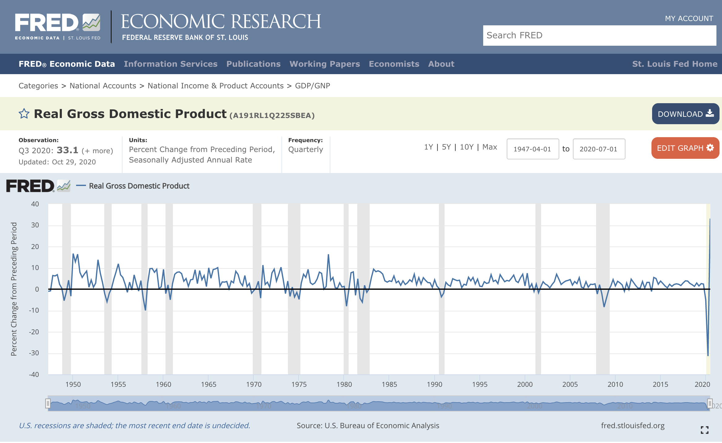
Well, try googling “fred code gdp change quarterly” and scan the top 5 results. When we did so and clicked on the second link, and it took us to the FRED website that shows the code for “Change in GDP”. We can see the FRED code on the screen just to the right of “Real Gross Domestic Product”.
The data is imported, but it’s not quite how we want it yet:
change_gdp_raw %>%
  head()
# A tibble: 6 × 3
symbol date price
<chr> <date> <dbl>
1 A191RL1Q225SBEA 1979-01-01 0.7
2 A191RL1Q225SBEA 1979-04-01 0.4
3 A191RL1Q225SBEA 1979-07-01 3
4 A191RL1Q225SBEA 1979-10-01 1
5 A191RL1Q225SBEA 1980-01-01 1.3
6 A191RL1Q225SBEA 1980-04-01 -8 There are several changes we want to make:
+ rename a couple of columns with the `rename()` function.
+ make sure the data is the right order with `arrange()`
+ add new columns with `mutate()`
+ choose columns with `select()`
+ only keep rows after 1979 with `filter()`
+ reorder columns with `relocate()`
Here’s a quick code chunk utilizing those functions.
change_gdp_raw %>%
  rename(fred_code = symbol, percent_change = price) %>%
  arrange(desc(date)) %>%
  mutate(title = "Change in GDP",
         percent_change = percent_change/100) %>%
  select(-fred_code) %>%
  filter(date >= "1979-01-01") %>%
  relocate(title, date, percent_change) %>%
  tail(3)
# A tibble: 3 × 3
title date percent_change
<chr> <date> <dbl>
1 Change in GDP 1979-07-01 0.03
2 Change in GDP 1979-04-01 0.004
3 Change in GDP 1979-01-01 0.007Let’s save the result as a tibble object called change_in_gdp_wrangled.
change_in_gdp_wrangled <-
change_gdp_raw %>%
  rename(fred_code = symbol, percent_change = price) %>%
  arrange(desc(date)) %>%
  mutate(title = "Change in Real GDP",
         percent_change = percent_change/100) %>%
  select(-fred_code) %>%
  filter(date >= "1976-01-01") %>%
  relocate(title, date, percent_change)
Here are the first few rows of the result:
change_in_gdp_wrangled %>%
  head(3)
# A tibble: 3 × 3
title date percent_change
<chr> <date> <dbl>
1 Change in Real GDP 2024-04-01 0.03
2 Change in Real GDP 2024-01-01 0.014
3 Change in Real GDP 2023-10-01 0.034We now have our main GDP data object that we will work with for the rest of this section and have covered several workhorse functions for data wrangling.
Now let’s spend some time on data visualization and some fundamental skills in that area. If you’re already a ggplot() advanced user, you can skim most of this.
Introduction to Visualization
Our GDP data objects are imported and wrangled, and that means it’s a good time to introduce data visualization.
In the next section, we review in detail how to build a nice chart with the ggplot2 package. It’s the most popular visualization package in R and there are a lot of good tutorials on it, but we want to include some common features when working with time series.
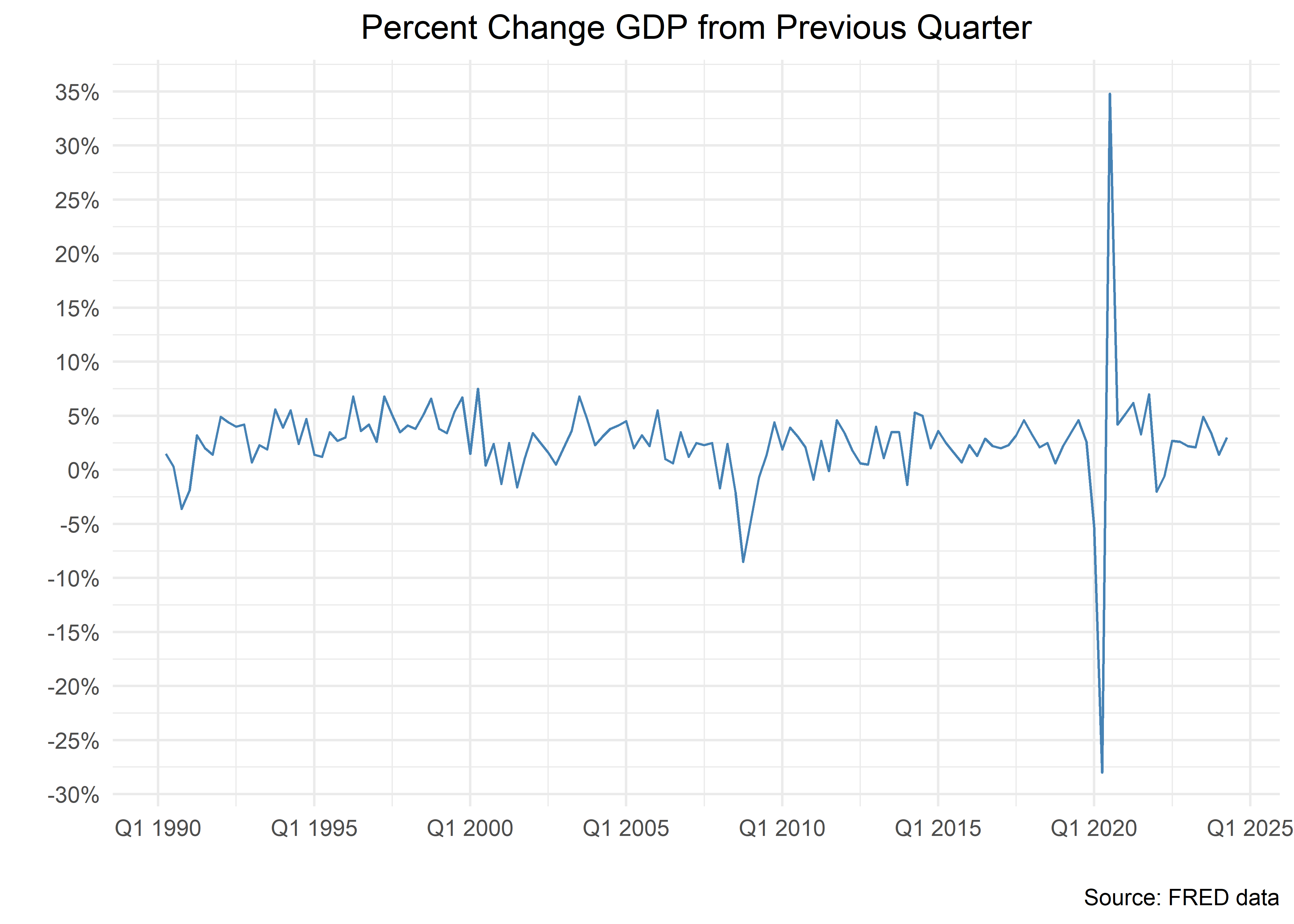
Let’s start with a line chart for percent change in GDP by quarter. Don’t get too bogged into the details of the code but have a look at how things proceed in steps.
change_in_gdp_wrangled %>%
  filter(date > "1990-01-01") %>%
  ggplot(aes(x = date,
             y = percent_change)) +
  geom_line(show.legend = F,
             color = "steelblue") +
  labs(title = "Percent Change GDP from Previous Quarter",
       y = "",
       x = "",
       caption = "Source: FRED data") +
  scale_y_continuous(labels = percent_format(accuracy = 1),
                     breaks = pretty_breaks(n = 10)) +
  scale_x_date(labels =
              function(x) zoo::format.yearqtr(x, "Q%q %Y"),
               breaks = pretty_breaks(n = 7)) +
  theme_minimal() +
  theme(plot.title = element_text(hjust = .5))
We will walk through the building of this chart step-by-step, not because it’s the most exciting chart in the world, but because the steps will serve as the foundation for our charting work - and it’s good to have a template to start when you want to get into more complex charts.
Let’s start with the first four lines of code used to generate the bones of the chart.
We are charting just our data since “2011-01-01” and that means we begin with change_in_gdp_wrangled %>% filter(date > "2011-01-01"). That has nothing to do with data visualization, it is a way to filter our data.
To start building a chart we pipe that data to the ggplot() function from the ggplot2 package. That’s the base function of ggplot2 and it gets us started but it doesn’t actually draw us a nice chart. To do that, we need to add the keys to ggplot2: 1) aesthetic mappings and 2) geoms.
Very often, aesthetic mappings is a precise way of saying: what goes on the x-axis and what goes on the y-axis.
We put the date on the x-axis by setting aes(x = date) (this is aesthetically mapping the date variable to the x-axis). We want percent change on the y-axis and thus we add aes(x = date, y = percent_change). That line of code - ggplot(aes(x = date, y = percent_change)) - has told the computer to draw a chart with date on the x-axis and percent change on the y-axis.
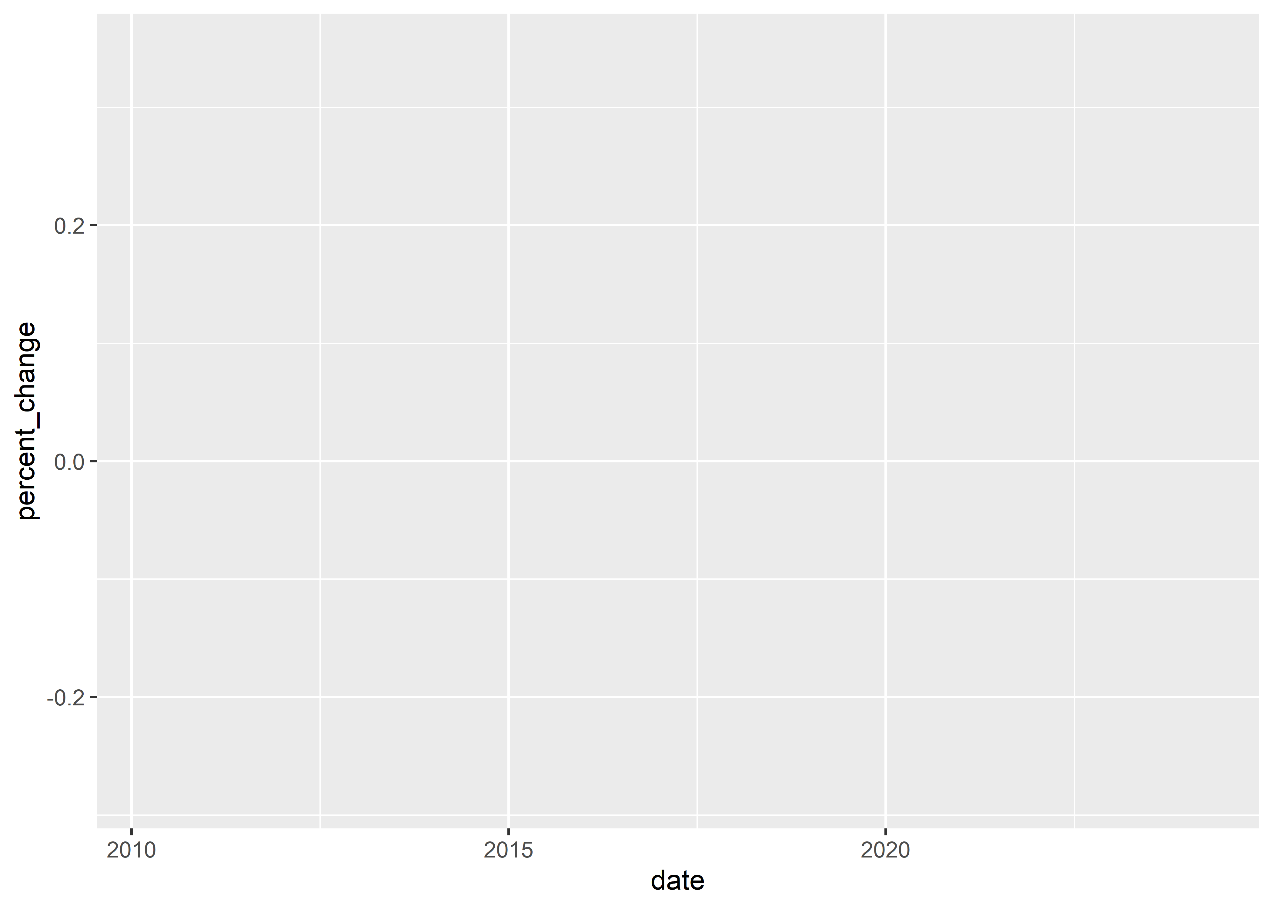
Let’s see what happens when we stop there. Remember, we need aesthetic mappings and geoms but we haven’t added a geom yet.
change_in_gdp_wrangled %>%
  filter(date > "2010-01-01") %>%
  ggplot(aes(x = date, y = percent_change))
ggplot() has produced exactly what we specified - a chart with an x-axis mapped to date and the y-axis mapped to percent_change, but nothing drawn on the chart. That’s because we didn’t tell ggplot() what to draw and it won’t guess at what we want - do we want a scatter plot, a line plot, a column chart? To build a line plot, we need to call geom_line(). If we want that line to have a color, we need to specify that color, and we choose color = "steelblue".
change_in_gdp_wrangled %>%
  filter(date > "2010-01-01") %>%
  ggplot(aes(x = date, y = percent_change)) +
  geom_line(color = "steelblue")
The job is done, line chart is produced and we could move on to different geom options for scatter and bar charts now, but let’s clean up some of the details on this chart.
Notice a few things:
+ there is no title
+ the label of the x-axis is "date", which seems superfluous
+ the title of the y-axis is "percent_change", perhaps unneeded
+ there is no data source caption
+ we can address these issues with the `labs()` function from `ggplot2()`.
The code chunk below includes the labs() function to change these features. Notice if we want no label for the x- or y-axis, we set x = "", or the x label is equal to an empty quotation marks.
ggplot2 defaults to have the title at the left of the chart. There’s probably a theoretical data visualization reason for that, but we often want the title to be centered. To center it, use theme(plot.title = element_text(hjust = .5)).
The final pieces of clean up involve the appearance of the x and y-axes. The x-axis is currently displaying just the year and the y-axis is not showing the % sign. The y-axis also is showing only the numerals .2, -.2 and 0. We want more “breaks” to be shown. To address the y-axis first, we use the scale_y_continuous() function and set labels = percent to add the % sign to the y-axis and breaks = pretty_breaks(n = 10) to add more breaks.
To make our date labels on the x-axis more informative, we have two options, both of which use the scale_x_date() function.
Let’s start with the more common way to use this function. Since we are dealing with quarterly GDP change, we want date breaks that are more frequent than one per year. We change that with date_breaks = "6 months". We can also specify the format of the date to make sure it includes certain information. If we wish to show the year and month, we set date_labels = "%b %Y". This is a very common way to use the scale_x_date() function.
change_in_gdp_wrangled %>%
  filter(date > "2010-01-01") %>%
  ggplot(aes(x = date, y = percent_change)) +
  geom_line(show.legend = F,
             color = "steelblue") +
  labs(title = "Percent Change GDP from Previous Quarter",
       y = "",
       x = "",
       caption = "Source: FRED data") +
  scale_y_continuous(labels = percent_format(accuracy = 1),
                     breaks = pretty_breaks(n = 10)) +
  scale_x_date(date_breaks = "18 months",
               date_labels = "%b %Y")  +
  theme_minimal() +
  theme(plot.title = element_text(hjust = .5))
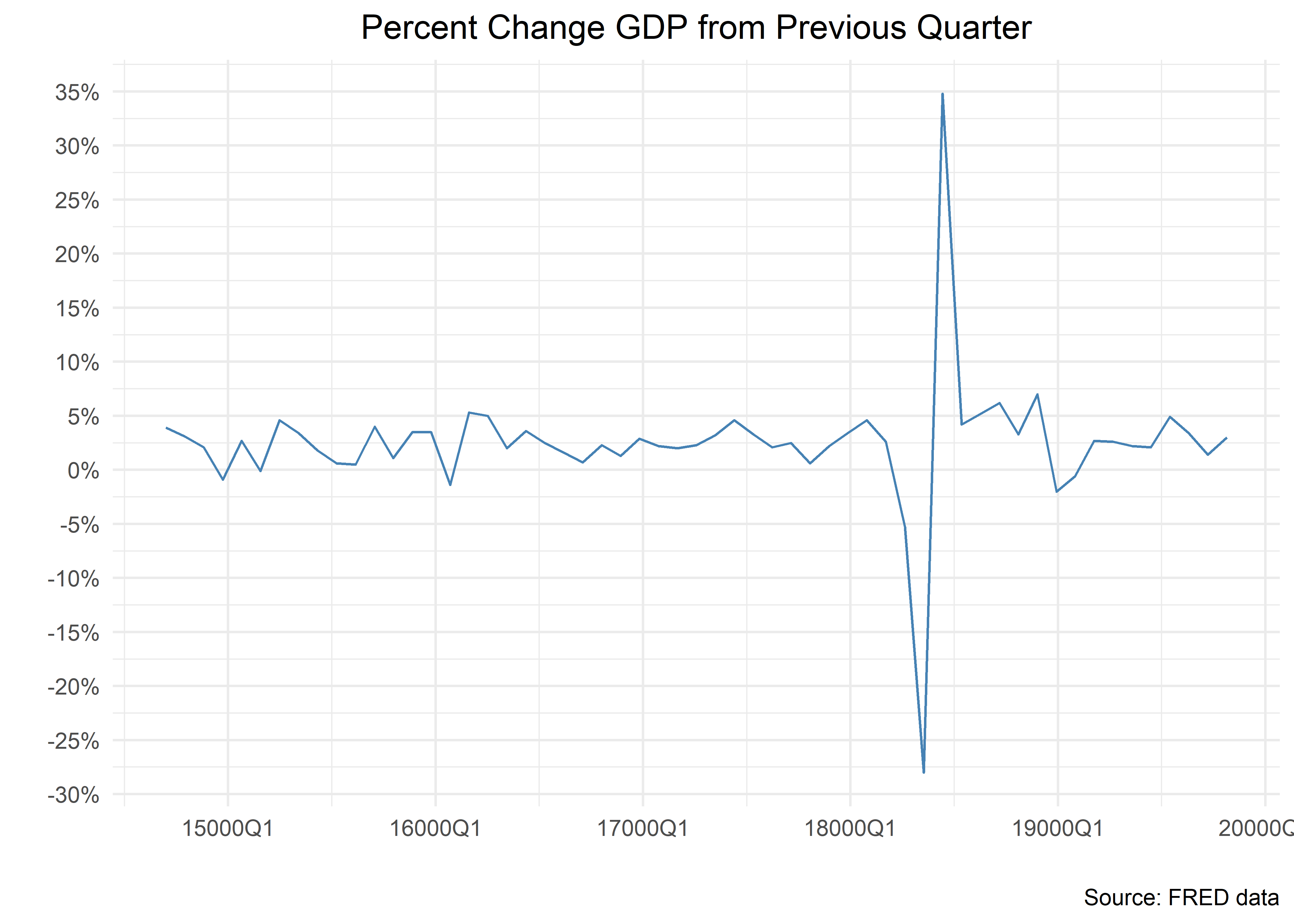
The x-axis looks good, but what if we want to emphasize that these are quarterly measurements? We can turn to the format.yearqtr() function from zoo and call scale_x_date(labels = function(x) zoo::format.yearqtr(x, "%YQ%q"). This is quite an uncommon way to use the scale_x_date() function - it only arises when we have quarterly data. But it’s a good example of how we can use a function inside of our call to scale_x_date(). And if we or you ever need to format a x-axis in a quarterly format again, the code is here.
Finally, we like to add theme_minimal()to give things a more spare look and remove the gray background, but it needs to be added before our centering of the title.
change_in_gdp_wrangled %>%
  filter(date > "2010-01-01") %>%
  ggplot(aes(x = date, y = percent_change)) +
  geom_line(show.legend = F,
             color = "steelblue") +
  labs(title = "Percent Change GDP from Previous Quarter",
       y = "",
       x = "",
       caption = "Source: FRED data") +
  scale_y_continuous(labels =  percent_format(accuracy = 1),
                     breaks = pretty_breaks(n = 10)) +
  scale_x_yearqtr(format = "%YQ%q", n  = 5) +
  theme_minimal() +
  theme(plot.title = element_text(hjust = .5))
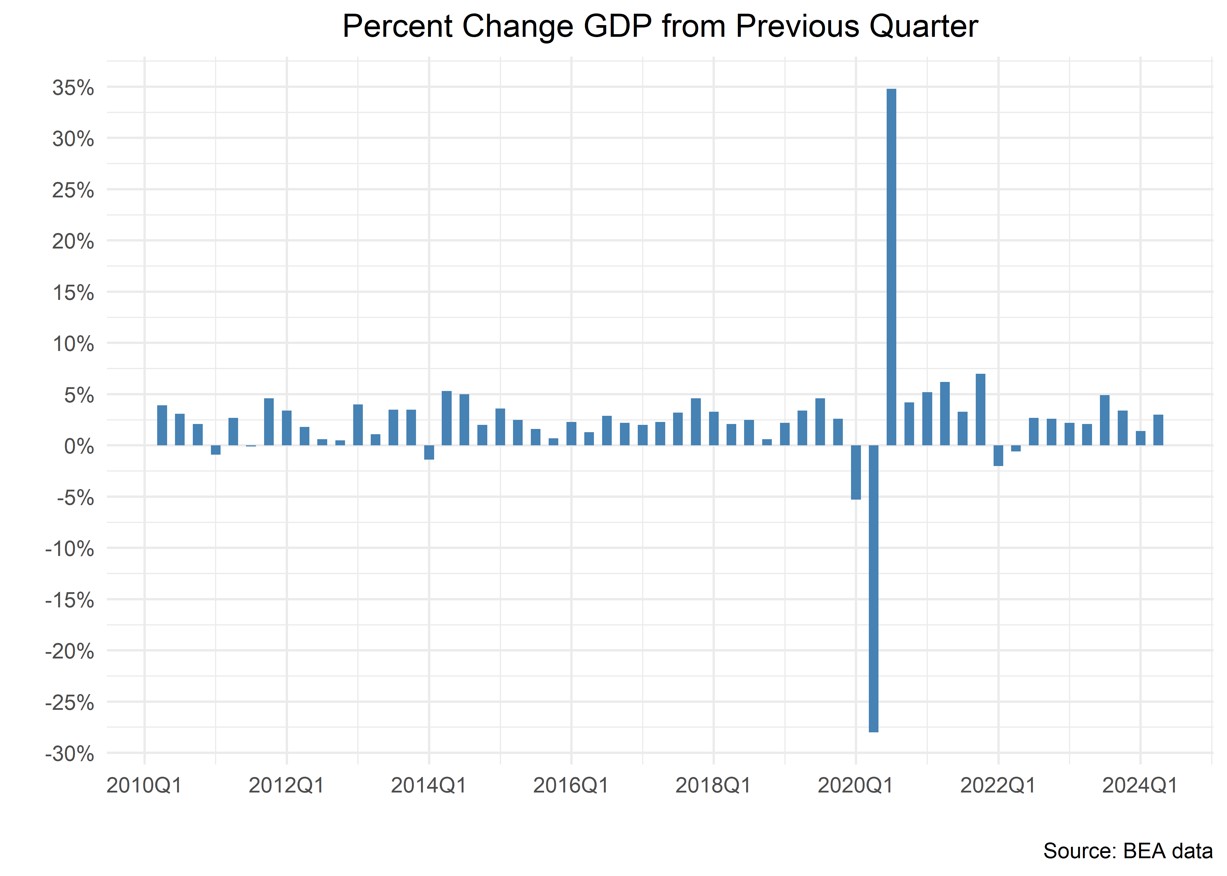
That was quite a bit of work to create a line chart - but the good news is when we want to toggle to a column chart, we change only one line of the code: replace geom_line() with geom_col().
change_in_gdp_wrangled %>%
  filter(date > "2010-01-01") %>%
  ggplot(aes(x = date, y = percent_change)) +
  # geom_line()
  geom_col(#color = "green",
           fill = "steelblue",
           width = 50) +
  labs(title = "Percent Change GDP from Previous Quarter",
       y = "",
       x = "",
       caption = "Source: BEA data") +
  scale_y_continuous(labels = percent_format(accuracy = 1),
                     breaks = pretty_breaks(n = 10)) +
  scale_x_date(labels = function(x) zoo::format.yearqtr(x, "%YQ%q"),
               breaks = pretty_breaks(n = 10)
               ) +
  theme_minimal() +
  theme(plot.title = element_text(hjust = .5))
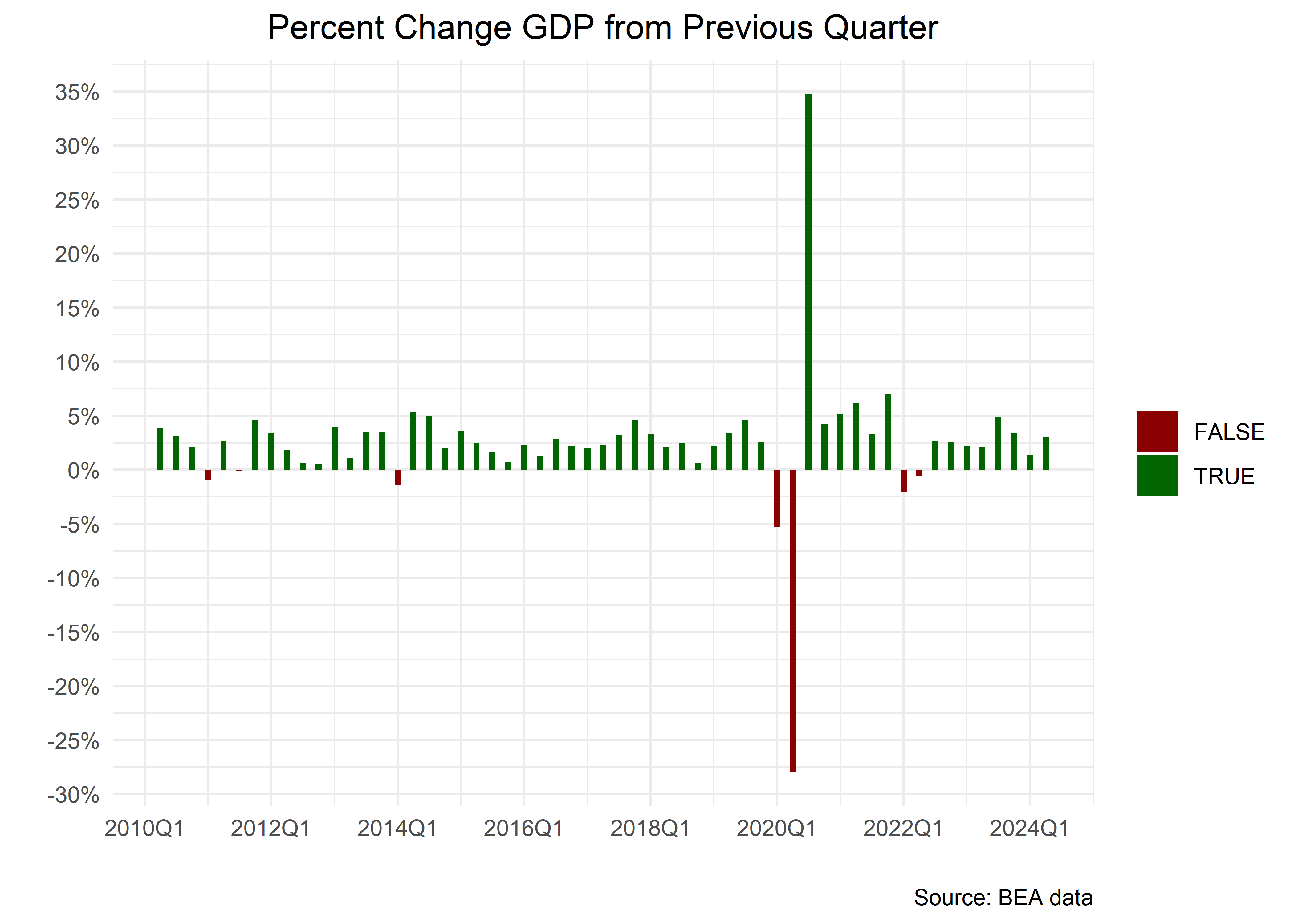
Let’s imagine we wish to color negative changes in GDP differently from positive changes. We insert a call to mutate(fill_column = percent_change > 0) to create a column that is “TRUE” if percent_change is greater than 0 and “FALSE” otherwise. We can then tell the fill aesthetic to be conditional on that column.
We also specify better colors with scale_fill_manual( values = c("darkred", "darkgreen")). The manual part of that function indicates we can manually choose whatever colors we wish.
change_in_gdp_wrangled %>%
  filter(date > "2010-01-01") %>%
  mutate(fill_column = percent_change > 0) %>%
  ggplot(aes(x = date,
             y = percent_change,
             fill = fill_column)) +
  # geom_line()
  geom_col(width = 35) +
  scale_fill_manual(
    values = c("darkred", "darkgreen")
  ) +
  labs(title = "Percent Change GDP from Previous Quarter",
       y = "",
       x = "",
       caption = "Source: BEA data",
       fill = "") +
  scale_y_continuous(labels = percent_format(accuracy = 1),
                     breaks = pretty_breaks(n = 10)) +
  scale_x_date(labels = function(x) zoo::format.yearqtr(x, "%YQ%q"),
               breaks = pretty_breaks(n = 10)
               ) +
  theme_minimal() +
  theme(plot.title = element_text(hjust = .5))
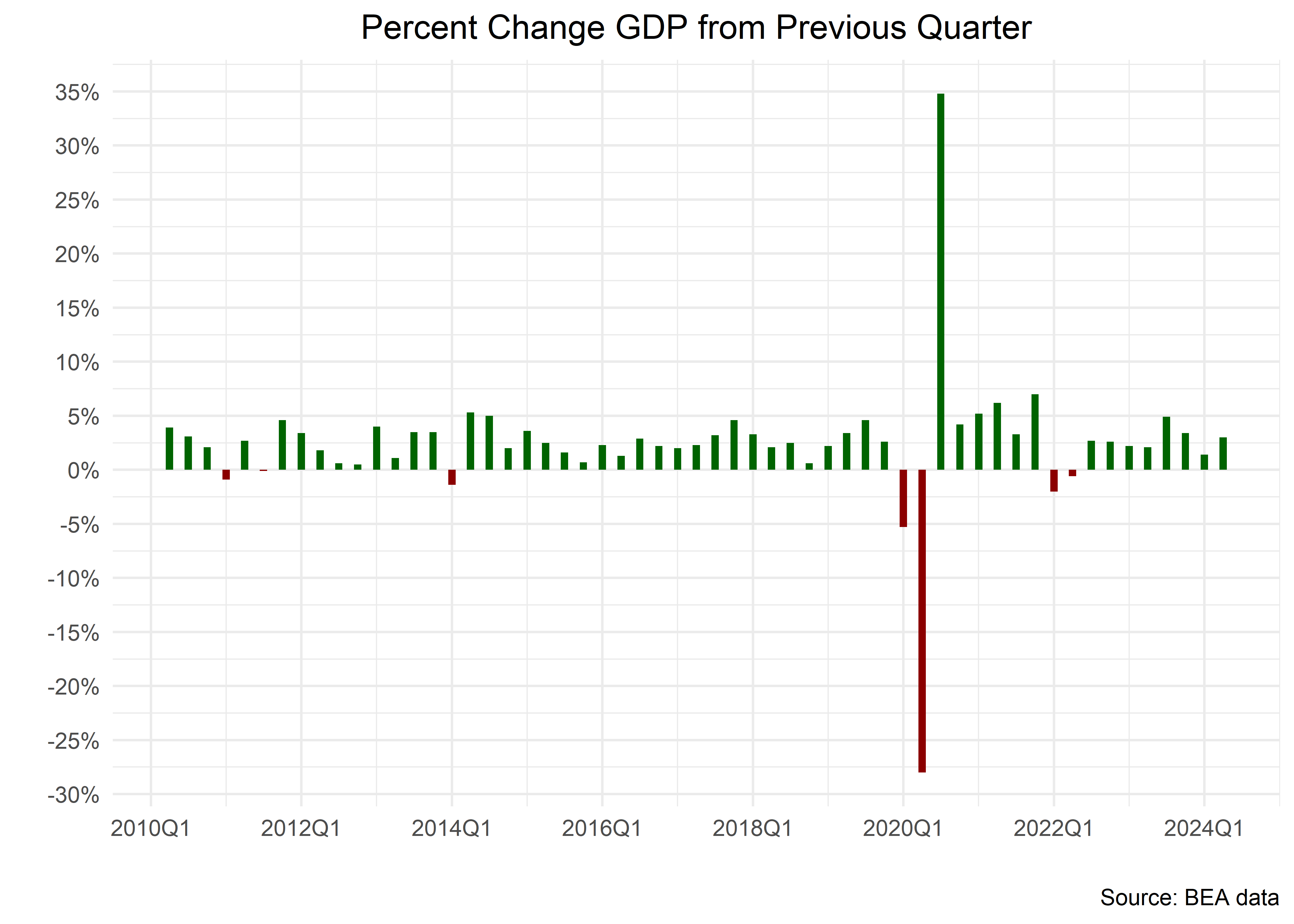
Have a look at the legend, it says TRUE and FALSE but perhaps we wish to conserve that space for our chart and let the user interpret the colors on their own, so we can add show.legend = F to geom_col().
change_in_gdp_wrangled %>%
  filter(date > "2010-01-01") %>%
  mutate(fill_column = percent_change > 0) %>%
  ggplot(aes(x = date, y = percent_change, fill = fill_column)) +
  # geom_line()
  geom_col(width = 35,
           show.legend = F) +
  scale_fill_manual(
    values = c("darkred", "darkgreen")
  ) +
  labs(title = "Percent Change GDP from Previous Quarter",
       y = "",
       x = "",
       caption = "Source: BEA data",
       fill = "") +
  scale_y_continuous(labels =  percent_format(accuracy = 1),
                     breaks = pretty_breaks(n = 10)) +
  scale_x_date(labels = function(x) zoo::format.yearqtr(x, "%YQ%q"),
               breaks = pretty_breaks(n = 10)
               ) +
  theme_minimal() +
  theme(plot.title = element_text(hjust = .5) )
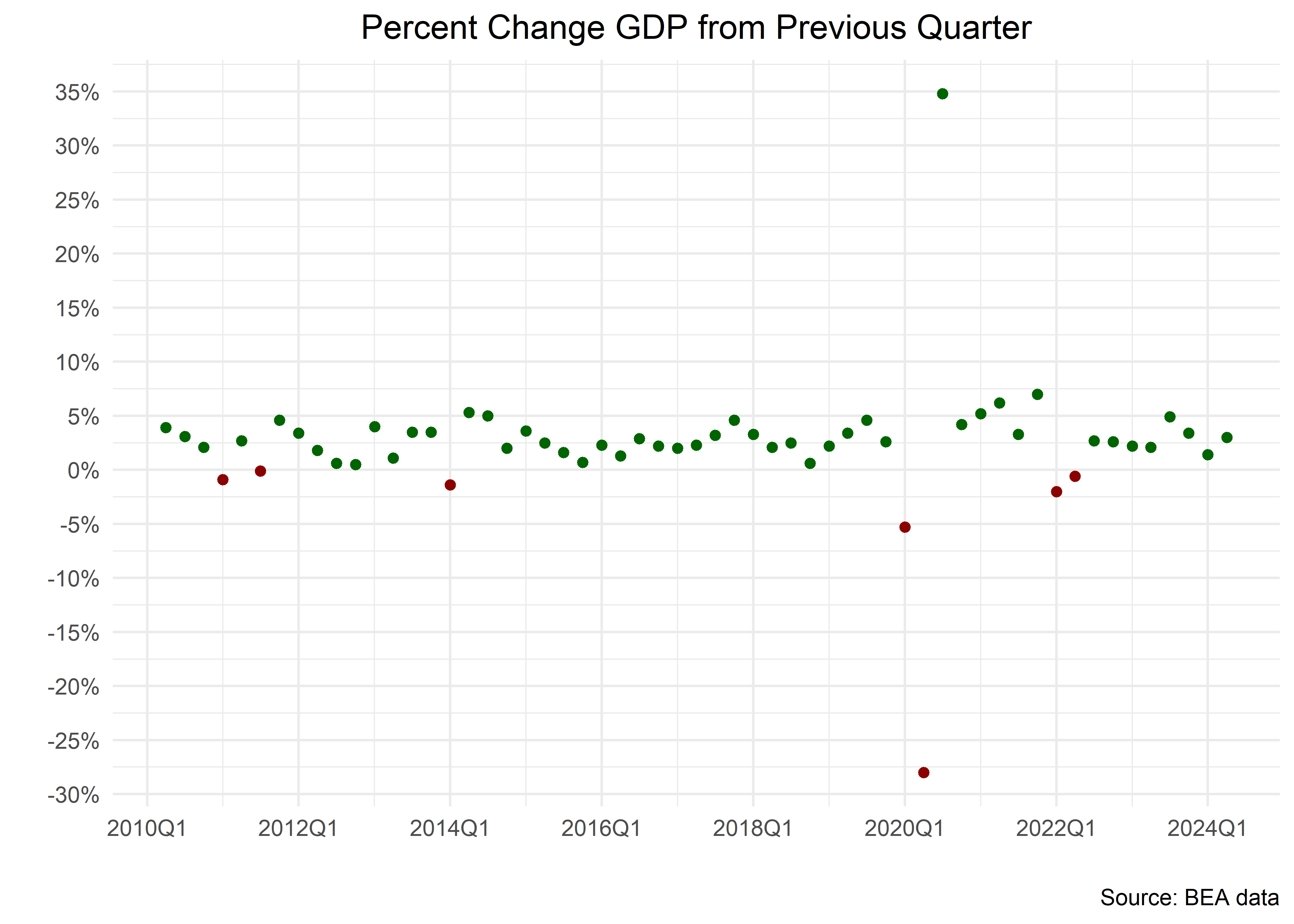
We like bar charts for showing percentage changes but it’s fast to experiment with a dot plot. We replace geom_col() with geom_point() and replace fill with color in the aes() function, and replace scale_fill_manual() with scale_color_manual().
change_in_gdp_wrangled %>%
  filter(date > "2010-01-01") %>%
  mutate(color_column = percent_change > 0) %>%
  ggplot(aes(x = date, y = percent_change, color = color_column)) +
  # geom_line()
  geom_point(
    show.legend = F
  ) +
  # not scale_fill_manual
  scale_color_manual(
    values = c("darkred", "darkgreen")
  ) +
  labs(title = "Percent Change GDP from Previous Quarter",
       y = "",
       x = "",
       caption = "Source: BEA data",
       fill = "") +
  scale_y_continuous(labels = percent_format(accuracy = 1),
                     breaks = pretty_breaks(n = 10)) +
  scale_x_date(labels = function(x) zoo::format.yearqtr(x, "%YQ%q"),
               breaks = pretty_breaks(n = 10)
               ) +
  theme_minimal() +
  theme(plot.title = element_text(hjust = .5) )
Visualizing More than One Timeseries
We have been visualizing change in overall GDP, but let’s suppose we wish to see how different components of GDP have changed on a quarterly basis. For that, we go back and re-wrangle the data we imported directly from the BEA. Let’s take a peek at the various GDP accounts.
read_excel(destfile,
           sheet = "T10101-Q",
    skip = 7) %>%
  select(-1)  %>%
  rename(account = 1, code = 2)  %>%
  distinct(account)
# A tibble: 24 × 1
account
<chr>
1 Gross domestic product
2 Personal consumption expenditures
3 Goods
4 Durable goods
5 Nondurable goods
6 Services
7 Gross private domestic investment
8 Fixed investment
9 Nonresidential
10 Structures
# ℹ 14 more rowsLet’s filter() to only the four top level components of GDP.
read_excel(destfile, sheet = "T10101-Q",
    skip = 7) %>%
  select(-1)  %>%
  rename(account = 1, code = 2) %>%
  mutate(
    across(c(-account, -code), as.numeric)
    ) %>%
  pivot_longer(-account:-code,
               names_to = "date",
               values_to = "percent_change") %>%
  mutate(date = parse_date_time(date, orders = "Yq"),
         date = ymd(date)) %>%
   filter(account %in% c("Personal consumption expenditures",
                         "Exports",
                         "Imports",
                         "Gross private domestic investment",
                         "Government consumption expenditures and gross investment" )
          ) %>%
  arrange(desc(date))
# A tibble: 1,545 × 4
account code date percent_change
<chr> <chr> <date> <dbl>
1 Personal consumption expenditures DPCE… 2024-04-01 2.9
2 Gross private domestic investment A006… 2024-04-01 7.5
3 Exports A020… 2024-04-01 1.6
4 Imports A021… 2024-04-01 7
5 Government consumption expenditures and gros… A822… 2024-04-01 2.7
6 Personal consumption expenditures DPCE… 2024-01-01 1.5
7 Gross private domestic investment A006… 2024-01-01 4.4
8 Exports A020… 2024-01-01 1.6
9 Imports A021… 2024-01-01 6.1
10 Government consumption expenditures and gros… A822… 2024-01-01 1.8
# ℹ 1,535 more rowsBefore we visualize, let’s save our new data as a data frame, clean up the column names with the very useful case_when() and check our results with slice().
gdp_components <-
read_excel(destfile, sheet = "T10101-Q",
    skip = 7) %>%
  select(-1)  %>%
  rename(account = 1, code = 2) %>%
  mutate(
    across(c(-account, -code), as.numeric)
    ) %>%
  pivot_longer(-account:-code,
               names_to = "date",
               values_to = "percent_change") %>%
  mutate(date = parse_date_time(date, orders = "Yq"),
         date = ymd(date)) %>%
   filter(account %in% c("Personal consumption expenditures",
                         "Exports",
                         "Imports",
                         "Gross private domestic investment",
                         "Government consumption expenditures and gross investment")
          ) %>%
  arrange(desc(date)) %>%
  relocate(date, everything()) %>%
  mutate(
    account =
      case_when(
        str_detect(account, "Personal") ~ "PCE",
        str_detect(account, "Government") ~ "Government",
        str_detect(account, "investment") ~ "Investment",
        T ~ account
      )
  ) %>%
  group_by(account) %>%
  select(-code)

gdp_components %>%
  slice(1, n())
# A tibble: 10 × 3
# Groups: account [5]
date account percent_change
<date> <chr> <dbl>
1 2024-04-01 Exports 1.6
2 1947-04-01 Exports -4.9
3 2024-04-01 Government 2.7
4 1947-04-01 Government -0.3
5 2024-04-01 Imports 7
6 1947-04-01 Imports 8.1
7 2024-04-01 Investment 7.5
8 1947-04-01 Investment -27.3
9 2024-04-01 PCE 2.9
10 1947-04-01 PCE 6.8Once our data is clean and organized, we are ready to start visualizing again.
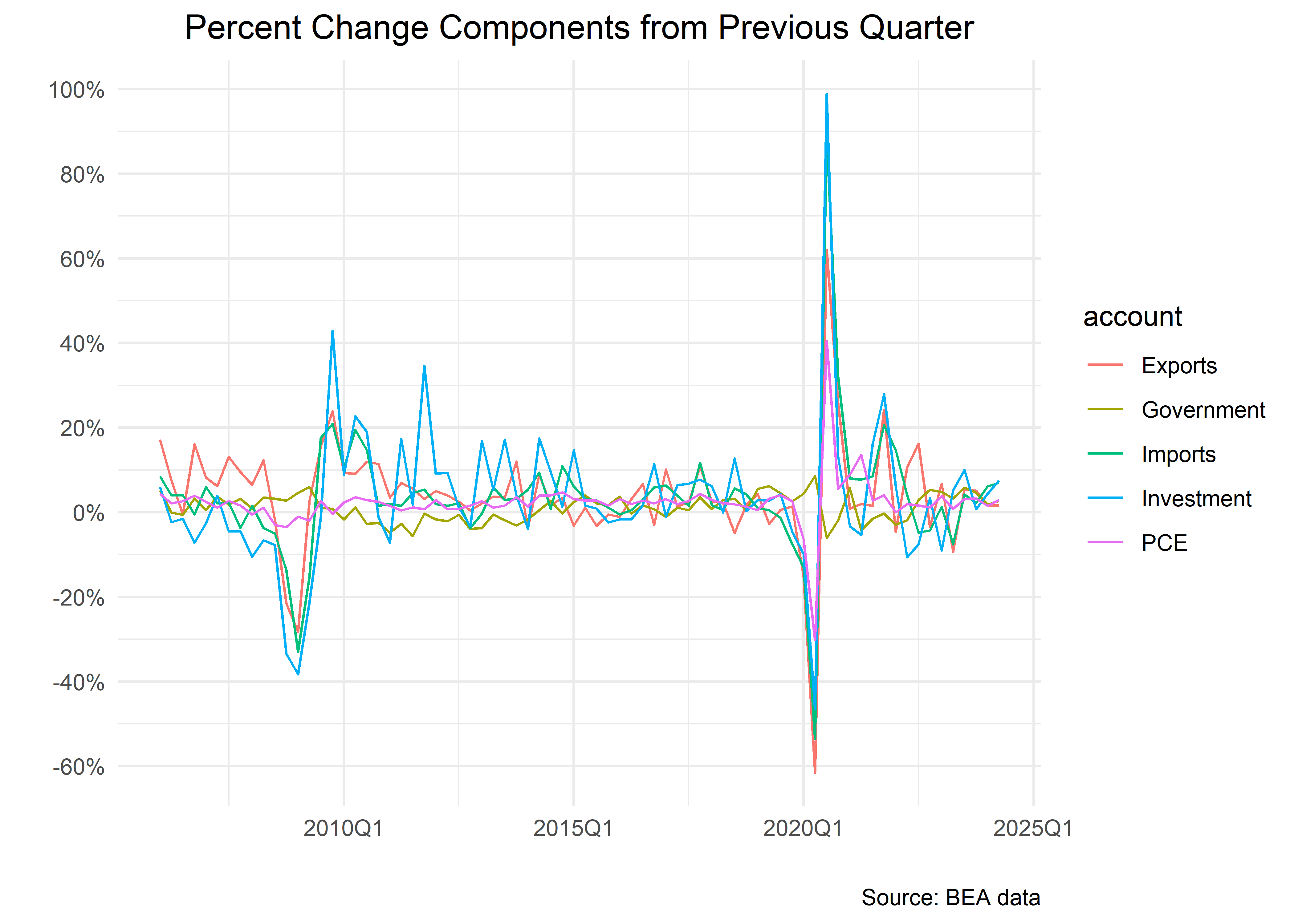
Let’s start with a line chart that includes more than one time series.
gdp_components %>%
  filter(date >= "2006-01-01") %>%
  ggplot(aes(x = date, y = percent_change, color = account)) +
  geom_line() +
  labs(title = "Percent Change Components from Previous Quarter",
       y = "",
       x = "",
       caption = "Source: BEA data",
       fill = "") +
  scale_y_continuous(labels = percent_format(scale = 1),
                     breaks = pretty_breaks(n = 10)) +
  scale_x_date(labels = function(x) zoo::format.yearqtr(x, "%YQ%q"),
               breaks = pretty_breaks(n = 5)
               ) +
  theme_minimal() +
  theme(plot.title = element_text(hjust = .5) )
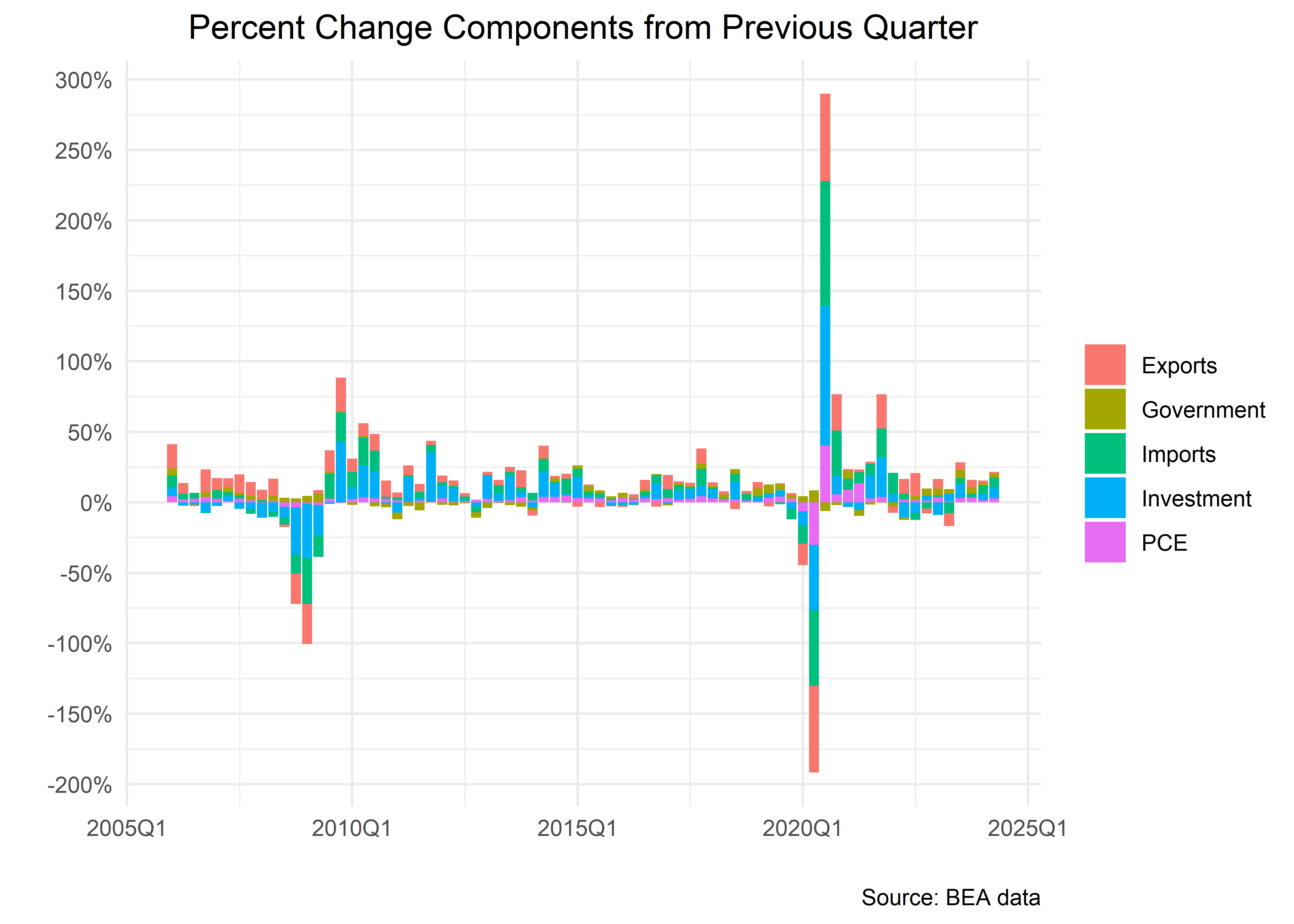
Let’s toggle to a stacked bar chart with geom_col().
gdp_components %>%
  filter(date >= "2006-01-01") %>%
  ggplot(aes(x = date, y = percent_change, fill = account)) +
  geom_col() +
  labs(title = "Percent Change Components from Previous Quarter",
       y = "",
       x = "",
       caption = "Source: BEA data",
       fill = "") +
  scale_y_continuous(labels = percent_format(scale = 1),
                     breaks = pretty_breaks(n = 10)) +
  scale_x_date(labels = function(x) zoo::format.yearqtr(x, "%YQ%q"),
               breaks = pretty_breaks(n = 5)
               ) +
  theme_minimal() +
  theme(plot.title = element_text(hjust = .5) )
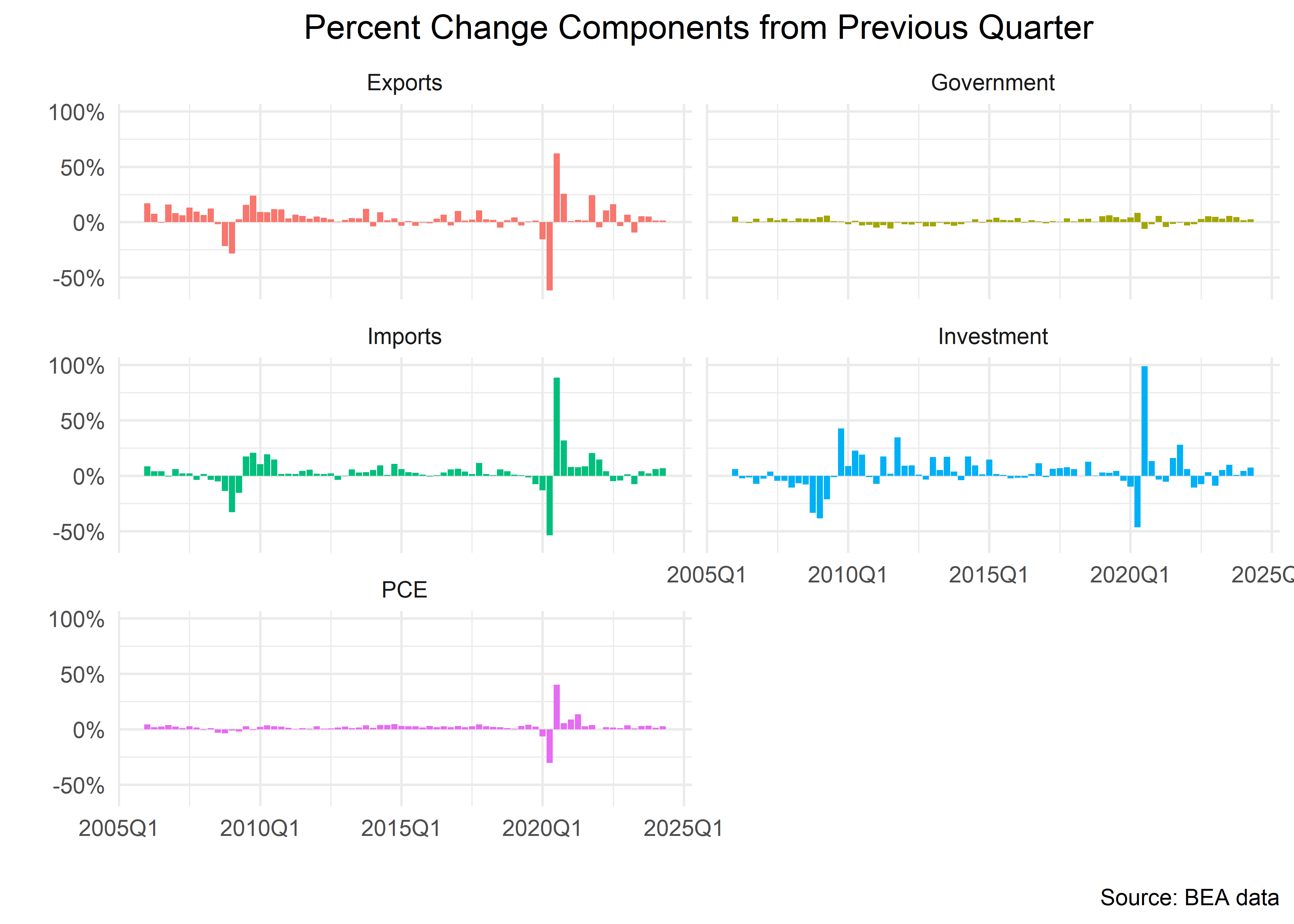
The stacked chart is misleading in this case, because the sum of the component percent changes does not equal total percent change in GDP, due to different weightings. To account for this we can break out each component to it’s own chart with facet_wrap().
gdp_components %>%
  filter(date >= "2006-01-01") %>%
  ggplot(aes(x = date, y = percent_change, fill = account)) +
  geom_col(
    show.legend =  F
  ) +
  labs(title = "Percent Change Components from Previous Quarter",
       y = "",
       x = "",
       caption = "Source: BEA data",
       fill = "") +
  scale_y_continuous(labels = percent_format(scale = 1),
                     breaks = pretty_breaks(n = 5)) +
  scale_x_date(labels = function(x) zoo::format.yearqtr(x, "%YQ%q"),
               breaks = pretty_breaks(n = 5)
               ) +
  theme_minimal() +
  theme(plot.title = element_text(hjust = .5) ) +
  facet_wrap(~account,
             ncol = 2)
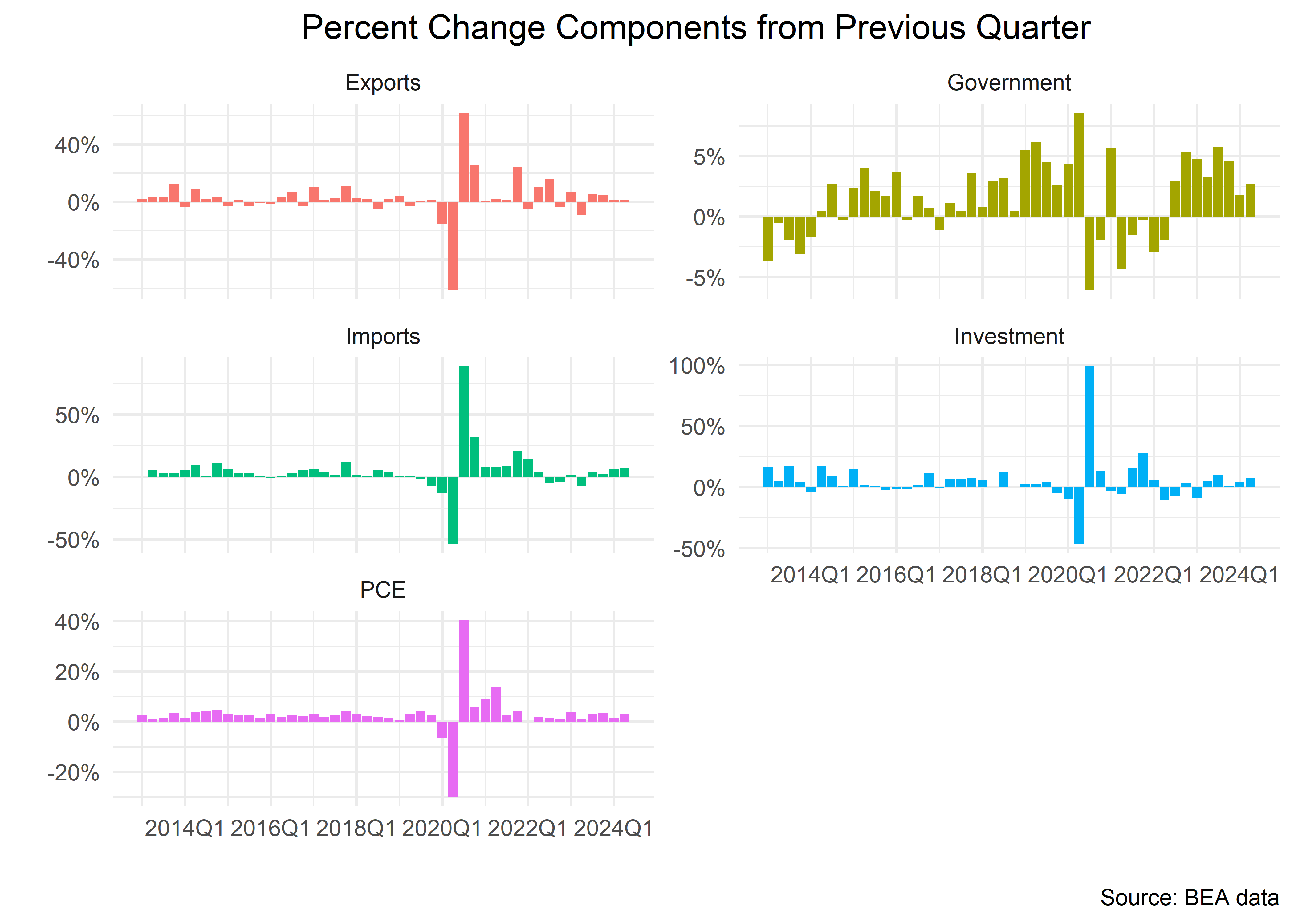
That faceted chart defaults to using a common scale for all the components, but let’s observe how different the charts look when each component has it’s own scale. We do this by setting scales = "free_y" inside facet_wrap().
gdp_components %>%
  filter(date >= "2013-01-01") %>%
  ggplot(aes(x = date, y = percent_change, fill = account)) +
  geom_col(
    show.legend =  F
  ) +
  labs(title = "Percent Change Components from Previous Quarter",
       y = "",
       x = "",
       caption = "Source: BEA data",
       fill = "") +
  scale_y_continuous(labels = percent_format(scale = 1)) +
  scale_x_date(labels = function(x) zoo::format.yearqtr(x, "%YQ%q"),
               breaks = pretty_breaks(n = 5)
               ) +
  theme_minimal() +
  theme(plot.title = element_text(hjust = .5) ) +
  facet_wrap(~account,
             ncol = 2,
             scales = "free_y")
Visualization is an important component of macroeconomic work and so is interpreting visualizations. There are a lot of tools that will automatically create charts for us, but we find that creating our own charts let’s us build more original interpretations, and gives us the freedom to work outside of automated tooling. In the next section, we will take on a more complicated use case, but the end result can be applied broadly to other macro situations.
Recession Use Case and Building our Own Function
Before we conclude our Chapter on GDP, let’s create a function for adding recession shading to our charts. This involves creating a custom function for use in our ggplot code flows and is a bit more involved than the previous section. The code to create this function is an interesting exercise but we also wish to emphasize the importance of creating our own functions in R.
If we find ourselves copy pasting complicated code more than a few times, we try to convert that code to a function. This recession shading is a great example because we add it to many charts, but the underlying code doesn’t change.
For a preview, our goal is to create the following function:
recession_shade_fun <- function(color_chosen = "darkgray",
                                start_date = "1979-01-01"){
  "USREC" %>%
  tq_get(get = "economic.data", from = start_date) %>%
  select(date, recession_flag = price) %>%
  mutate(recession_label =
           case_when(
             recession_flag == 1 &
             lag(recession_flag == 0) ~ str_glue("{year(date)} recession"),
         TRUE ~ NA_character_)) %>%
  filter(recession_flag == 1) %>%
  fill(recession_label, .direction = "down") %>%
  group_by(recession_label) %>%
  slice(1, n()) %>%
  select(-recession_flag) %>%
  mutate(start = case_when(date == min(date) ~ date,
                           TRUE ~ NA_Date_),
         end = case_when(date == max(date) ~ date,
                         TRUE ~ NA_Date_),
         end = lead(end)
         ) %>%
  filter(!is.na(start)) %>%
  select(-date) %>%
    geom_rect(data = .,
            inherit.aes = F,
            aes(xmin = start,
                xmax = end,
                ymin = -Inf,
                ymax = +Inf),
            fill = color_chosen,
            alpha = 0.4)
}
We see why it might be useful to turn that into a function - it involves a lot of code that we don’t want to copy and paste each time we want a recession shading on a chart.
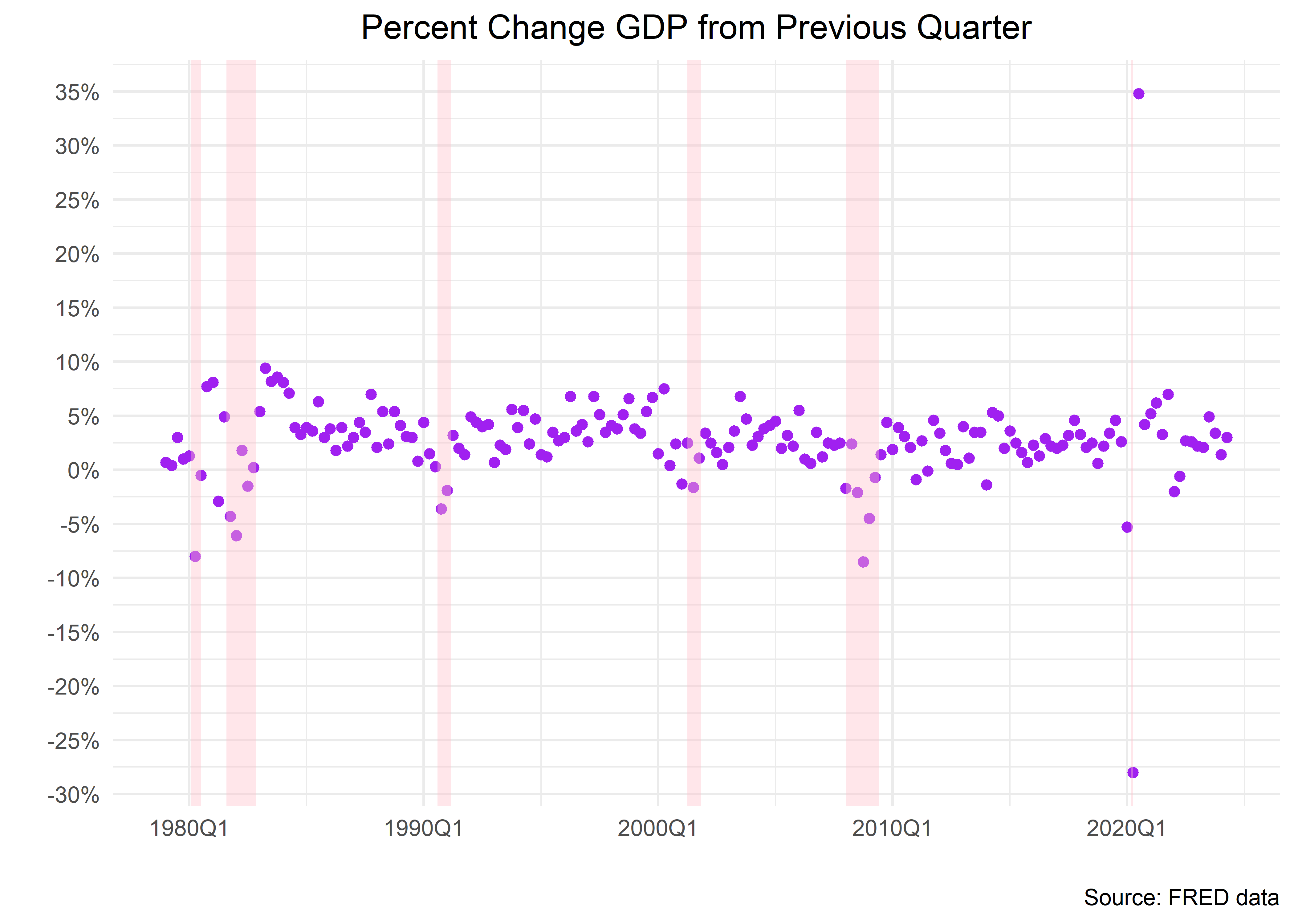
Here is how we can use that function - we simply include it at the end of our ggplot() code flow. If you wish to use that function and don’t really care about how to build it, you can copy the code above and load it into your setup code chunk, then add it to any ggplot() code.
change_in_gdp_wrangled %>%
  ggplot(aes(x = date, y = percent_change)) +
  geom_point(color = "purple") +
  labs(title = "Percent Change GDP from Previous Quarter",
       y = "",
       x = "",
       caption = "Source: FRED data") +
  scale_y_continuous(labels = percent_format(accuracy = 1),
                     breaks = pretty_breaks(n = 10)) +
  scale_x_date(labels = function(x) zoo::format.yearqtr(x, "%YQ%q"),
               breaks = pretty_breaks(n = 7)
               ) +
  theme_minimal() +
  theme(plot.title = element_text(hjust = .5))  +
  recession_shade_fun(color_chosen = "pink")
For the bold who have stuck with us and wish to go through the steps to build that function, let’s dig in to the recession shader.
Here are the first 4 steps we need to encode.
 1) Import the `USREC` data set from FRED.
 This data set flags recessionary periods based on official NBER data.
 2) `rename()` the price column as `recession_flag`.
 This column holds a 1 if the economy was in recession and 0 otherwise.
 3) use `case_when()` to add a `recession_label` column that
 glues together the year a recession started and the word "recession".
 We just want to add that label to the first month of the recession.
 4) `filter()` to just periods where `recession_flag` == 1.
"USREC" %>%
tq_get(get = "economic.data", from = "1979-01-01") %>%
select(date, recession_flag = price) %>%
mutate(recession_label =
case_when(
recession_flag == 1 & lag(recession_flag == 0) ~
str_glue("{year(date)} recession"),
T ~ NA_character_)
) %>%
filter(recession_flag == 1) %>%
head(3)# A tibble: 3 × 3
date recession_flag recession_label
<date> <int> <glue>
1 1980-02-01 1 1980 recession
2 1980-03-01 1 <NA>
3 1980-04-01 1 <NA> Next things get a little more complicated. We need to create a column that tells us when a recession began and when it ended. Here are the steps:
1) `fill()` the NAs with the recession label.
2) `slice()` just the first and last date of each recession.
3) use `mutate()` to create a column called `start` and a column called `end` to hold the start and end dates.
We use `case_when()` to grab the `min(date)` and `max(date)` for each recession to populate the columns.
The result is a table identifying our recessions and their end and start dates.
 "USREC" %>%
  tq_get(get = "economic.data", from = "1979-01-01") %>%
  select(date, recession_flag = price) %>%
  mutate(recession_label = case_when(recession_flag == 1 &
                                     lag(recession_flag == 0) ~
                                       str_glue("{year(date)} recession"),
         TRUE ~ NA_character_)) %>%
  filter(recession_flag == 1) %>%
  fill(recession_label, .direction = "down") %>%
  group_by(recession_label) %>%
  slice(1, n()) %>%
  select(-recession_flag) %>%
  mutate(start = case_when(date == min(date) ~ date,
                           TRUE ~ NA_Date_),
         end = case_when(date == max(date) ~ date,
                         TRUE ~ NA_Date_),
         end = lead(end)
         ) %>%
  filter(!is.na(start)) %>%
  select(-date)
# A tibble: 6 × 3
# Groups: recession_label [6]
recession_label start end
<glue> <date> <date>
1 1980 recession 1980-02-01 1980-07-01
2 1981 recession 1981-08-01 1982-11-01
3 1990 recession 1990-08-01 1991-03-01
4 2001 recession 2001-04-01 2001-11-01
5 2008 recession 2008-01-01 2009-06-01
6 2020 recession 2020-03-01 2020-04-01Next we use that table to create shaded rectangles for use with ggplot. Those recession regions are considered geom_rect() objects - rectangular geoms. We also wrap the entire flow into a function, so we can choose how far back we wish to search for recessions and the color we wish to put on our charts. That means we create a function that accepts two arguments: start_date and color_chosen.
recession_shade_fun <- function(color_chosen = "darkgray",
                                start_date = "1979-01-01"){
  "USREC" %>%
  tq_get(get = "economic.data", from = start_date) %>%
  select(date, recession_flag = price) %>%
  mutate(recession_label = case_when(recession_flag == 1 &
                                       lag(recession_flag == 0) ~
                                       str_glue("{year(date)} recession"),
         TRUE ~ NA_character_)) %>%
  filter(recession_flag == 1) %>%
  fill(recession_label, .direction = "down") %>%
  group_by(recession_label) %>%
  slice(1, n()) %>%
  select(-recession_flag) %>%
  mutate(start = case_when(date == min(date) ~ date,
                           TRUE ~ NA_Date_),
         end = case_when(date == max(date) ~ date,
                         TRUE ~ NA_Date_),
         end = lead(end)
         ) %>%
  filter(!is.na(start)) %>%
  select(-date) %>%
    geom_rect(data = .,
            inherit.aes = F,
            aes(xmin = start,
                xmax = end,
                ymin = -Inf,
                ymax = +Inf),
            fill = color_chosen,
            alpha = 0.4)
}
And we’re done! We can add recession shaded regions to any ggplot() object by including this function in the code flow. Here’s an example where we want pink shaded regions instead of gray.
change_in_gdp_wrangled %>%
  ggplot(aes(x = date, y = percent_change)) +
  geom_point(color = "purple") +
  labs(title = "Percent Change GDP from Previous Quarter",
       y = "",
       x = "",
       caption = "Source: FRED data") +
  scale_y_continuous(labels = percent_format(accuracy = 1),
                     breaks = pretty_breaks(n = 10)) +
  scale_x_date(labels = function(x) zoo::format.yearqtr(x, "%YQ%q"),
               breaks = pretty_breaks(n = 7)
               ) +
  theme_minimal() +
  theme(plot.title = element_text(hjust = .5))  +
  recession_shade_fun(color_chosen = "pink")
That was quite a bit of work, but now we have that function in our toolkit and don’t need to revisit that code again.
Realized vs. Expected GDP
GDP is a crucial macroeconomic indicator, however in financial markets the expected GDP may be even more important. Market participants make decisions today based on where they believe the economy will be tomorrow. Participants make investment decisions based on their current expectations and then may revise their portfolios when the actual (or realized) data is released. How can we estimate the expected GDP? Typically there are two ways: we can survey economic experts and directly ask them what they expect, or we can use a mathematical model that gives us a (hopefully good) forecast. Fortunately for us, we can easily access both types of expected GDP.
Since 1968, the Federal Reserve Bank of Philadelphia conducts a quarterly survey of macroeconomic forecasts, commonly called the Survey of Professional Forecasters (SPF) since all participants are market professionals. The results are posted in the Philadelphia Fed’s website (<https://www.philadelphiafed.org/surveys-and-data/real-time-data-research/survey-of-professional-forecasters}) as Excel spreadsheets that are easily accessible.
In a more recent effort the Federal Reserve Bank of Atlanta has created a mathematical model to forecast GDP that is updated in real time as other economic indicators are released. The Atlanta Fed call their estimate the GDPNow since it incorporates the most up to date economic information in its construction. The GDPNow is a purely mathematical model and as such it is a great complement to the SPF, more information about its construction can be found in the Atlanta Fed’s website (<https://www.atlantafed.org/cqer/research/gdpnow}).
Before we move forward and pull data for the SPF and GDPNow we have to make an important point about how the GDP information is released. The BEA releases quarterly GDP data roughly one month after the quarter ended—for the first quarter of the year the BEA would release GDP data on April—but this is called an advanced estimate because some of the GDP components, such as imports and exports, have not been properly collected and are instead being estimated. The advanced estimate goes through two monthly revisions (in May and June in our example of the first quarter), called the Second and Third estimate, until it is considered finalized in a Fourth monthly revision (July). Hence, the first estimate of GDP released to the market can go through multiple revisions that may increase or decrease its value, and in FRED we only have the GDP after its final (or most recent) revision. Thus, the estimate of GDP that market participants see in its first release may be quite different from the one we have in FRED, this is an important point to keep in mind if we are trying to gauge what the market reaction was a particular GDP release.
We will pull the GDPNow estimate from the Atlanta Fed website which makes it available as an Excel file, and in addition it contains the advanced estimate for the realized GDP and the exact date when it was released to the market. The Excel file is in the following url <https://www.atlantafed.org/-/media/documents/cqer/researchcq/gdpnow/GDPTrackingModelDataAndForecasts.xlsx}, let’s load it into an object.
url <-
  "https://www.atlantafed.org/-/media/documents/cqer/researchcq/gdpnow/GDPTrackingModelDataAndForecasts.xlsx"
destfile <- "GDPTrackingModelDataAndForecasts.xlsx"
curl::curl_download(url, destfile)
Next we use read_excel() and specify the sheet as “TrackRecord”. This gives us data on the gdpNow estimate versus what was actually reported, the difference being the “surprise”.
gdp_now <-
read_excel(destfile, sheet = "TrackRecord")  %>%
  clean_names() %>%
select(1:4) %>%
  mutate(forecast_period = ymd(quarter_being_forecasted),
         gdp_now = as.numeric(model_forecast_right_before_be_as_advance_estimate),
         gdp_advance = be_as_advance_estimate,
         release_date = ymd(release_date)) %>%
  select(forecast_period, gdp_now, gdp_advance, release_date)
gdp_now %>%
head(5)# A tibble: 5 × 4
forecast_period gdp_now gdp_advance release_date
<date> <dbl> <dbl> <date>
1 2024-06-30 2.61 2.8 2024-07-25
2 2024-03-31 2.70 1.59 2024-04-25
3 2023-12-31 2.38 3.3 2024-01-25
4 2023-09-30 5.41 4.88 2023-10-26
5 2023-06-30 2.41 2.41 2023-07-27 Here we have the period for when the forecast is being made, the GDPNow forecast, the realized GDP advanced estimate, and the day when it was released to the market.
Let’s now pull the median forecast for GDP growth from the Philadelphia Fed’s SPF, the Excel file for this forecast is <https://www.philadelphiafed.org/-/media/frbp/assets/surveys-and-data/survey-of-professional-forecasters/data-files/files/median_rgdp_growth.xlsx}.
spf_url <-
  "https://www.philadelphiafed.org/-/media/frbp/assets/surveys-and-data/survey-of-professional-forecasters/data-files/files/median_rgdp_growth.xlsx"
spf_destfile <- "GDPTrackingModelDataAndForecasts.xlsx"
curl::curl_download(spf_url, spf_destfile)
The column strangely named DRGDP2 represents the median forecast for GDP growth for the combination of YEAR and QUARTER. We need to construct a proper YYYY-MM-DD date variable that represents the end period of the YEAR and QUARTER combination, and in addition give a proper name to the DRGDP2 variable. The snippet below achieves that by transforming the YEAR and QUARTER variables to strings, concatenating them, and then adding a an offset that makes the date be the last day of the quarter (otherwise it would be the first day of the quarter).
gdp_spf <-
read_excel(spf_destfile)  %>%
  clean_names() %>%
  mutate(
    forecast_period = str_glue("Q{quarter}/{year}"),
    forecast_period = as.Date(as.yearqtr(forecast_period, format = "Q%q/%Y")) + months(3) - days(1)
  ) %>%
  rename("gdp_philly" = "drgdp2") %>%
  select(forecast_period, gdp_philly)
Finally, we join our gdpNow data with our SPF data.
gdp_now_spf <-
gdp_now %>%
  left_join(gdp_spf, by = "forecast_period")
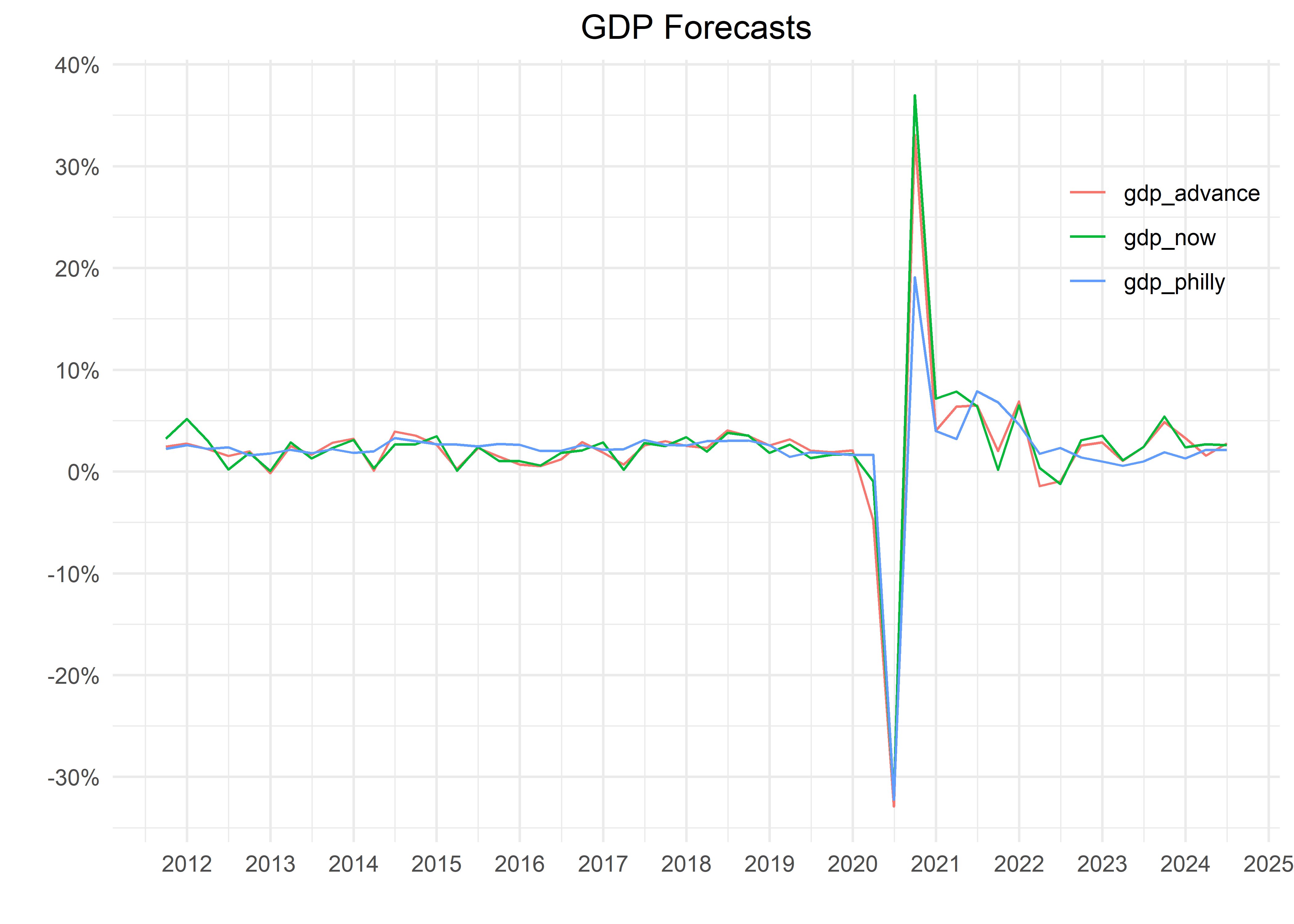
Let’s now make a plot where we can observe their time series behavior. We will first make the data long—recall that this how ggplot prefers data—and then chart them beginning in 2015.
gdp_now_spf %>%
  select(-release_date) %>%
  filter(forecast_period >= "2000-01-01") %>%
  pivot_longer(-forecast_period) %>%
  ggplot(aes(x = forecast_period,
             y = value,
             color = name)) +
  geom_line() +
  theme_minimal() +
  scale_y_continuous(labels = percent_format(scale = 1),
                     breaks = pretty_breaks(10)) +
  scale_x_date(
    date_breaks = "1 year",
    date_labels = "%Y"
  ) +
  theme(legend.position = c(.9, .8),
        plot.title = element_text(hjust = .5)) +
  labs(
    title = "GDP Forecasts",
    y = "",
    x = "",
    color = ""
  )
Let’s also take a quick look at the correlation between the realized GDP and its two expectations.
gdp_now_spf %>%
corrr::correlate(diagonal = NA)
# A tibble: 3 × 4
term gdp_now gdp_advance gdp_philly
<chr> <dbl> <dbl> <dbl>
1 gdp_now NA 0.987 0.909
2 gdp_advance 0.987 NA 0.931
3 gdp_philly 0.909 0.931 NA The two forecasts track the realized value of GDP quite closely, reassuring us that they are good measures of expectations. Nevertheless, the GDPNow estimate seems to track closer the realized GDP.
It seems the estimate from the SPF is just slightly off: it does not track the realized GDP as well since the Covid-19 shock of 2020, whereas the GDPNow expectation is very close to the real value. We will return to this difference between expected and realized GDP growth when we analyze stock market returns and how it reacts to GDP releases that are surprising, that is the expected and realized value differ significantly.
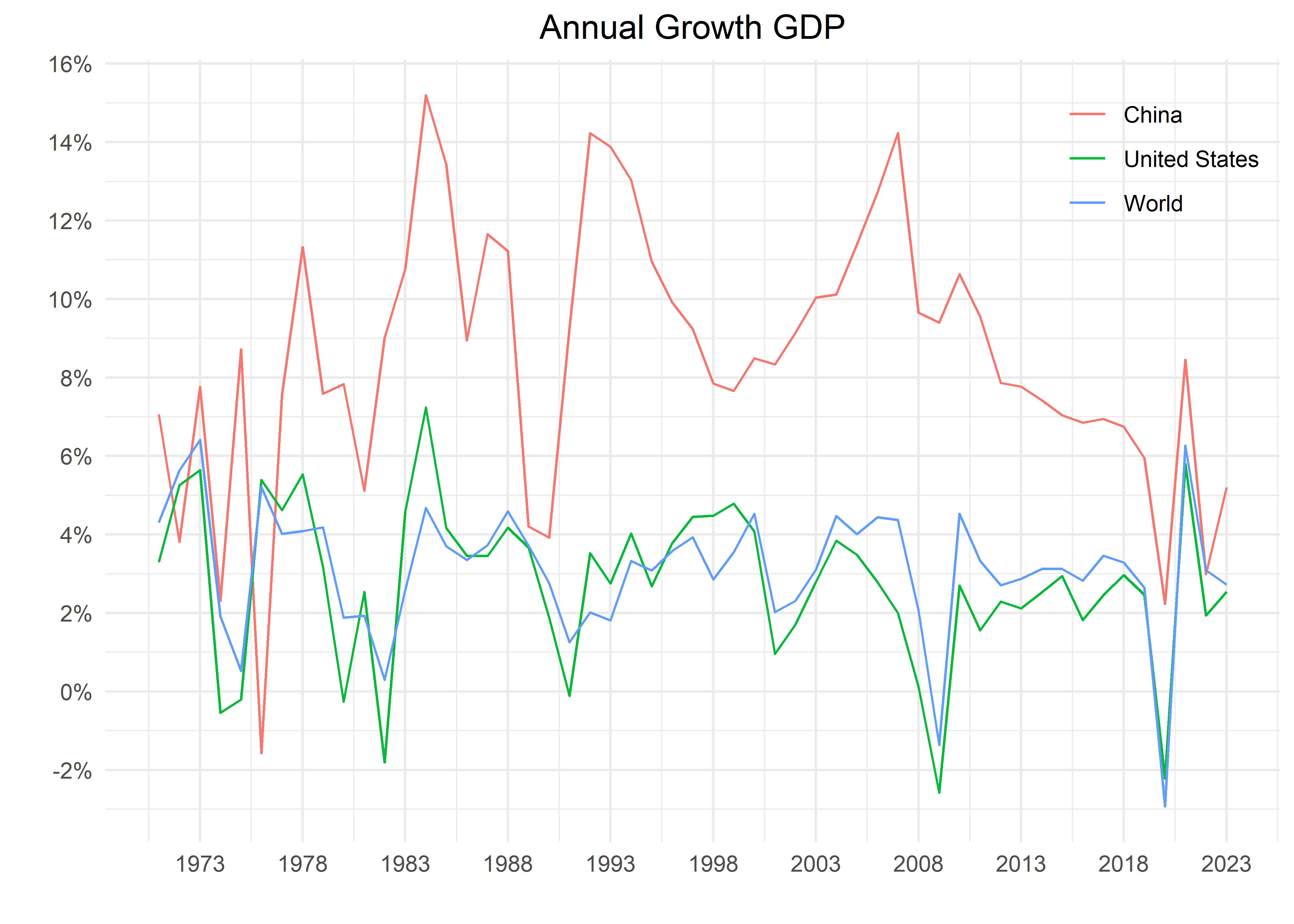
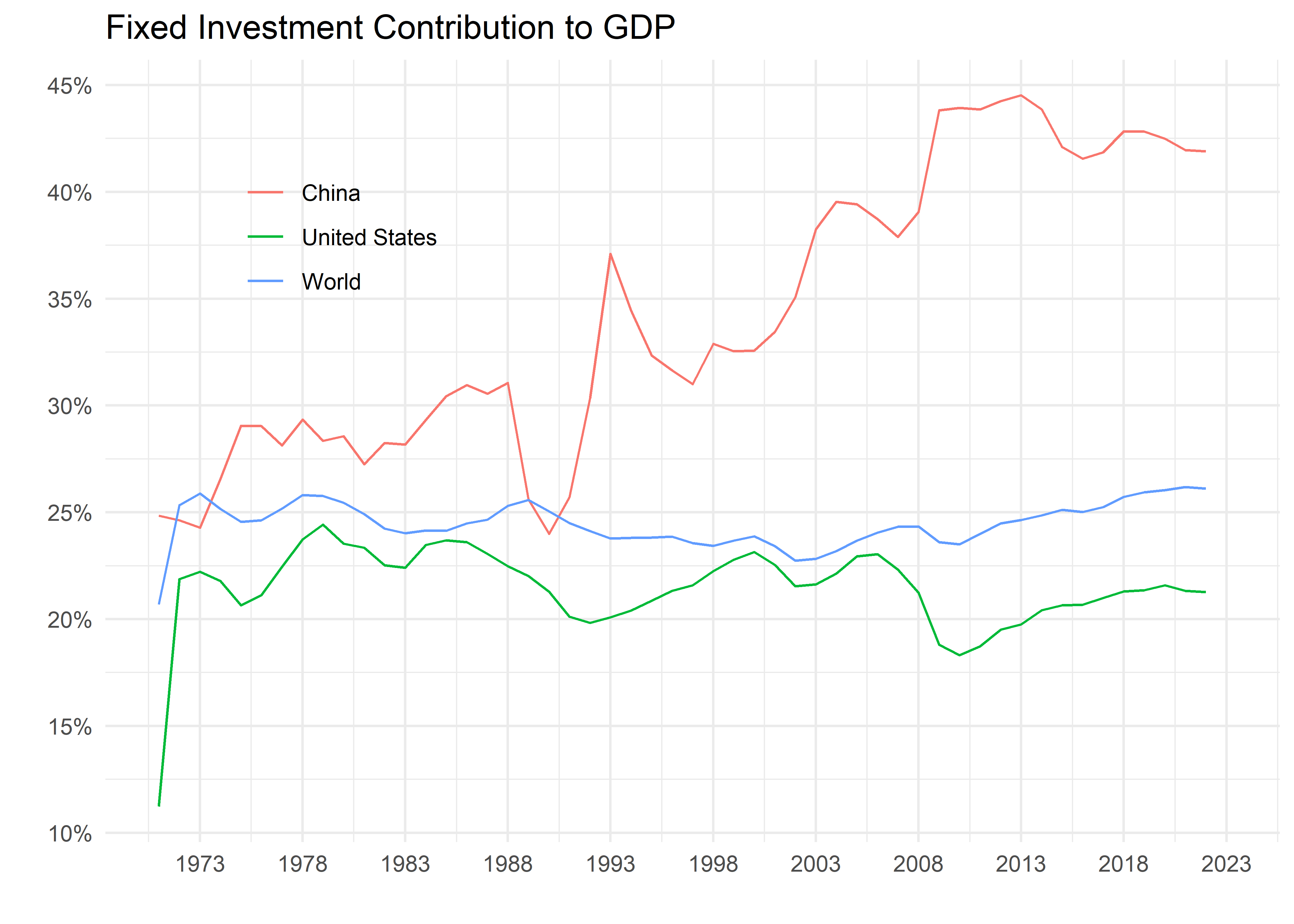
International Comparison
So far we have looked at GDP for only one country, the United States, but this macroeconomic aggregate is fundamental for any economy. In principle, we can replicate the previous workflow for any country, as long as we can find the data.
Lucky for us, international organizations such as the World Bank, the International Monetary Fund, or the Bank for International Settlements, collect a lot of information about the world economy and financial markets. Here we will access the World Bank’s World Development Indicators (WDI) to pull data for GDP growth for international economies. We could access the WDI by visiting its website (<https://databank.worldbank.org/home.aspx}), but fortunately there is an R package called WDI that makes it seamless to pull World Bank data.
The WDI contains a variety of indicators and all of them have their unique ID, which is a mnemonic that rarely makes sense. We have to navigate to the WDI website and search in its toolbar for the series we need, and we find its ID in its details. The mnemonic for annual GDP is NY.GDP.MKTP.KD.ZG, we’ll pull this series for the United States, China, and the whole world. In the code snippet below, we first import the module that allows us to pull data from the WDI, and then we download the annual GDP growth from 1980 to 2022; note that we provide a list of three countries according to two digit ISO conventions, and the 1W code is for the whole world.
library(WDI)

us_china_world_gdp_growth <-
WDI(
country = c("US", "CN", "1W"),
indicator = 'NY.GDP.MKTP.KD.ZG',
) %>%
  mutate(date = str_glue("{year}-01-01") %>% ymd()) %>%
select(country, date, gdp_growth = `NY.GDP.MKTP.KD.ZG`)
The data we pull is already in long format and porting to ggplot() to make a chart is quite smooth.
us_china_world_gdp_growth %>%
  filter(date >= "1971-01-01") %>%
  ggplot(aes(x = date,
             y = gdp_growth,
             color = country)) +
  geom_line() +
  scale_y_continuous(labels = percent_format(scale = 1),
                     breaks = pretty_breaks(10)) +
  scale_x_date(
    date_breaks = "5 years",
    date_labels = "%Y"
  ) +
  theme_minimal() +
  labs(x = "",
       y = "",
       title = "Annual Growth GDP",
       color = "") +
  theme(legend.position =  c(.9, .9),
        plot.title = element_text(hjust = .5))
The U.S. growth rate tracks the world’s rate closely, a little bit faster in the 1990s and a little slower in the 2010s, this makes sense since the U.S. is the largest economy in the world. China, on the other hand, grows much faster from the early 1990s to the late 2010s, even reaching double digit GDP growth in several years. However, since the global financial crisis its growth rate has decelerated noticeably.
Important market commentators, such as Michael Pettis and Adam S. Posen, believe that imbalances in the Chinese economy represent an important challenge for its future growth.3 In their view, a serious structural challenge that China faces is that its economic model is based on fixed capital investment (think of this like buildings, roads, bridges, etc.). As a percentage of GDP they invest a lot more than the U.S. or the average country, for most advanced economies consumption is the main driver of GDP but not in China. The challenge is that over time fixed capital investment may suffer from decreasing marginal returns (i.e. bridges to nowhere) which severely impacts overall growth.
A proper analysis of the Chinese macroeconomy is way outside of the scope of this book, but let’s do some quick charts along the lines suggested by Pettis and Posen using data from the WDI. Let’s pull the series for fixed capital investment as a percentage of GDP for China, the U.S., and the world and see how they compare. The ID for this series is NE.GDI.FTOT.ZS
Here we see the point that Pettis and others make: China’s fixed capital investment, as percent of GDP, is about twice the U.S. and world’s rate; and this imbalance seems to be growing over time. For completeness sake, let’s now pull household consumption as percent of GDP (the ID is NE.CON.PRVT.ZS) and chart it over the years.
us_china_world_gdp_components <-
WDI(
country = c("US", "CN", "1W"),
indicator = c('NE.GDI.FTOT.ZS', 'NE.CON.PRVT.ZS')
) %>%
  rename("consumption_percent" = "NE.CON.PRVT.ZS",
         "fixed_capital_percent" = "NE.GDI.FTOT.ZS") %>%
  mutate(date = str_glue("{year}-01-01") %>% ymd()) %>%
   select(country, date, contains("percent"))
us_china_world_gdp_components %>%
filter(date >= "1971-01-01") %>%
ggplot(aes(x = date,
y = fixed_capital_percent,
color = country)) +
geom_line() +
scale_y_continuous(labels = percent_format(scale = 1),
breaks = pretty_breaks(10)) +
scale_x_date(
date_breaks = "5 years",
date_labels = "%Y"
) +
theme_minimal() +
labs(x = "",
y = "",
title = "Fixed Investment Contribution to GDP",
color = "") +
theme(legend.position = c(.2, .8))us_china_world_gdp_components %>%
filter(date >= "1971-01-01") %>%
ggplot(aes(x = date,
y = consumption_percent,
color = country)) +
geom_line() +
scale_y_continuous(labels = percent_format(scale = 1),
breaks = pretty_breaks(10)) +
scale_x_date(
date_breaks = "5 years",
date_labels = "%Y"
) +
theme_minimal() +
labs(x = "",
y = "",
title = "Consumption Contribution to GDP",
color = "") +
theme(legend.position = c(.2, .2))Here we observe that household consumption in the U.S. comprises around two thirds of GDP and seems to be growing in importance over time, whereas in China it is close to one third and decreasing over time. We won’t delve further into international data but the WDI package makes it easy to run this same analysis across different countries and observe where GDP trends are headed.
Conclusion
That concludes are our introduction to GDP data, importing from FRED, wrangling and data visualization. The amazing thing to us is that FRED has 800,000 data sets on it, and we can use the exact code flow we just reviewed to work with the majority of them: tq_get() + data wrangling + ggplot2 opens up a huge world to us. We will revisit FRED data many more times, but for now let’s move to a different source and type of data and dig into the stock market.
Footnotes
For a primer on GDP, see https://www.bea.gov/resources/methodologies/nipa-handbook.↩︎
More background can be found in Michael Pettis’ blogpost at https://carnegieendowment.org/chinafinancialmarkets/89466 and the article “The End of China’s Economic Miracle” by Adam S. Posen in the September 2023 edition of Foreign Affairs.↩︎
