# workhorse packages
library(tidyverse)
library(tidyquant)
library(timetk)
library(readxl)
library(janitor)

# data sources
library(fredr)

# vis specific
library(gt)
library(plotly)
library(scales)Employment
Introduction
As noted in the first section, the Fed carries a dual mandate: 1) control inflation and 2) maintain full employment. In this section, we will focus on that second mandate and dive into the labor market.
Employment is perhaps the piece of the macroeconomy that influences people’s lives the most, or at least the most directly. The labor force in America is over 100 million people, and that doesn’t count people who used to be in the labor force and have retired (or people who are young and will someday be in the labor force). It’s also a piece of the macroeconomy that is quite tangible and understandable: we don’t need data science or economic theory to understand what happens when people start losing their jobs. Contrast that to interest rates (banned in ancient societies as evil!) or inflation (inflation is bad, but deflation is also bad?), which aren’t intuitive to most of us. Most people have a sense for how the labor market is trending, though we can be heavily biased by our own sectoral experience. If we work in data science, and the data science job market is doing poorly, we’ll naturally feel the entire labor market is doing poorly, even if other sectors like health care are booming. This stands in distinction to, say, interest rates or inflation or the stock market, which are experienced in a more fungible way.
With that in mind, we’ll make our way through employment data in the following way:
- Examine the unemployment rate
- Visualize unemployment and recessions
- Visualize payroll numbers
- Build the Beveridge Curve
- Build a custom labor slack index
Here are the packages we will be using in this chapter:
Unemployment Rate
Let’s start with the unemployment rate, which is defined by FRED as “the number of unemployed as a percentage of the labor force…restricted to people 16 years of age and older…who are not on active duty in the Armed Forces.”
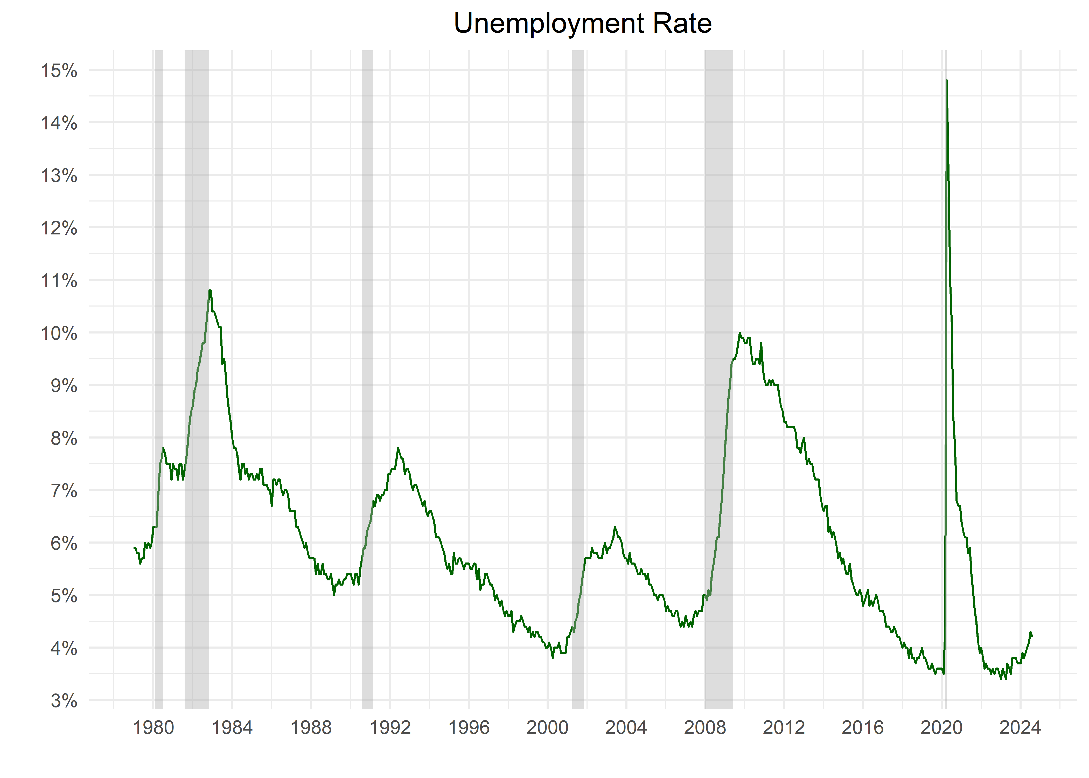
Since this is an unemployment rate, the lower it gets the better news for the economy. As the chart below slows, other than around the COVID shutdowns, unemployment has been quite low from the Great Financial Crisis through 2023. In fact, we need to go back to the 1960’s to find another era with unemployment hovering around 3.5%.
unrate <-
  "UNRATE" %>%
  tq_get(
    get = "economic.data",
    from = "1960-01-01"
  )

unrate %>%
  filter(date >= "1979-01-01") %>%
  ggplot(aes(
    x = date,
    y = price
  )) +
  geom_line(color = "darkgreen") +
  theme_minimal() +
  recession_shade_fun(start_date = "1979-01-01") +
  # bear_market_programmatic
  labs(
    x = "",
    y = "",
    title = "Unemployment Rate"
  ) +
  scale_y_continuous(
    labels = percent_format(
      accuracy = 1,
      scale = 1
    ),
    breaks = pretty_breaks(10)
  ) +
  scale_x_date(
    date_labels = "%Y",
    date_breaks = "4 years"
  ) +
  theme(plot.title = element_text(hjust = .5))
Note how recessions and unemployment spikes coincide and unemployment tends to peak after the recessionary periods have officially ended, and increases through the recession. Unemployment is a lagging indicator of economic activity and this is a good chart to demonstrate that.
People tend to talk about unemployment in the context of recession frequently, so in the next section let’s build a table to help us communicate how those two relate to one another.
