# workhorse packages
library(tidyverse)
library(tidyquant)
library(timetk)
library(readxl)
library(janitor)

# data sources
library(fredr)

# vis specific
library(gt)
library(gtExtras)
library(ggrepel)
library(english)
library(ggtext)
library(plotly)
library(scales)
library(formattable)

# data import
library(httr)
library(jsonlite)
library(XML)Inflation
Introduction
Let’s now turn our attention to the economic phenomenon that has been top of mind for much of the last few years: inflation. Our goal in this section is to equip ourselves with the tools to curate and contextualize Inflation beyond the headlines.
Inflation is a deceptively simple concept. If we paid $2 for a gallon of milk last week, and this week we paid $2.20, there has been $.20 of inflation on that milk (and a week-on-week rate of inflation of 10%!). Simple and explainable to our kids.
The nuance and complication enter the picture when we consider overall inflation: what if the price of eggs has fallen 10% also - has there been inflation? What if we don’t buy milk, but only eggs - has there been deflation? What’s causing this inflation? A shortage of cows (supply constraints) or a abundance of milk drinkers (demand push)?
We will end the thread of questions there but we do feel it’s important to drill beyond headline inflation into specific components of inflation measures, and we will introduce the tools to do. Visualizing those components offers an opportunity to add a new tool to our toolkit as well: the table! If building tables doesn’t sound like an exciting way to spend a Saturday night, we urge the reader to keep an open mind as we explore the power of the new gt package in R.
With that, let’s get into inflation.
Here are the packages we will be using in this chapter:
Measures of Inflation
There are two measures of inflation that we will cover: the Consumer Price Index (the CPI) and Personal Consumption Expenditures Index (PCEPI). CPI is the more commonly referenced measure - meaning when media participants say “inflation is increasing”, they are generally referring to the rate of growth of CPI. CPI is measured and reported by the Bureau of Labor Statistics (the BLS) and is defined as “a measure of the average change overtime in the prices paid by urban consumers for a market basket of consumer goods and services.”1 How large is the market basket of goods and services referenced above? It consists of about 80,000 items that people purchase for consumption on a regular basis. As we will discuss below, different weights are assigned to different categories of goods, based on their importance. As with all indexes, CPI is an average of prices faced by consumers. It does not reflect the exact prices or price changes faced by a specific consumer.
PCEPI, though less discussed in the media, is an equally important measure to keep in mind because it’s the measure preferred by the Federal Reserve.2 PCEPI is measured and reported by the Bureau of Economic Analysis (the BEA). PCEPI and CPI are similar, in that they both measure a price index of consumption, but as we will see they differ in weights and rates of change. A few key differences are: the PCEPI measures all items consumed, not just items paid out of pocket. This means health care, for which most people don’t pay out of pocket, has a higher weight in PCEPI, and housing has a lower weight in PCEPI. PCEPI is also a chained index, meaning it can take account of substitution between items when one becomes more expensive. This makes PCEPI more adaptive, and also less prone to a large rates of increase. For our purposes and for the purposes of market participants, the upshot is that the Federal Reserve tracks a price index that tends to move less quickly than what the media typically calls “inflation”.
Let’s take a quick look at CPI and PCEPI over time. We first create a tibble called pcepi_cpi to hold both times series and then calculate their YoY changes. We then chart the time series of both indexes, and the time series of the YoY changes of both indexes. When market participants reference “inflation”, that reference is usually to the YoY percentage change in inflation, not the level of the actual index.
pcepi_cpi <-
  tribble(
    ~symbol,    ~name,
    "CPIAUCSL", "CPI Inflation",
    "PCEPI",    "PCE Inflation"
  ) %>%
  tq_get(get = "economic.data", from = "1979-01-01") %>%
  group_by(name) %>%
  mutate(yoy_change = price / lag(price, 12) - 1)
Let’s visualize both time series for the sake of comparison.
pcepi_cpi %>%
  ggplot(aes(x = date, y = price, color = name)) +
  geom_line(show.legend = F) +
  scale_color_manual(values = c("darkgreen", "darkblue")) +
  recession_shade_fun(color_chosen = "pink") +
  geom_hline(aes(yintercept = 100),
    linetype = 4,
    size = .3
  ) +
  geom_text(aes(label = name),
    data = . %>% filter(date == max(date)),
    nudge_x = 2200,
    show.legend = F
  ) +
  coord_cartesian(clip = "off") +
  scale_y_continuous(breaks = pretty_breaks(15)) +
  scale_x_date(
    date_breaks = "5 years",
    date_labels = "%Y"
  ) +
  theme_minimal() +
  labs(
    x = "", y = "",
    title = "CPI v. PCEPI",
    color = ""
  ) +
  theme(
    plot.title = element_text(hjust = .5),
    plot.margin = margin(0.1, 1, 0.1, 0.1, "cm")
  )
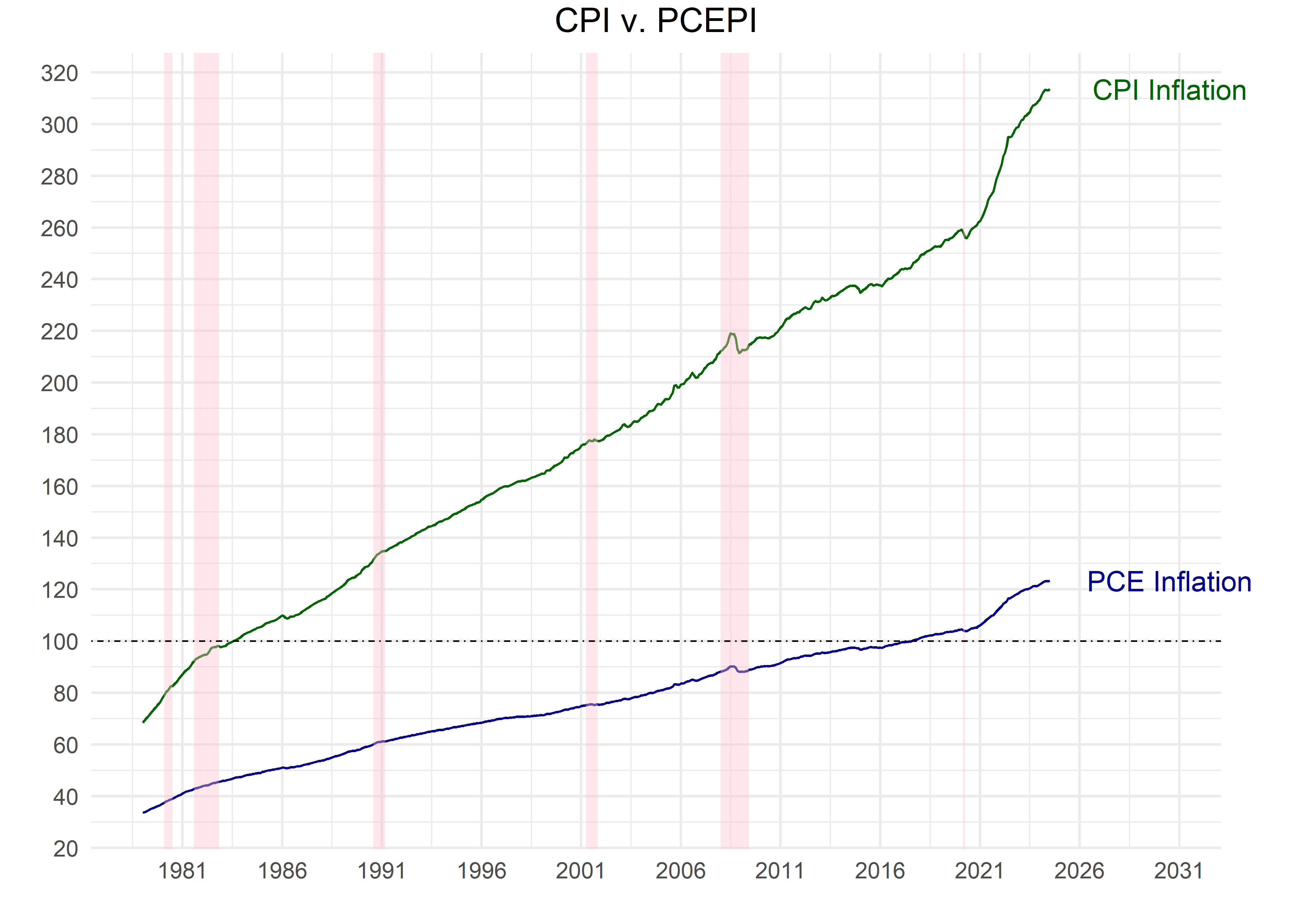
We have included a horizontal line to highlight where each index is equal to 100.
CPI is at 100 for the years around 1982-1984. That’s because CPI is indexed so that the 36-month average is 100 for that time period, and it allows us to quickly estimate percent changes from that baseline. The current CPI is well over 275 - indicating that average consumer prices have grown more than 250% since 1982-1984.
PCEPI is at 100 for the year 2012 because 2012 is its anchor index year. Since 2012, PCEPI has risen to around 120.
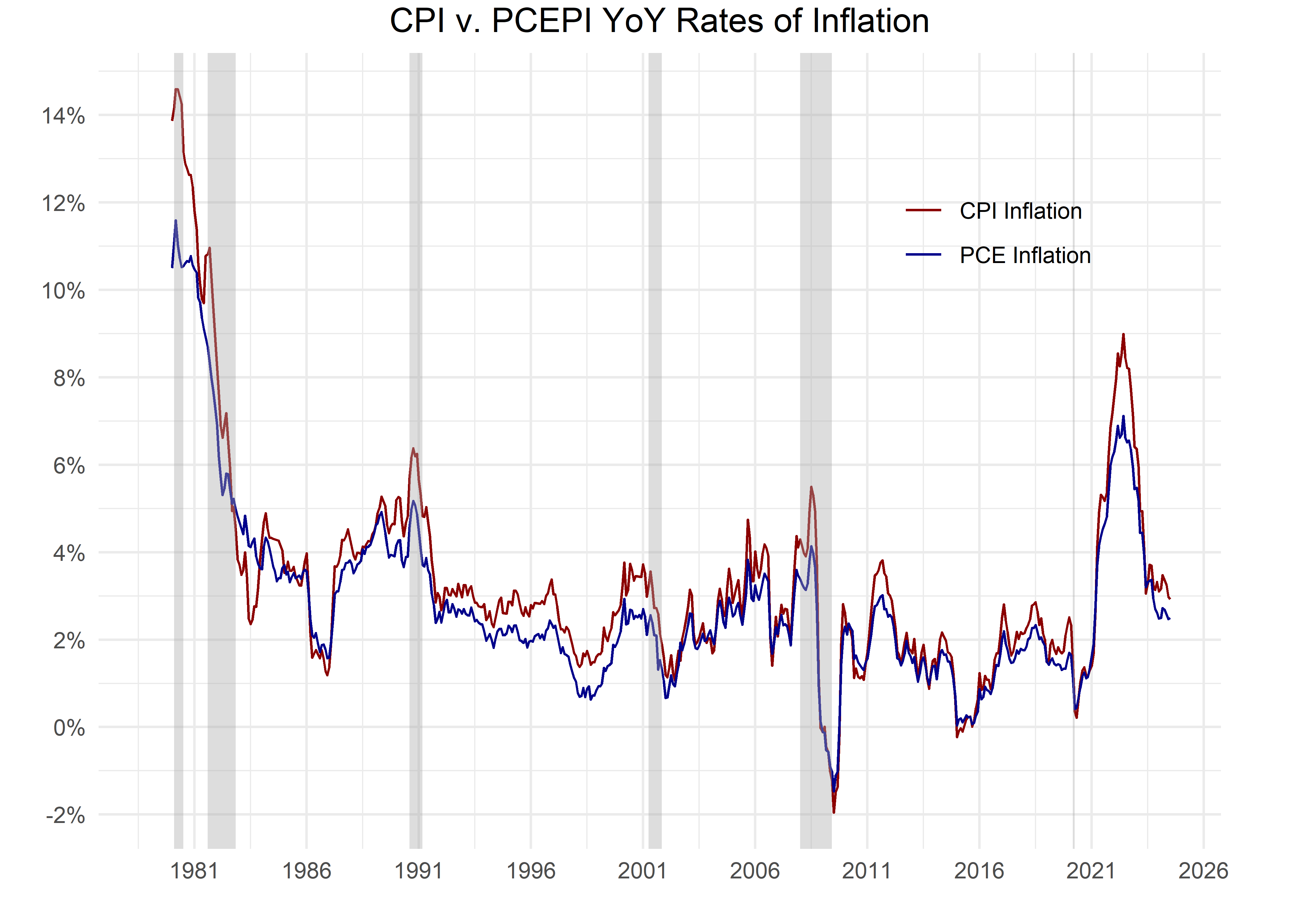
Let’s have a look at the respective YoY rates of inflation over time. These are the numbers that typically grab headlines.
pcepi_cpi %>%
  ggplot(aes(x = date, y = yoy_change, color = name)) +
  geom_line() +
  scale_color_manual(values = c("darkred", "darkblue")) +
  scale_y_continuous(
    labels = percent_format(accuracy = 1),
    breaks = pretty_breaks(n = 10)
  ) +
  coord_cartesian(clip = "off") +
  scale_x_date(
    date_breaks = "5 years",
    date_labels = "%Y"
  ) +
  theme_minimal() +
  labs(
    x = "", y = "", title = "CPI v. PCEPI YoY Rates of Inflation",
    color = ""
  ) +
  theme(
    legend.position = c(.8, .8),
    plot.title = element_text(hjust = .5),
    plot.margin = margin(0.1, 1, 0.1, 0.1, "cm")
  ) +
  recession_shade_fun()
Note a few things. First, both of these measures of inflation have increased significantly over the last 40 years, but PCEPI’s YoY rate tends to be lower than CPI (the red line is just a bit higher than the blue line most of the time). That is partly due to PCEPI being a chained index. A chained index takes account of consumer changes from month to month, as consumers substitute away from more expensive goods to less expensive goods. That means the chained index should have smaller fluctuations month by month, as it naturally shifts weight away from goods that have become more expensive.
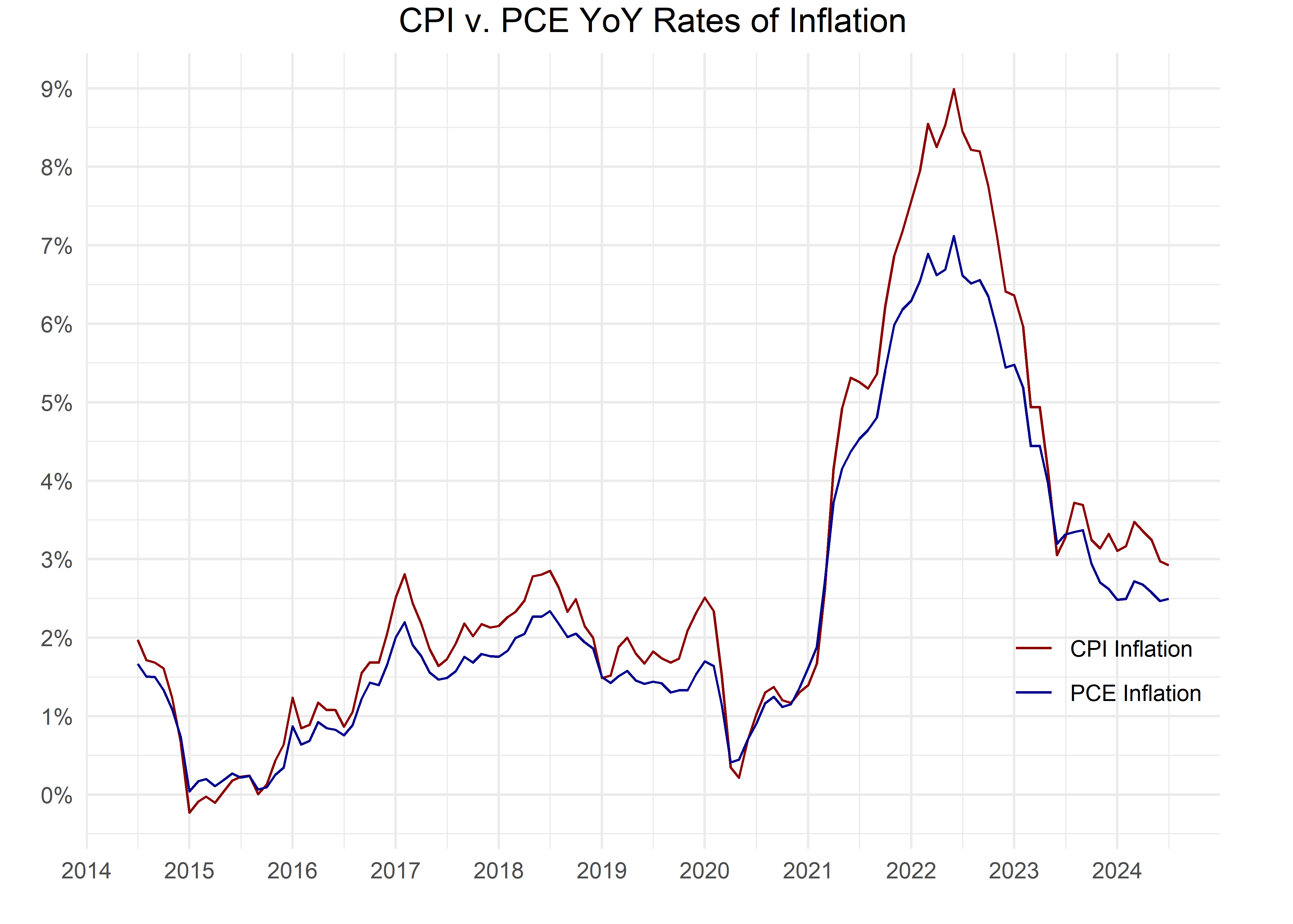
Let’s zoom in to the last decade.
pcepi_cpi %>%
  filter(date >= "2014-07-01") %>%
  ggplot(aes(x = date, y = yoy_change, color = name)) +
  geom_line(show.legend = T) +
  scale_color_manual(values = c("darkred", "darkblue")) +
  scale_y_continuous(
    labels = percent_format(accuracy = 1),
    breaks = pretty_breaks(n = 10)
  ) +
  scale_x_date(
    date_breaks = "1 years",
    date_labels = "%Y"
  ) +
  theme_minimal() +
  labs(
    x = "", y = "",
    title = "CPI v. PCE YoY Rates of Inflation",
    color = ""
  ) +
  theme(
    legend.position = c(.9, .25),
    plot.title = element_text(hjust = .5),
    plot.margin = margin(0.1, 1, 0.1, 0.1, "cm")
  )
It’s remarkable to see CPI and PCEPI rates of change very close from mid-2020 through early 2021, and then CPI taking a steeper path through mid-2022 - the spread here reached 2% during that period.


