import pandas as pd
import altair as altGDP
Introduction
In this chapter we will introduce the Gross Domestic Product (GDP), a term probably already familiar to the reader. GDP is widely considered the catch-all measure of the economy — when pundits remark that the economy is growing or faltering they are referring to the change in GDP.1
GDP is reported quarterly by the Bureau of Economic Analysis (BEA) and consists of four components: Consumption, Investment, Government Expenditures, and Net Exports. Each component can be further divided into sub-components. When we talk about GDP we are referring to the sum of these components. We could analyze components individually, for example if we were particularly interested in personal consumption or housing investment.
We begin our journey by importing data directly from the BEA website, in the form of a not so friendly spreadsheet. While many data providers offer GDP data already processed, going to the primary source will help us understand the steps we need to follow when we encounter spreadsheets that are poorly formatted for code based work, a common occurrence in the finance industry. It’s unlikely that your first experience with messy data will exactly mirror this BEA spreadsheet but it is likely that these skills will be applicable throughout your time in the financial industry. Messy spreadsheets are inherently sticky.
Our goal for most spreadsheets is to achieve a specific data structure called tidy or long where
- Every column is a variable.
- Every row is an observation.
- Every cell is a single value.
By the end of this chapter you will be able to locate data on the internet, import it via spreadsheet and work through some complex wrangling to get the data into a nice, tidy format.
We also get a chance to review the foundational data wrangling functions. Remember that data scientists and quants spend at least 50% of their time wrangling and cleaning data. These functions and concepts will stay with us for our entire career so we need to learn to be vary familiar with them.
In Python the pandas library provides the most comprehensive solution for data wrangling and it is also one of the most used and well-documented packages.2 The most common functions (or methods) we will use from pandas are
assign()to create new columnsdrop()to delete columnsrename()to rename columnsquery()to select rows based on conditions from columnsmelt()to make data tidy or longpivot()to make data widegroupby()to conduct split-apply-combine operationshead()to print the first 5 lines to screen
There are many visualization libraries in Python, we prefer the altair package because it follows a consistent grammar of graphics approach where every plot is broken into several constituent parts:
- Data: the dataframe we hope to visualize
- Marks: to visualize our data, we must represent it with actual marks on our figure (points, circles, bars, lines, etc.)
- Enconding: in order to represent our data in a figure, we must encode different aspects of our data into the various visual features (or channels) of our figure
We will talk more about altair when we make our first plot. Now, let’s import our libraries and get to work.
Real v. Nominal GDP
Before we start our analysis, let’s briefly discuss an important distinction in macroeconomic quantities: nominal versus real. GDP is defined as the value of goods and services produced in the United States. That might sound like a difficult thing to encapsulate in one number and indeed it is. An important word to call out in the definition of GDP is the word value. The typical value of goods and services is represented by their price. However, when we consider whether the economy has grown or not, we typically mean real growth, not growth that reflects an increase in prices only. The distinction between real growth and price growth is reflected in two different measures of GDP: Nominal GDP and Real GDP. As those names imply, Real GDP is adjusted for increases in price, whereas Nominal GDP is not.
In a nutshell, Nominal GDP represents the value of all goods and services produced in an economy at current market prices, while Real GDP represents that same value adjusted for inflation using a base year’s prices (2017 as the writing of this book). Many macroeconomic aggregates will have a nominal and a real measure, and the difference between them is if prices are adjusted for inflation or not.
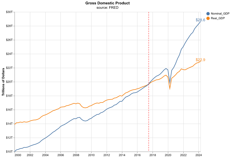
Let’s take a quick look at the chart of Nominal and Real GDP. Throughout the book we will show you the code for constructing charts such as this one, here we will skip it since we haven’t started our Python journey yet.
That chart shows us a few interesting points. The most recent readings of Real and Nominal are separated by about $5 trillion. If someone asks, what’s the GDP of the United States, is the answer $28 Trillion or $23 trillion? It depends if we or they mean Real or Nominal.
Also, notice the vertical red line. That line occurs at 2017, and it’s the year at which Real and Nominal GDP are exactly equal to each other, and that’s due to how Real GDP is indexed against Nominal GDP as of this writing. 2017 is the indexing data for the latest iteration of Real v. Nominal - notice how quickly Nominal GDP has outstripped Real GDP since then, that is the impact of inflation. The difference between Real and Nominal GDP is properly called the Deflator, and it’s defined as Nominal GDP divided by Real GDP multiplied by 100.
For the rest of this chapter (and the book) we will deal only with Real GDP, but now we know what makes it real.
BEA Data
We want this book to mirror reality, and the reality is that our first task (and many many subsequent tasks) in industry is usually to work with a tangled, messy, impenetrable spreadsheet.
Luckily, the BEA provides one such spreadsheet where they report on GDP data. Starting with a messy spreadsheet will also be our chance to introduce foundational data wrangling functions that will cover around 90% of our work in tidying data.
It’s not the fun stuff, but we want to start with spreadsheet work and data wrangling.
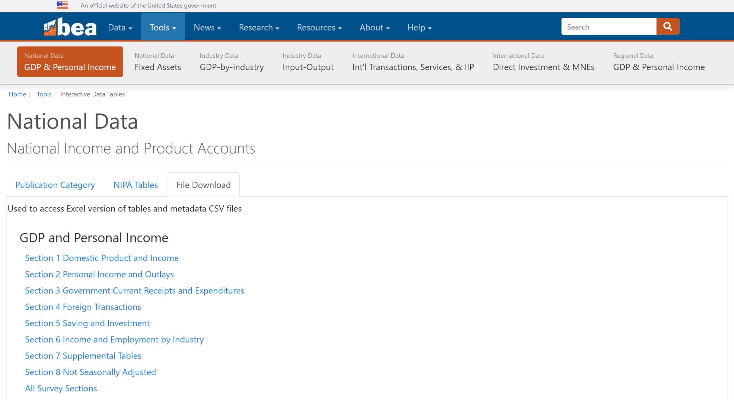
We will retrieve GDP data from the BEA, which is the primary source for this important dataset. Let’s first make a quick trip to the BEA website to figure out the exact URL where the data resides. We navigate to the following URL: https://apps.bea.gov/iTable/itable.cfm?isuri=1&reqid=19&step=4&categories=flatfiles&nipa_table_list=1,
The first list is Section 1 Domestic Product and Income, copy the address of this hyperlink and assign it to an object called url—this is where the BEA stores its GDP data.
url = "https://apps.bea.gov/national/Release/XLS/Survey/Section1All_xls.xlsx"To download the entire data we use the ExcelFile() method from pandas, where we only need to feed the url object we created.
BEA_file = pd.ExcelFile(url)After we run that code snippet, we have downloaded the Section 1 data from the BEA and it’s now sitting in the object BEA_file. That’s the end of our need for an internet connection. We could disconnect from Wifi and get on an airplane for the rest of this section.
The downloaded excel file has more than one sheet, it is common to have data in different tabs or sheets within one excel workbook. Unless we already know which tab we want, we can view the available sheets with the sheet_names attribute, here we show the first five sheets.
BEA_file.sheet_names[0:5]['Contents', 'T10101-A', 'T10101-Q', 'T10102-A', 'T10102-Q']We can find the number of tabs in our Excel file since sheet_names returns a list, if we examine its length with the built-in len function we can figure out how many sheets the workbook has.
len(BEA_file.sheet_names)107There are over 100 sheets available, and the first one is called Contents. That’s a good place to start to find out what’s in this data. Not all spreadsheets will have a Contents sheet, but the BEA has been kind enough to include one. We can look at the Contents sheet by using the parse method, this creates a dataframe that stores the contents of the sheet. We use the head() function prints to our screen the first 5 rows of the dataframe.
Contents = BEA_file.parse(sheet_name = 'Contents',
                          header=2)

Contents.head()
Unnamed: 0 Code Title
0 NaN NaN NaN
1 NaN T10101 Table 1.1.1...
2 NaN T10102 Table 1.1.2...
3 NaN T10103 Table 1.1.3...
4 NaN T10104 Table 1.1.4...There are two columns in this dataframe, Code and Title. The Title column will let us know the names for each data set. The Code column provides the same information if we have memorized the table codes for our data sets.
How many entries for Title does our sheet have? We can use the count method to find out, it automatically ignores entries with missing values (NaN), such as the first row.
Contents['Title'].count()57There are 57 rows or titles in Contents here but we have 107 sheets. What’s going on?
Those data codes and titles are both subdivided into annual and quarterly data. Have a look back up to when we ran the sheet_names and notice how A and Q are appended to the codes, standing for “Annual” and “Quarterly”. We will need to deal with this when we decide exactly which data set to extract from this spreadsheet.
Quarterly Change GDP
We can see in the table above that the first sheet, 10101-Q, holds data on the quarterly change in GDP, expressed as a percentage. That tends to be the headline GDP number reported in the media so let’s work with this data.
Before we parse this data, let’s imagine what we want as end result in our dataframe. We need to have the date and a value column for GDP percent change, it is also good practice to include identifiers as separate columns, so we might include the alphanumeric code assigned by the BEA for GDP growth and/or a column that explains in words what the series is. Let’s read the spreadsheet from the BEA as is and see our result. We use the parse() function to read a specific tab from our BEA_file object.
BEA_file.parse(sheet_name = "T10101-Q").head() Table 1.1.1. Percent Change From Preceding Period in Real Gross Domestic Product \
0 [Percent] S...
1 Quarterly d...
2 Bureau of E...
3 Data publis...
4 File create...
Unnamed: 1 Unnamed: 2 ... Unnamed: 309 Unnamed: 310 Unnamed: 311
0 NaN NaN ... NaN NaN NaN
1 NaN NaN ... NaN NaN NaN
2 NaN NaN ... NaN NaN NaN
3 NaN NaN ... NaN NaN NaN
4 NaN NaN ... NaN NaN NaN
[5 rows x 312 columns]This dataframe is far from what we want. Notice that we don’t need the first 7 rows. They contain meta data about when this file was created that is interesting but we don’t want that to be part of our analysis. We can skip these rows using the skiprows argument of parse(), let’s also assign the parsed sheet to an object named GDP_Q.
GDP_Q = BEA_file.parse(sheet_name = "T10101-Q",
                       skiprows = 7)

GDP_Q.head()
Line Unnamed: 1 Unnamed: 2 ... 2023Q4 2024Q1 2024Q2
0 1.0 Gross d... A191RL ... 3.4 1.4 2.8
1 2.0 Personal co... DPCERL ... 3.3 1.5 2.3
2 3.0 Goods DGDSRL ... 3 -2.3 2.5
3 4.0 Durable... DDURRL ... 3.2 -4.5 4.7
4 5.0 Nondura... DNDGRL ... 2.9 -1.1 1.4
[5 rows x 312 columns]That looks much better but there are still issues. The first column is called Line and seems unnecessary. Let’s remove it from our dataframe using the drop() method.
GDP_Q = GDP_Q.drop(columns = ['Line'])

GDP_Q.head()
Unnamed: 1 Unnamed: 2 1947Q2 ... 2023Q4 2024Q1 2024Q2
0 Gross d... A191RL -1 ... 3.4 1.4 2.8
1 Personal co... DPCERL 6.8 ... 3.3 1.5 2.3
2 Goods DGDSRL 7.4 ... 3 -2.3 2.5
3 Durable... DDURRL 8.6 ... 3.2 -4.5 4.7
4 Nondura... DNDGRL 7 ... 2.9 -1.1 1.4
[5 rows x 311 columns]Now let’s rename our first two columns to have more informative names other than Unnamed. We use the rename() function to give our columns new names, we feed a dictionary composed of pairs where we have OLD-NAME: NEW-NAME so we change the name of only the first two columns.
GDP_Q = GDP_Q.rename(columns = {'Unnamed: 1': 'Account',
                                'Unnamed: 2': 'Code'} )

GDP_Q.head()
Account Code 1947Q2 ... 2023Q4 2024Q1 2024Q2
0 Gross d... A191RL -1 ... 3.4 1.4 2.8
1 Personal co... DPCERL 6.8 ... 3.3 1.5 2.3
2 Goods DGDSRL 7.4 ... 3 -2.3 2.5
3 Durable... DDURRL 8.6 ... 3.2 -4.5 4.7
4 Nondura... DNDGRL 7 ... 2.9 -1.1 1.4
[5 rows x 311 columns]It is possible to do these last operations all together at the same time by chaining, that is getting the result from one function and then applying another one without assigning it to an object first. It makes for more compact code that is easier to read, since the operations are all done in the same code block and we can see their order.
The trick to chaining operations is to tell Python that we are not done with our code block even if we are at the end of a line. We can easily do this by enclosing all of our operations within parentheses. Note how the code snippet below achieves the same result as our previous blocks in a more compact fashion.
GDP_Q = (
        BEA_file.parse(sheet_name = "T10101-Q",
                       skiprows = 7)
        .drop( columns = ['Line'] )
        .rename(columns = {'Unnamed: 1': 'Account',
                          'Unnamed: 2': 'Code'} )
)

GDP_Q.head()
Account Code 1947Q2 ... 2023Q4 2024Q1 2024Q2
0 Gross d... A191RL -1 ... 3.4 1.4 2.8
1 Personal co... DPCERL 6.8 ... 3.3 1.5 2.3
2 Goods DGDSRL 7.4 ... 3 -2.3 2.5
3 Durable... DDURRL 8.6 ... 3.2 -4.5 4.7
4 Nondura... DNDGRL 7 ... 2.9 -1.1 1.4
[5 rows x 311 columns]The structure of our dataframe, a separate column for each date and a separate rows for each item, might feel appealing for human eyes. The bad news is that we are going to completely reject that structure and force ourselves to reorganize our data into a longer, tidier format which in the end is more convenient for data analysis.
Tidying Wide Data
As noted at the start of the chapter, tidy or long data have three main elements,
- Every column is a variable.
- Every row is an observation.
- Every cell is a single value.
It might be more efficient to examine long data than to linger on the definition. Fortunately, the melt() function makes quick work of turning a wide dataframe into a long one.
GDP_Q = (
        BEA_file.parse(sheet_name = "T10101-Q",
                       skiprows = 7)
        .drop( columns = ['Line'] )
        .rename(columns = {'Unnamed: 1': 'Account',
                          'Unnamed: 2': 'Code'} )
        .melt(id_vars = ['Account', 'Code'],
              var_name = 'date',
              value_name = 'percent_change')
)

GDP_Q.head()
Account Code date percent_change
0 Gross d... A191RL 1947Q2 -1
1 Personal co... DPCERL 1947Q2 6.8
2 Goods DGDSRL 1947Q2 7.4
3 Durable... DDURRL 1947Q2 8.6
4 Nondura... DNDGRL 1947Q2 7Notice how we have gone from over 300 columns to only 4, our data is much less wide. At the same time, we have gone from 28 rows to several thousand, our data is longer. It is also tidy in the sense that we have a column for the date and another one for the percent change of GDP.
The mechanics of using melt() are very important though not intuitive at first sight. The id_vars argument represents one or more columns present in the wide data to use as identifiers in the long data, all other columns not named will be “unpivoted” (or turned into rows). var_name is the name to use for the series that now contains the names of the unpivoted columns, and value_name is the name to use for the series that contains the values of the cells unpivoted. While the use of melt() can be confusing at first, we will use it many times in this book so that by the end the reader will be quite familiar with the function.
Type Wrangling
When dealing with data it is important to make sure data types are being stored correctly; that is, numerical data is stored as numbers, text data is stored as strings, dates are stored as dates, etc. Incorrectly stored data will almost surely lead to errors in analysis. We can check the data types of a dataframe by printing the dtypes attribute of a dataframe,
GDP_Q.dtypesAccount object
Code object
date object
percent_change object
dtype: objectWe can see that all of our columns are stored as objects. This is correct if you have a text column of possibly different lengths in each row—such as Account and Code—but this is no good for numeric and date variables. Let’s fix the percent_change variable which should numeric and the date column which should be stored as a date, this is easily done with the to_numeric() and to_datetime() methods from pandas.
GDP_Q['percent_change'] = pd.to_numeric(GDP_Q['percent_change'],
                                        errors = 'coerce')

GDP_Q['date'] = pd.to_datetime( GDP_Q['date'] )
Let’s now check our types again,
GDP_Q.dtypesAccount object
Code object
date datetime64[ns]
percent_change float64
dtype: objectThe data type for percent_change now reads as float64, which means it is stored as a floating point number with 64 bits (or double precision). The type for date is now datetime, which is the correct way for pandas to store dates.
Before we move on, let’s see how to include these type wrangling operations in our chained block of code, this will give us our first taste of assign() which is used to create columns in a dataframe.
GDP_Q = (
    BEA_file.parse(sheet_name = "T10101-Q",
                   skiprows = 7)
      .drop( columns = ['Line'] )
      .rename(columns = {'Unnamed: 1': 'Account',
                       'Unnamed: 2': 'Code'} )
      .melt(id_vars = ['Account', 'Code'],
           var_name = 'date',
           value_name = 'percent_change')
      .assign(percent_change = lambda df: pd.to_numeric(df['percent_change'], errors = 'coerce'),
              date = lambda df: pd.to_datetime(df['date']) )
)
We are using assign() to re-assign the value of already created columns, in this case to fix their type. Further, note the use of lambda which defines an anonymous function, which is a quick way of writing a function consisting of a single statement whose result is the return value. Here we use lambda to refer to our dataframe, which has no name yet assigned to it, and we use the placeholder df to refer to it.
Let’s confirm that our data types are correct.
GDP_Q.dtypesAccount object
Code object
date datetime64[ns]
percent_change float64
dtype: objectFinally, let’s see some additional date functionalities available in pandas. Sometimes it may be necessary to break down a date into its components, such as year, month, day, etc. We can quickly obtain these date properties using the dt accessor and then the property we need, for instance, dt.year will give us the year of a date. The block of code below processes our spreadsheet and in addition creates columns for the year, quarter, and month of our date.
GDP_Q = (
    BEA_file.parse(sheet_name = "T10101-Q",
                  skiprows = 7)
      .drop( columns = ['Line'] )
      .rename(columns = {'Unnamed: 1': 'Account',
                        'Unnamed: 2': 'Code'} )
      .melt(id_vars = ['Account', 'Code'],
           var_name = 'date',
           value_name = 'percent_change')
      .assign(percent_change = lambda df: pd.to_numeric(df['percent_change'], errors = 'coerce'),
              date = lambda df: pd.to_datetime(df['date']),
              date_yr =  lambda df: df['date'].dt.year ,
              date_qtr = lambda df: df['date'].dt.quarter,
              date_month = lambda df: df['date'].dt.month )
)

GDP_Q.head()
Account Code date ... date_yr date_qtr date_month
0 Gross d... A191RL 1947-04-01 ... 1947 2 4
1 Personal co... DPCERL 1947-04-01 ... 1947 2 4
2 Goods DGDSRL 1947-04-01 ... 1947 2 4
3 Durable... DDURRL 1947-04-01 ... 1947 2 4
4 Nondura... DNDGRL 1947-04-01 ... 1947 2 4
[5 rows x 7 columns]Filter and Slice
Let’s now study how to select rows of our dataframe based on values from a column. We use the query() method to express the condition we want as a string, and we can refer to columns in our dataframe by their name. query() evaluates this string instruction and returns the result. For instance, let’s find the rows where the Account column equals Gross domestic product, note how we use single quotes (’) to build the string for query() and double quotes (“) for the comparison inside it.
GDP_Q.query('Account == "Gross domestic product"')Empty DataFrame
Columns: [Account, Code, date, percent_change, date_yr, date_qtr, date_month]
Index: []
[0 rows x 7 columns]It seems like we made a mistake somewhere because the result from our query is an empty dataframe, but can see there are rows with Gross domestic product in the Account column. This is actually a common problem when working with text data, many times we have extra whitespaces in front or after the string—we can see the text but we cannot observe the whitespaces. Eliminating these potential lead or trailing whitespaces is straightforward, pandas provides many string function under its str accessor, to eliminate whitespaces we use strip().
GDP_Q.query('Account.str.strip() == "Gross domestic product"').head() Account Code date ... date_yr date_qtr date_month
0 Gross d... A191RL 1947-04-01 ... 1947 2 4
28 Gross d... A191RL 1947-07-01 ... 1947 3 7
56 Gross d... A191RL 1947-10-01 ... 1947 4 10
84 Gross d... A191RL 1948-01-01 ... 1948 1 1
112 Gross d... A191RL 1948-04-01 ... 1948 2 4
[5 rows x 7 columns]Let’s include this string operation in our workflow to obtain a clean dataframe.
GDP_Q = (
    BEA_file.parse(sheet_name = "T10101-Q",
                  skiprows = 7)
      .drop(columns = ['Line'])
      .rename(columns = {'Unnamed: 1': 'Account',
                        'Unnamed: 2': 'Code'} )
      .melt(id_vars = ['Account', 'Code'],
            var_name = 'date',
            value_name = 'percent_change')
      .assign( percent_change = lambda df: pd.to_numeric(df['percent_change'], errors = 'coerce'),
              date = lambda df: pd.to_datetime(df['date']),
              Account = lambda df: df['Account'].str.strip() )
)
We can filter our dataframe by date using the query() method. Let’s select rows for all dates in 2020 and after.
GDP_Q.query('date >= "2020-01-01"').head() Account Code date percent_change
8148 Gross domes... A191RL 2020-01-01 -5.3
8149 Personal co... DPCERL 2020-01-01 -6.4
8150 Goods DGDSRL 2020-01-01 -2.1
8151 Durable goods DDURRL 2020-01-01 -16.6
8152 Nondurable ... DNDGRL 2020-01-01 6.1Another useful way to slice our dataframe is the combination of groupby() with nth(). The groupby() method allows us to perform split-apply-combine operations where we split our sample by a grouping variable, apply a function to each group individually, and combine the result into one dataframe. The nth() function will take the nth row of each group as defined by groupby(). For instance, if we wish to see the first and last row of each different Account we write the following line.
GDP_Q.groupby('Account').nth([0,-1]).head() Account Code date percent_change
0 Gross domes... A191RL 1947-04-01 -1.0
1 Personal co... DPCERL 1947-04-01 6.8
2 Goods DGDSRL 1947-04-01 7.4
3 Durable goods DDURRL 1947-04-01 8.6
4 Nondurable ... DNDGRL 1947-04-01 7.0This is a good way to check if all of our accounts have the same starting and ending date.
We prefer to have the most recent date at the top of our dataframe, thus we need to sort the date in descending order. We do this by making a call to sort_values() which sorts a dataframe according to one or several of its columns, since we want it in decreasing order we define ascending=False.
GDP_Q = (
    BEA_file.parse(sheet_name = "T10101-Q",
                  skiprows = 7)
      .drop( columns = ['Line'] )
      .rename(columns = {'Unnamed: 1': 'Account',
                       'Unnamed: 2': 'Code'} )
      .melt(id_vars = ['Account', 'Code'],
            var_name = 'date',
            value_name = 'percent_change')
      .assign(percent_change = lambda df: pd.to_numeric(df['percent_change'], errors = 'coerce'),
              date = lambda df: pd.to_datetime(df['date']),
              Account = lambda df: df['Account'].str.strip() )
      .sort_values(by = 'date', ascending=False )
)

GDP_Q.head()
Account Code date percent_change
8651 Gross domes... A191RP 2024-04-01 5.2
8637 Change in p... ZZZZZZ 2024-04-01 NaN
8624 Gross domes... A191RL 2024-04-01 2.8
8625 Personal co... DPCERL 2024-04-01 2.3
8626 Goods DGDSRL 2024-04-01 2.5Lastly, suppose we want the date column to be the first one in our dataframe or we simply want to rearrange variables. We can use the filter() method to specify how we want our columns arranged, we just feed it a list with the order. We can go a step further and also use filter() to drop variables, any column not included in the list gets dropped. Let’s include in our workflow filter() to rearrange date as our first column and also drop the Code variable.
GDP_Q = (
    BEA_file.parse(sheet_name = "T10101-Q",
                   skiprows = 7)
        .drop( columns = ['Line'] )
        .rename(columns = {'Unnamed: 1': 'Account',
                          'Unnamed: 2': 'Code'} )
        .melt(id_vars = ['Account', 'Code'],
                   var_name = 'date',
                   value_name = 'percent_change')
        .assign( percent_change = lambda df: pd.to_numeric(df['percent_change'],
                                                          errors = 'coerce'),
                 date = lambda df: pd.to_datetime(df['date']),
                 Account = lambda df: df['Account'].str.strip() )
        .sort_values(by = ['date'], ascending = False )
        .filter(items = ['date', 'Account', 'percent_change'] )
)
This concludes our work wrangling this dataset. For a quick recap, we started with this horribly formatted spreadsheet with dates running as column headers,
BEA_file.parse(sheet_name = "T10101-Q",
              skiprows = 7).head()
Line Unnamed: 1 Unnamed: 2 ... 2023Q4 2024Q1 2024Q2
0 1.0 Gross d... A191RL ... 3.4 1.4 2.8
1 2.0 Personal co... DPCERL ... 3.3 1.5 2.3
2 3.0 Goods DGDSRL ... 3 -2.3 2.5
3 4.0 Durable... DDURRL ... 3.2 -4.5 4.7
4 5.0 Nondura... DNDGRL ... 2.9 -1.1 1.4
[5 rows x 312 columns]After our workflow, we transformed it to this
GDP_Q.head() date Account percent_change
8651 2024-04-01 Gross domes... 5.2
8637 2024-04-01 Change in p... NaN
8624 2024-04-01 Gross domes... 2.8
8625 2024-04-01 Personal co... 2.3
8626 2024-04-01 Goods 2.5With the date running vertically along a column, we could now align this quarterly change in GDP data with other market and economic time series.
All of this spreadsheet work is a chore that unfortunately comes up frequently, and this is why we went through it in detail and repeated some steps. We hope those code chunks can serve as a future reference for you when someone emails a spreadsheet over and asks if you could “just clean that up”. Before we get to the market data, let’s examine another source for this data that will save us a lot of work.
FRED Data
In the previous section, we imported data directly from the BEA, but we could have gone to a centralized repository of macroeconomic data called FRED, which stands for Federal Reserve Economic Data. FRED is maintained by the St. Louis Federal Reserve and even has a very helpful About webpage available here.
The data available there goes far beyond the series produced by the Federal Reserve - there are currently more than 800,000 data series available. There’s even a FRED iphone app where interested people can get a look at new data and blog posts. In this Chapter we will import GDP data from FRED, which is substantially easier than doing so directly from the BEA.
It is not onerous to download data from FRED into Python using the pandas_datareader package.3 This library has the get_data_fred() function which pulls data directly from FRED, we only need to input the code for the series and time period. Each series in FRED has a unique code or mnemonic identifier, some are intuitive but the majority are not. For example, the code for quarterly change in GDP is A191RL1Q225SBEA which is not at all intuitive.
Let’s import pandas_datareader to our environment and pull quarterly GDP growth from 1976 onward.
import pandas_datareader as pdr

change_gdp = pdr.get_data_fred('A191RL1Q225SBEA',
                              start = '1976-01-01')

change_gdp.head()
A191RL1Q225SBEA
DATE
1976-01-01 9.3
1976-04-01 3.0
1976-07-01 2.2
1976-10-01 2.9
1977-01-01 4.8 Note how the rows of our dataframe do not have numbers but rather the date, we refer to this as the index of the dataframe. The index of a dataframe is not a column but rather a row name. While this setup can be useful in some cases, our personal preference is to have the date as a proper column of the dataframe, this is also the more common setup in software outside of pandas. To pull the index out as a column we use reset_index().
change_gdp = (
    pdr.get_data_fred('A191RL1Q225SBEA',
                     start = '1976-01-01')
      .reset_index()
)

change_gdp.head()
DATE A191RL1Q225SBEA
0 1976-01-01 9.3
1 1976-04-01 3.0
2 1976-07-01 2.2
3 1976-10-01 2.9
4 1977-01-01 4.8 Note that now DATE is a proper column and again we have numbers indexing the rows of the dataframe.
Now we see why FRED is so popular, instead of seeking out data on primary source websites like the BEA all we need is the FRED code and a function, and we do not need to visit a lot of disparate websites. The call to FRED is short and simple, and if we wish to download a different data set we simple change to a different FRED code.
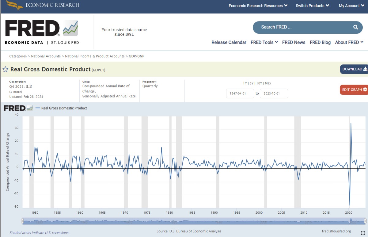
A key question is how to find the proper FRED code. If we navigate to FRED’s website there is a handy search bar where we can look up any series using regular English terms. For instance, if we look up “quarterly change in gdp” the first hit is the following page
The id is the alphanumeric code in parenthesis next to the series name. We can do this for any of the other many series in FRED.
Getting back to our change in GDP dataframe, let’s make a few changes which will serve as additional wrangling practice.
- rename columns
- add new columns
- sort dataframe
- slice rows
- reorder columns
We chain all operations in the following block of code. Let’s go over it one step at a time. We pull the data from FRED and pull the date out of the index into a proper columns, then we rename both variables with rename(). Then we create a couple of new variables, percent_change is just GDP change in decimals rather than percentage points (this will be useful when creating plots), and title just expresses what the series is. After that, we sort the dataframe by date in descending order with sort_values(), we slice our data so we only keep rows with date from 1979 onwards with query() (our stock market data will start in 1979), and finally arrange our columns in a preferred order and at the same time drop the pct_change variable.
change_gdp = (
  pdr.get_data_fred('A191RL1Q225SBEA', start = '1976-01-01')
     .reset_index()
     .rename( columns = {'A191RL1Q225SBEA': 'pct_change',
                        'DATE': 'date'} )
     .assign( percent_change = lambda df: df['pct_change']/100,
              title = 'Change in GDP' )
     .sort_values(by=['date'], ascending = False )
     .query('date >= "1979-01-01"')
     .filter(items = ['title', 'date', 'percent_change'] )
)

change_gdp.head()
title date percent_change
193 Change in GDP 2024-04-01 0.028
192 Change in GDP 2024-01-01 0.014
191 Change in GDP 2023-10-01 0.034
190 Change in GDP 2023-07-01 0.049
189 Change in GDP 2023-04-01 0.021We now have our main GDP data object that we will work with for the rest of this section.
Visualization
Our GDP data objects are imported and wrangled, and that means it’s a good time to introduce data visualization. There are many libraries that can be used in Python to construct plots, as mentioned previously we like altair because it follows a consistent grammar of graphics and it can produce interactive plots in html format.
Visualization in altair follow a similar order: we pass tha dataframe to plot, the mark we want (i.e. the type of plot), the encodings (what goes in the x-axis, y-axis, etc.), and additional properties (like the title).
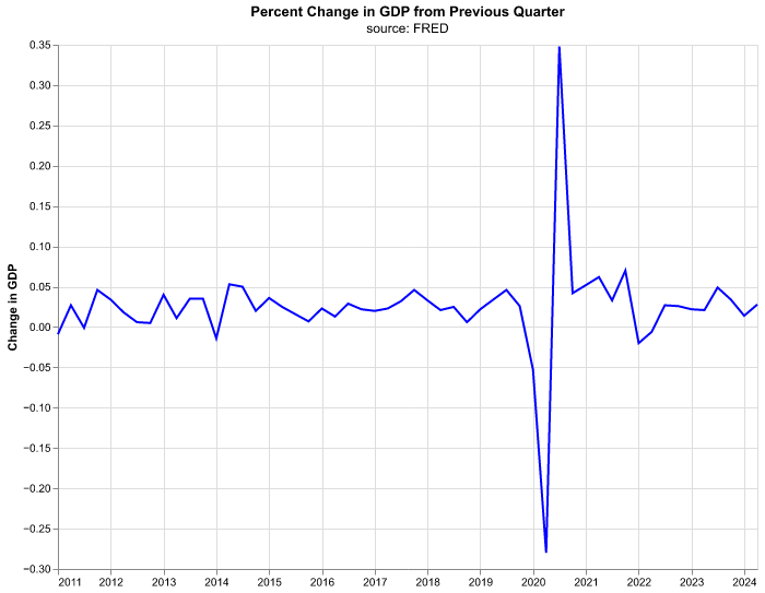
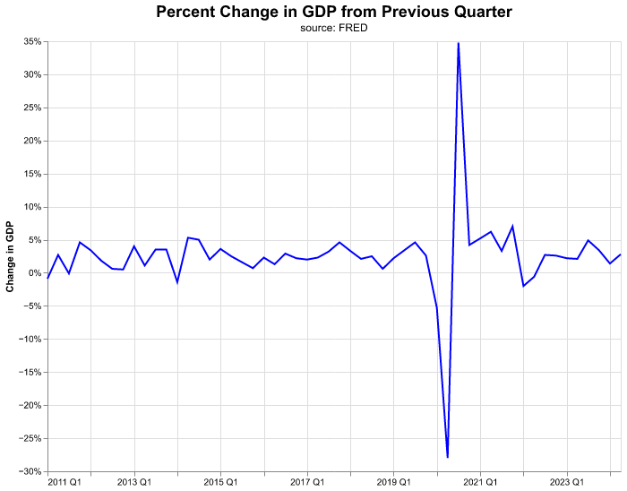
Let’s start with a line chart for percent change in GDP by quarter. Don’t get too bogged into the details of the code but have a look at how things proceed in steps.
(
alt.Chart(change_gdp.query('date >= "2011-01-01"'),
        title = alt.Title(
          'Percent Change in GDP from Previous Quarter',
          subtitle = 'source: FRED')
  )
  .mark_line(color = 'blue')
  .encode(
    alt.X('date:T').title(None),
    alt.Y('percent_change:Q').title('Change in GDP')
  )
  .properties(width=640, height=480)
)
We will walk through the building of this chart step-by-step, not because it’s the most exciting chart in the world, but because the steps will serve as the foundation for our visualization work—and it’s good to have a template to start when you want to get into more complex charts.
We write our code inside of parenthesis so we can chain all the commands and Python understands the end of a line is not the end of our code. The line alt.Chart() initializes the plot, receives our dataframe change_gdp (which we are filtering at the same time to only have dates starting in 2011), and handles the title properties. Once altair has the dataframe, we need to declare the kind of graph we want, mark_line() states we want a line plot—this will be the line of code we change when we want other kind of plots (bubble plots, bar charts, etc.)—and the argument of color declares the color we want.
Most of the action comes in the encode() function, where we pass the aesthetics or channels of the plot. alt.X declares which variable goes in the x-axis, we write date:T because we want the date column in the x-axis and the :T part is to specify that this variable is of type temporal for date/time. If we forget to specify the type of our variable, altair will attempt to guess it and succeed most of the time, still it is good practice to declare it ourselves. The method .title(None) attached to alt.X means that we don’t want an axis title or label, this makes sense when we have dates as these are self-explanatory. In alt.Y we declare our y-axis in similar fashion, except we use :Q to declare a quantitative variable and we do provide an axis title.
Finally, the properties() serve to specify the size of the chart and, later on, other properties. The proper size of the chart depends on its ultimate use (is it part of a report? presentation? website? etc.) so it will vary on a case by case basis.
Let’s start to make some improvements in the graph. Suppose we want to emphasize that the data is quarterly. There are data transformation functions that we can use directly inside of the altair call. Note that by using yearquarter(date) now our x-axis contains the date variable expressed as YYYY QQ. In addition, we’ll make the title bigger by choosing a number for its fontSize.
(
alt.Chart( change_gdp.query('date >= "2011-01-01"'),
        title = alt.Title(
          'Percent Change in GDP from Previous Quarter',
          fontSize = 18,
          subtitle = 'source: FRED')
  )
  .mark_line(color = 'blue')
  .encode(
    alt.X('yearquarter(date):T').title(None),
    alt.Y('percent_change:Q').title('Change in GDP')
  )
  .properties(width=640, height=480)
)
Now let’s improve the y-axis labels where instead of showing GDP increments in decimals (the current scale of percent_change) we show it in percentage points. Here we need to specify the axis method of alt.Y and we make use of the option to format the axis to percentage points.
(
alt.Chart( change_gdp.query('date >= "2011-01-01"'),
        title = alt.Title(
          'Percent Change in GDP from Previous Quarter',
          fontSize = 18,
          subtitle = 'source: FRED')
  )
  .mark_line(color = 'blue')
  .encode(
    alt.X ('yearquarter(date):T').title(None),
    alt.Y('percent_change:Q').title('Change in GDP')
        .axis(format='%')
  )
  .properties(width=640, height=480)
)
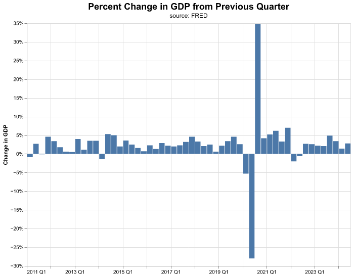
That was quite a bit of work to create a line chart—but the good news is when we want to toggle to a column chart, we change only one line of the code in the mark to mark_bar().
(
alt.Chart( change_gdp.query('date >= "2011-01-01"'),
        title = alt.Title(
          'Percent Change in GDP from Previous Quarter',
          fontSize = 18,
          subtitle = 'source: FRED')
  )
  .mark_bar()
  .encode(
    alt.X('yearquarter(date):T').title(None),
    alt.Y('percent_change:Q').title('Change in GDP')
        .axis(format='%')
  )
  .properties(width=640, height=480)
)
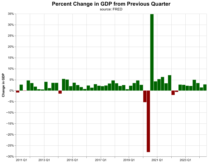
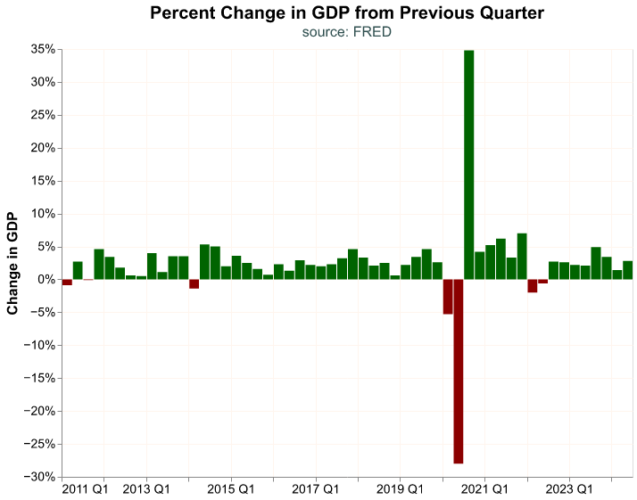
Let’s improve the chart further and color negative changes in GDP differently from positive changes. We achieve this by encoding additional information to a new channel, color. In this case, we encode a condition to color, if the data in percent_change is positive we assign the value darkgreen, otherwise the value darkred.
(
alt.Chart( change_gdp.query('date >= "2011-01-01"'),
        title = alt.Title(
          'Percent Change in GDP from Previous Quarter',
          fontSize = 18,
          subtitle = 'source: FRED')
  )
  .mark_bar()
  .encode(
    alt.X('yearquarter(date):T').title(None),
    alt.Y('percent_change:Q').title('Change in GDP')
        .axis(format='%'),
    color = alt.condition(
      alt.datum.percent_change > 0,
      alt.value('darkgreen'),
      alt.value('darkred') )
  )
  .properties(width=640, height=480)
)
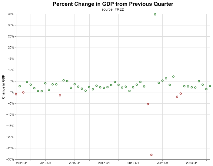
The encoding is consistent across different marks, thus it is easy to create multiple visualizations quickly and then decide which one we prefer. By changing our mark to mark_point() we create the following bubble point chart,
(
alt.Chart( change_gdp.query('date >= "2011-01-01"'),
      title = alt.Title(
        'Percent Change in GDP from Previous Quarter',
        fontSize = 18,
        subtitle = 'source: FRED')
  )
  .mark_point()
  .encode(
    alt.X('yearquarter(date):T').title(None),
    alt.Y('percent_change:Q').title('Change in GDP')
        .axis(format='%'),
    color= alt.condition(
      alt.datum.percent_change > 0,
      alt.value('darkgreen'),
      alt.value('darkred')
      )
    )
  .properties(width=640, height=480 )
)
Visualization is an important component of macroeconomic work and so is interpreting the charts. There are a lot of tools that will automatically create plots for us, but we find that creating our own charts let’s us build more original interpretations, and gives us the freedom to work outside of automated tooling. Further, we can tailor a chart to a specific format or color.
In the next section, we will take on a more complicated use case, but the end result can be applied broadly to other macro situations.
Our Own altair Theme
In altair we have the option to select the global configurations for all charts (background color, font, grid pattern, etc.) in a wholesale manner, we call this a theme. We can use different themes already created, you can find them here, but we find it best to create our own. Declaring our own theme can be quite helpful if we need to follow certain guidelines for our job—such as color palette, font choice, etc.—or if we simply want to personalize our charts, and there is the added benefit that it lets us create charts with even less lines of code, since we no longer have to specify dimensions or font sizes.
Making our own theme is straightforward, we need to define a function that returns a dictionary of configuration options. The many possible choices for configuration can be found in the documentation for altair here. The following is the theme we will use through out the book:
def PracticalMacroTheme():
    return {
        'config': {
            'view': {
                'height': 480,
                'width': 640
            },
            'mark': {
              'color': 'darkblue',
              'fontWeight': 'bold',
              'fontSize': 12
            },
            'title': {
                'fontSize': 20,
                'subtitleFontSize': 16,
                'subtitleColor': 'darkslategray'
            },
            'legend': {
              'labelFontSize': 14,
              'titleFontSize': 16
            },
            'axisY': {
                'labelFontSize': 14,
                'titleFontSize': 16,
                'gridColor': 'seashell'
            },
            'axisX': {
                'labelFontSize': 14,
                'titleFontSize': 16,
                'gridColor': 'seashell'
            }
        }
    }
The next step is to register our theme with altair so it can be recognized.
alt.themes.register('PracticalMacroTheme', PracticalMacroTheme)Once we have a theme registered, we enable it so we can use it.
alt.themes.enable('PracticalMacroTheme')After we have registered and enabled our theme, it will be applied directly to any new chart. It is possible to override the theme options by declaring new choices in the chart, otherwise they become the new “default” choices. Let’s see our GDP bar chart again with our own theme.
(
alt.Chart( change_gdp.query('date >= "2011-01-01"'),
        title = alt.Title(
          'Percent Change in GDP from Previous Quarter',
          subtitle = 'source: FRED')
  )
  .mark_bar()
  .encode(
    alt.X('yearquarter(date):T').title(None),
    alt.Y('percent_change:Q').title('Change in GDP')
        .axis(format='%'),
    color = alt.condition(
      alt.datum.percent_change > 0,
      alt.value('darkgreen'),
      alt.value('darkred') )
  )
)
Visualizing Multiple Accounts
We have been visualizing change in overall GDP, but let’s suppose we wish to see how different components of GDP have changed on a quarterly basis. We could go to FRED and pull multiple GDP components, but let’s choose the hard way and go back to our BEA file, this will give us more practice in wrangling spreadsheets, a skill that cannot be understated. Let’s take a peek at the first 10 GDP accounts.
(
BEA_file.parse(sheet_name = "T10101-Q",
                       skiprows = 7)
        .drop( columns = ['Line'] )
        .rename(columns = {'Unnamed: 1': 'Account',
                          'Unnamed: 2': 'Code'} )
        .filter( items = ['Account'] )
        .drop_duplicates()
        .head(10)
)
Account
0 Gross d...
1 Personal co...
2 Goods
3 Durable...
4 Nondura...
5 Services
6 Gross priva...
7 Fixed inv...
8 Nonresi...
9 Struc...Note how we keep only the Account column with filter() and get rid of duplicated accounts with drop_duplicates() in the code block.
Let’s process the BEA file as before and finish with a call to query() to get the top 5 GDP components which readers familiar with Keynesian macroeconomics will surely recognize: Personal consumption expenditures, Exports, Imports, Gross private domestic investment, and Government consumption expenditures and gross investment.
GDP_components = (
    BEA_file.parse(sheet_name = "T10101-Q",
                  skiprows = 7)
        .drop( columns = ['Line'] )
        .rename(columns = {'Unnamed: 1': 'Account',
                          'Unnamed: 2': 'Code'} )
        .melt(id_vars = ['Account', 'Code'],
                   var_name = 'date',
                   value_name = 'pct_change')
        .assign( percent_change = lambda df: pd.to_numeric(df['pct_change'],
                                                    errors = 'coerce')/100,
                 date = lambda df: pd.to_datetime(df['date']),
                 Account = lambda df: df['Account'].str.strip() )
        .sort_values(by = ['date'], ascending = False )
        .filter(items = ['date', 'Account', 'percent_change'] )
        .query(
          "Account == ['Personal consumption expenditures', \
                  'Exports', \
                  'Imports', \
                  'Gross private domestic investment', \
                  'Government consumption expenditures and gross investment']"
          )
)

GDP_components.head()
date Account percent_change
8625 2024-04-01 Personal co... 0.023
8630 2024-04-01 Gross priva... 0.084
8645 2024-04-01 Government ... 0.031
8639 2024-04-01 Exports 0.020
8642 2024-04-01 Imports 0.069Notice how we use the backward slash (\) in the string for query(). We do this because the string itself is quite long, we are comparing Account against a list of five items with long names. The backward slash helps us construct a long string over multiple lines, basically it tells Python that our string is not yet finished; by breaking a long string over several lines we make our code more readable.
Before we visualize the components growth, let’s clean up their names a bit since some are quite long and wouldn’t look good in a chart. We will map the values in Account to shorter versions, and for this we use the map() function where we feed it a dictionary where the key is old name and the value is the (shorter) new name. The map() method is similar to rename(), except that the former renames column values while the latter changes a column’s name. Let’s construct the dictionary and call it names_dict,
names_dict = {'Personal consumption expenditures': 'PCE',
              'Exports': 'Exports',
              'Imports': 'Imports',
              'Gross private domestic investment': 'Investment',
              'Government consumption expenditures and gross investment': 'Government'}
Now we update the values in Account by mapping the values in the dictionary.
GDP_components['Account'] = GDP_components['Account'].map(names_dict)

GDP_components.head()
date Account percent_change
8625 2024-04-01 PCE 0.023
8630 2024-04-01 Investment 0.084
8645 2024-04-01 Government 0.031
8639 2024-04-01 Exports 0.020
8642 2024-04-01 Imports 0.069Once our data is clean and organized, we are ready to start visualizing again.
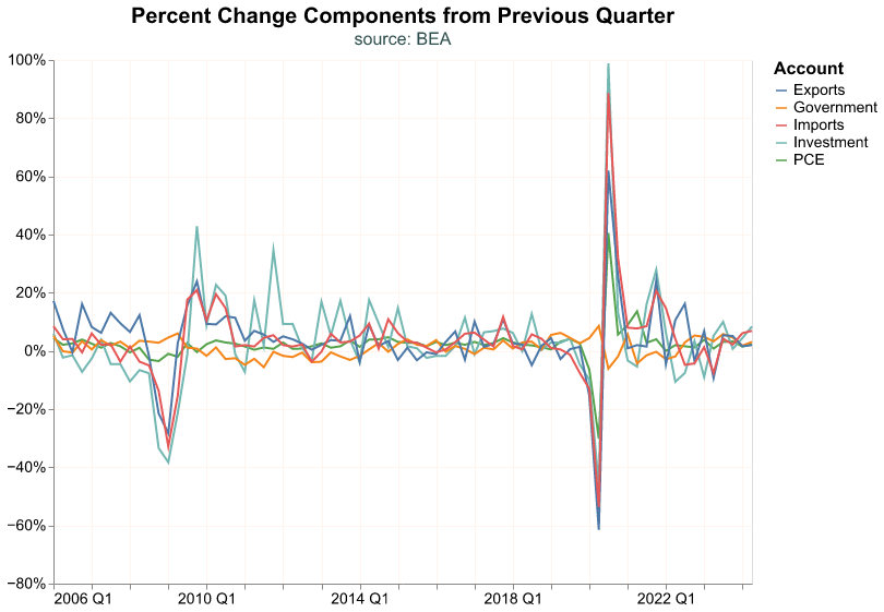
Let’s start with a line chart that includes more than one time series. Note that we encode Account to the alt.Color channel, so that each GDP component gets a different color. We use Account:N to represent that Account is a nominal variable (discrete unordered categories).
(
alt.Chart( GDP_components.query('date >= "2006-01-01"'),
    title = alt.Title(
      'Percent Change Components from Previous Quarter',
      subtitle = 'source: BEA')
  )
  .mark_line()
  .encode(
    alt.X('yearquarter(date):T').title(None),
    alt.Y('percent_change:Q').title(None)
        .axis(format='%'),
    alt.Color('Account:N')
    )
)
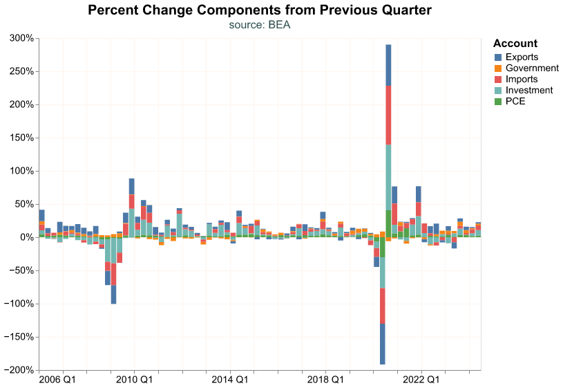
Let’s toggle to a stacked bar chart instead.
(
alt.Chart( GDP_components.query('date >= "2006-01-01"'),
    title = alt.Title(
      'Percent Change Components from Previous Quarter',
      subtitle = 'source: BEA')
  )
  .mark_bar()
  .encode(
    alt.X('yearquarter(date):T').title(None),
    alt.Y('percent_change:Q').title(None)
        .axis(format='%'),
    alt.Color('Account:N')
    )
)
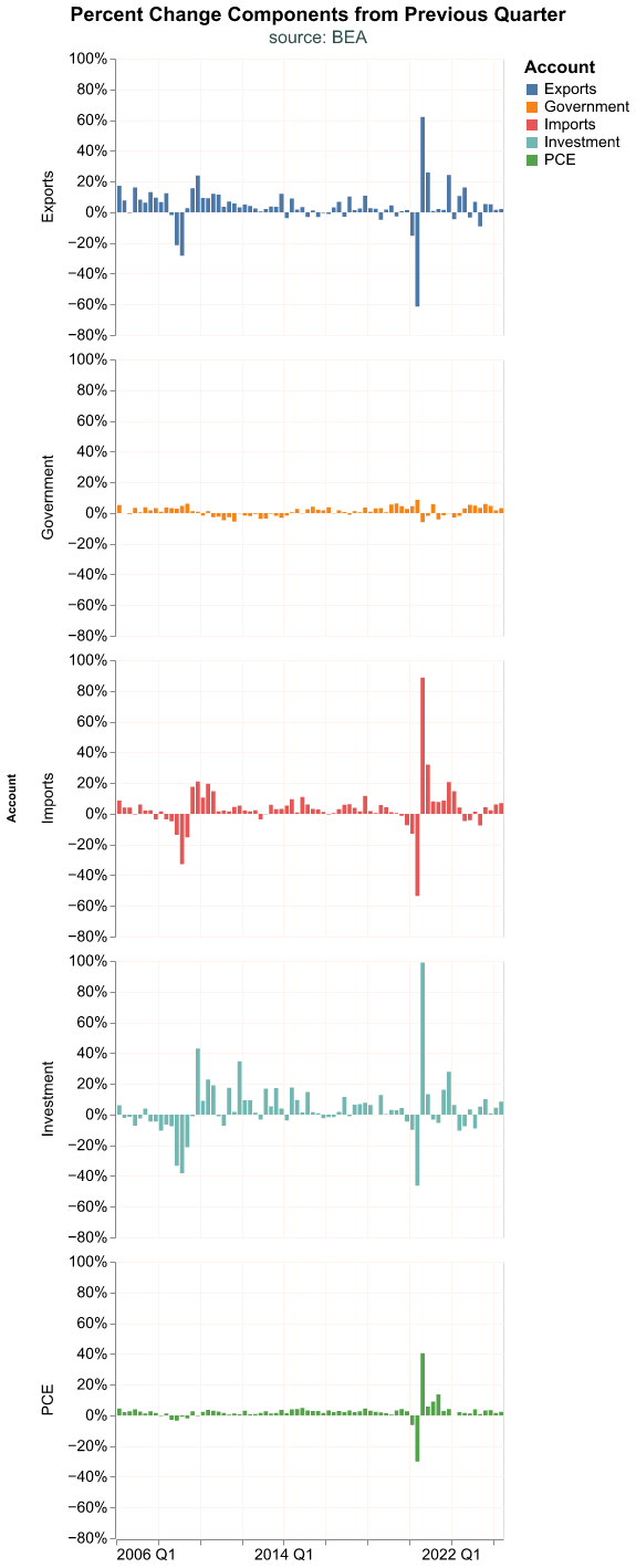
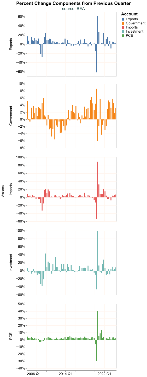
The stacked chart is misleading in this case, because the sum of the component percent changes does not equal total percent change in GDP because they are weighted. It’s probably best to make a faceted chart where we break out each component on its own. We add the alt.Row channel to the encoding where we declare the variable we want to use to separate the chart in rows. There is a similar encoding alt.Column that serves to separate a chart into columns.
(
alt.Chart( GDP_components.query('date >= "2006-01-01"'),
title = alt.Title(
        'Percent Change Components from Previous Quarter',
        fontSize=18,
        subtitle = 'source: BEA',
        anchor='middle') )
  .mark_bar()
  .encode(
    alt.X('yearquarter(date):T').title(None),
    alt.Y('percent_change:Q').title(None)
        .axis(format='%') ,
    alt.Color('Account:N'),
    alt.Row('Account:N').header(labelFontSize=14)
    )
  .properties(width=350, height=250)
)
Faceted charts default to using a common scale for all the components, which can make it hard to see the changes in some GDP components. Observe how different the charts look when each component has it’s own scale. With resolve_scale() we can declare the y-axis of each facet as independent.
(
alt.Chart( GDP_components.query('date >= "2006-01-01"'),
  title = alt.Title(
        'Percent Change Components from Previous Quarter',
        fontSize=18,
        subtitle = 'source: BEA',
        anchor='middle') )
  .mark_bar()
  .encode(
    alt.X('yearquarter(date):T').title(None),
    alt.Y('percent_change:Q').title(None)
        .axis(format='%') ,
    alt.Color('Account:N'),
    alt.Row('Account:N').header(labelFontSize=14)
    )
  .properties(width=350, height=250)
  .resolve_scale(y='independent')
)
We can now appreciate better the change for each component but this improvement might come at a cost. With each facet using its own scale, at first sight it might seem that Government expenditures are quite volatile, which is actually not true once we consider the y-axis scale.
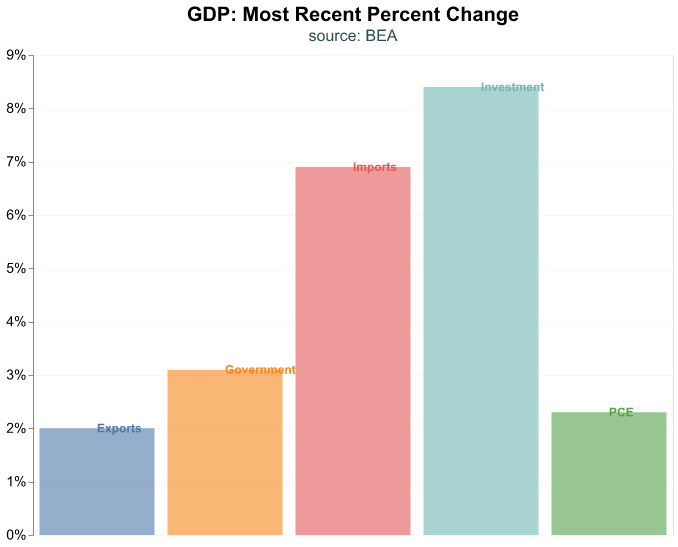
Let’s focus on the most recent quarter and make a bar plot where we label directly each bar. We achieve this by layering two plots—think of this like making a chart on top of another one—where one chart is for the bars and another one for the labels. Layering charts is a useful technique, the basic idea is to make multiple charts that share the same data and some (though not all) encodings, and create a single plot of them. In the code below, we create two named plots (bars_plot and labels_plot) and then create the layer.
Note that in bars_plot we feed the dataframe of our GDP components but we lookup only the rows where date is its maximum value, thus we only keep the most recent date. Then we use an opacity argument in mark_bar(), this controls how translucent the bars are and goes from 0 (complete translucent) to 1 (solid); many times when we layer charts we have to play around with this argument to make all layers visible.
Note that we do not feed a dataframe to labels_plot, but instead refer to bars_plot and then declare a different mark and encoding. Since we want to layer the name of the GDP component, we use mark_text() and we encode the Account as text.
The last line in the code snippet layers the two charts into a single plot with the layer method.
# first plot
bars_plot = (
  alt.Chart(GDP_components.query('date == date.max()'),
      title = alt.Title(
        'GDP: Most Recent Percent Change',
        subtitle='source: BEA' )
  )
  .mark_bar(opacity = 0.6)
  .encode(
    alt.X('Account:N').title(None)
        .axis(None),
    alt.Y('percent_change:Q').title(None)
        .axis(format='%'),
    alt.Color('Account:N').legend(None)
  )
)

# second plot
labels_plot = (
  bars_plot
  .mark_text(
    align='left',
    baseline='middle')
  .encode(text='Account:N')
)

# layer
alt.layer(bars_plot, labels_plot)
These exploratory charts are not complicated but they are important for laying the foundation of our visualization toolkit and our ability to communicate about time series. Each of these paradigms could be applied again to the next subcomponent of GDP, for example, to more deeply understand the components of PCE.
Distributional Charts
Time series charts are useful because we can visualize a series long run behavior or how it responds to a particular economic shock. For instance, we can see how each GDP top level component reacted to the Covid-19 shock in 2020.
Let’s change our visualization strategy and investigate the distribution of the quarterly percent changes of our top level GDP components, this way we can see if they roughly follow a normal distribution, if outliers are important to a series, etc. For these charts, we will not be plotting our data as a time series—meaning as a practical matter date will not be on the x-axis and we will not be observing a trend over time.
We begin with a boxplot of the percent changes of GDP components. A boxplot is common chart in the world of economics as it allows us to view key summary statistics of a distribution:
- outliers to the downside
- the first quartile (25th percentile)
- the median
- the third quartile (75th percentile)
- outliers to the upside
The range between the 25th and 75th percentile is called the interquartile range (the IQR). In a boxplot, the IQR generally forms the box and two lines extend from the box to a minimum and maximum boundary. Those lines are sometimes called whiskers, and a boxplot is sometimes called a “box and whiskers” plot.
The minimum and maximum boundary are meant to exclude outliers, so how are they calculated? The most common case is the “1.5 rule” whereby the minimum boundary is the first quartile (25th percentile) minus 1.5 \(\times\) IQR and the maximum boundary is the third quartile (75th percentile) + 1.5 \(\times\) IQR. Any points outside those minima and maxima boundary are plotted as outliers.
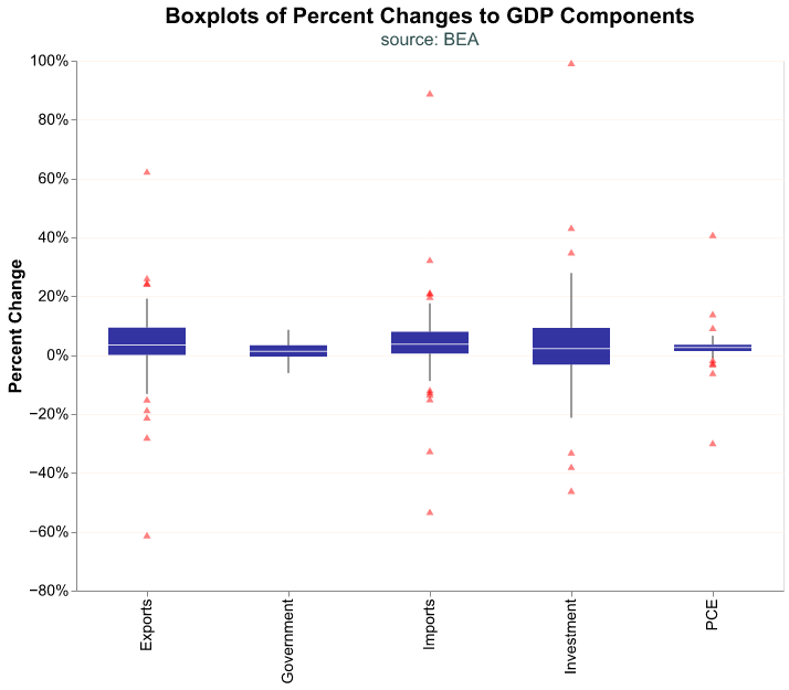
To make a boxplot in altair all we have to modify is our mark to mark_boxplot(). We include several arguments that relate to the size and transparency of the box, and then the side, color, transparency, and shape of the outliers.
(
alt.Chart(GDP_components.query('date >= "2000-01-01"'),
    title = alt.Title(
      'Boxplots of Percent Changes to GDP Components',
      subtitle='source: BEA')
    )
   .mark_boxplot(size = 70,
                 opacity = 0.8,
                 outliers={'size': 12,
                           'color': 'red',
                           'opacity': 0.5,
                           'shape': 'triangle'})
   .encode(
      alt.X('Account:N').title(None),
      alt.Y('percent_change:Q').title('Percent Change')
        .axis(format='%'),
    )
)
Note how a boxplot gives us quick information about distributional properties. We can see that the Governments and PCE components of GDP have very small variations (their boxes are quite narrow) and the former has no outliers at all. On the other hand, Investment seems to be quite volatile.
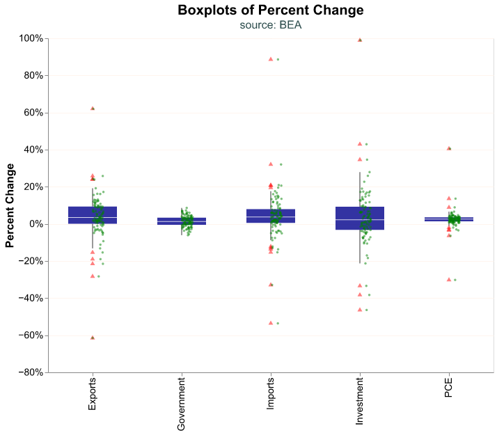
We can make our boxplot more complete by including all the data points for each category as a cloud. This can make sense when our dataset is not too large, as is the case here. To create this chart we need to layer two plots, the boxplot and the data cloud. In the code snippet below we create box_plot as above and then layer the cloud of points in jitter_plot where we have to jitter each point (this means move slightly) so they do not overlap and we can distinguish each observation. The jitter is achieved by the alt.XOffset() function in the encoding, and we use a random transformation to offset each observation by a small random amount. The scale method to alt.XOffset() controls how small the random perturbation is, depending on how many data points we have we may need to play around with this parameter to make the cloud visible.
box_plot = (
alt.Chart(GDP_components.query('date >= "2000-01-01"'),
    title=alt.Title('Boxplots of Percent Change',
      subtitle = 'source: BEA')
  )
   .mark_boxplot(size = 70,
                 opacity = 0.8,
                 outliers={'size': 12,
                           'color': 'red',
                           'opacity': 0.5,
                           'shape': 'triangle'})
   .encode(
      alt.X('Account:N').title(None),
      alt.Y('percent_change:Q').title('Percent Change')
        .axis(format='%'),
   )
)

jitter_plot = (
alt.Chart(GDP_components.query('date >= "2000-01-01"'))
   .mark_circle(opacity = 0.5, size = 12, color='green')
   .encode(
      alt.X('Account:N').title(None),
      alt.Y('percent_change:Q').title('Percent Change')
         .axis(format='%'),
      alt.XOffset('my_jitter:Q').scale(domain=(-4,4))
   )
   .transform_calculate(my_jitter = 'random()')
)

alt.layer(box_plot, jitter_plot)
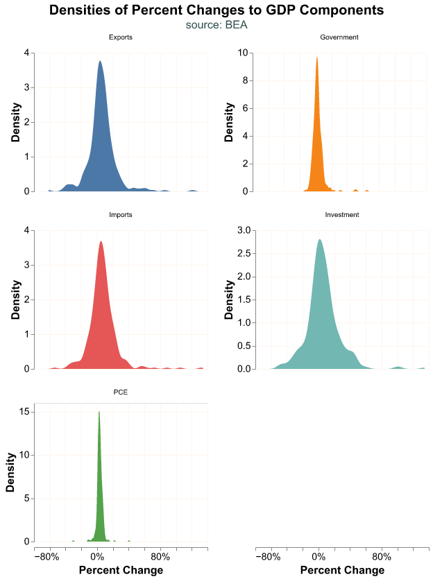
We can also plot the smoothed density estimates of each GDP component. altair has several transformation functions which take the original dataframe and transform one or several of its variables. transform_density() obtains the density from a variable, in this case percent_change, and the as_ input represents what we want to call the transformed data which is the name we use to plot in y-axis in alt.Y(). We use the facet() function where we declare the variable we want to use to separate the charts and how many columns (or rows) we desire; this is an alternative to using the Row or Column encoding. For a faceted chart, the top-level title is an input to the facet() argument.
(
alt.Chart(GDP_components)
   .transform_density(density = 'percent_change',
                      as_=['percent_change', 'Density'],
                      groupby=['Account'])
   .mark_area()
   .encode(
      alt.X('percent_change:Q').title('Percent Change')
          .axis(format='%'),
      alt.Y('Density:Q'),
      alt.Color('Account:N').legend(None)
    )
   .properties(width=250, height=200)
   .facet(alt.Facet('Account:N').title(None),
      columns = 2,
      title = alt.Title('Densities of Percent Changes to GDP Components',
        subtitle='source: BEA',
        anchor='middle') )
   .resolve_scale(y='independent')
)
Note how Government has almost no density to the left of 0%, while Investment has a much spread out distribution. PCE has a very narrow density, most of it slightly positive. This is what we expect, Government expenditures tend to not decrease, it is hard for personal consumption to vary much from quarter to quarter, but private investment responds very strongly to economic conditions.
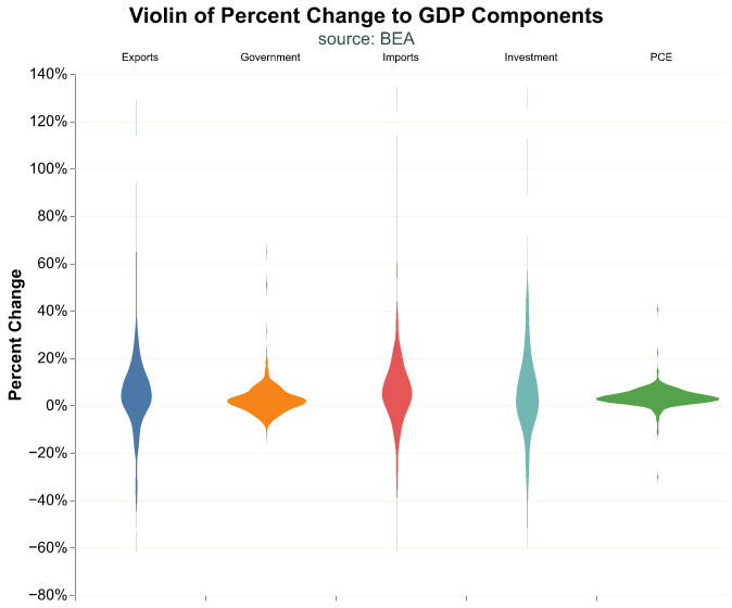
Another effective plot is the violin chart, which is a combination of a box plot and a density plot. In this case the density is flipped, the width of the violin represents the smoothed density. Formatting a violin plot can be tricky, so we use a few additional arguments in our code to get the look we want in the chart.
(
alt.Chart(GDP_components,
  title = alt.Title('Violin of Percent Change to GDP Components',
      subtitle='source: BEA',
      anchor='middle')
  )
   .transform_density(density = 'percent_change',
                      as_=['percent_change', 'density'],
                      groupby=['Account'])
    .mark_area(orient = 'horizontal')
    .encode(
      alt.X('density:Q').title(None)
          .stack('center')
          .impute(None)
          .axis(labels=False, values=[0], grid=False, ticks=True),
      alt.Y('percent_change:Q').title('Percent Change')
          .axis(format='%') ,
      alt.Color('Account:N').legend(None),
      alt.Column('Account:N').title(None)
    )
    .properties(width=120)
    .configure_facet(spacing=0)
    .configure_view(stroke=None)
)
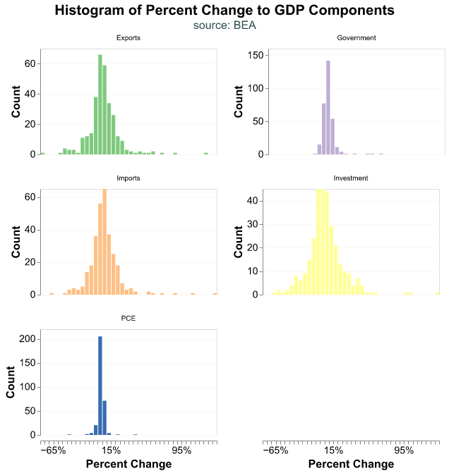
Finally we can display our data as a histogram instead of a smoothed density and place our observations into discrete bins. In this plot we use count() as the variable in y-axis so that the bars represent the binned count of the variable in the x-axis. Note that we use a scale method in alt.Color so we can pick the color palette to use, though this is a personal preference.
(
alt.Chart(GDP_components)
    .mark_bar(orient = 'horizontal')
    .encode(
      alt.X('percent_change:Q').title('Percent Change')
          .axis(format='%')
          .bin(maxbins=50),
      alt.Y('count()').title('Count'),
      alt.Color('Account:N').legend(None)
          .scale(scheme='accent')
    )
    .properties(width=250, height=150)
    .facet(alt.Facet('Account:N').title(None),
      columns=2,
      title = alt.Title('Histogram of Percent Change to GDP Components',
      subtitle='source: BEA',
      anchor='middle')
    )
    .resolve_scale(y='independent')
)
Relationship Between Two Components
Next let’s suppose we wish to explore the relationship between the change in two components of GDP.
To explore this relationship we first need to re-wrangle our data. We want to treat two accounts as different variables, not as different groups, so let’s pivot() our dataframe and put each account into its own column.
(
GDP_components.pivot(index = 'date',
                    columns = 'Account',
                    values = 'percent_change')
              .reset_index()
              .head()
)
Account date Exports Government Imports Investment PCE
0 1947-04-01 -0.049 -0.003 0.081 -0.273 0.068
1 1947-07-01 -0.188 0.000 -0.382 -0.113 0.013
2 1947-10-01 -0.382 -0.031 0.232 1.030 0.001
3 1948-01-01 -0.171 0.061 0.619 0.478 0.020
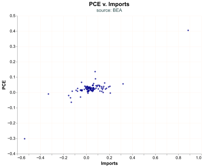
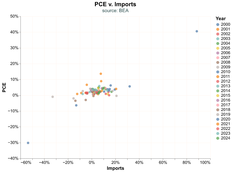
4 1948-04-01 -0.325 0.149 0.168 0.271 0.047Suppose we wish to study the relationship between PCE and Imports since the year 2000. As a first attempt we can create a scatter plot and put PCE on the y-axis and Imports on the x-axis.
(
alt.Chart(
  GDP_components.pivot(index = 'date',
                      columns = 'Account',
                      values = 'percent_change')
                .reset_index()
                .query("date >= '2000-01-01'"),
  title = alt.Title('PCE v. Imports',
      subtitle='source: BEA')
  )
  .mark_circle()
  .encode(
    alt.X('Imports:Q'),
    alt.Y('PCE:Q')
  )
)
Let’s add a few bells and whistles to the chart, start with coloring the dots by the year of the observation and choosing their size. When we feed the dataframe we create a date_yr column to represent the year of the observation and note we define it as an unordered categorical variable (this is the :N suffix), otherwise altair will consider it a continuous variable and assign a color gradient instead of a discrete scale.
(
alt.Chart(
  GDP_components.pivot(index='date',
                      columns='Account',
                      values='percent_change')
                .reset_index()
                .query("date >= '2000-01-01'")
                .assign(date_yr = lambda df: df['date'].dt.year ),
  title = alt.Title('PCE v. Imports',
      subtitle='source: BEA')
  )
  .mark_circle(size=70)
  .encode(
    alt.X('Imports:Q').axis(format='%'),
    alt.Y('PCE:Q').axis(format='%'),
    alt.Color('date_yr:N').title('Year')
  )
)
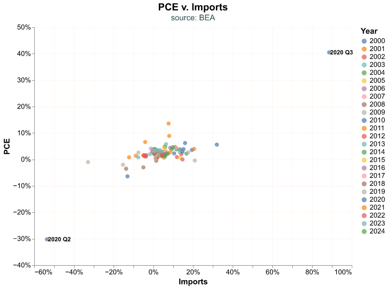
Look at the observations in the left and right corners. It seems natural to wonder when did those outliers occur. Let’s add a second layer to our plot where we add this information. These extreme points are the maximum and minimum of the Imports variables, and this is how we are able to pinpoint them in our data.
We label the outliers by layering a second plot on top of our scatter plot. In the code snippet below, points_plot is the scatter plot layer while labels_plot is the text. Note how we find the extreme observations in labels_plot, we call a query where Imports is at either its maximum or minimum value. The dx argument in mark_text() serves to move the label horizontally so we can read it better next to its bubble; many times this value must be chosen by trial and error.
points_plot = ( alt.Chart(
  GDP_components.pivot(index='date',
                      columns='Account',
                      values='percent_change')
                .reset_index()
                .query("date >= '2000-01-01'")
                .assign(date_yr = lambda df: df['date'].dt.year ),
  title = alt.Title('PCE v. Imports',
      subtitle='source: BEA')
  )
  .mark_circle(size=70)
  .encode(
    alt.X('Imports:Q').axis(format='%'),
    alt.Y('PCE:Q').axis(format='%'),
    alt.Color('date_yr:N').title('Year')
  )
)

labels_plot = ( alt.Chart(
  GDP_components.pivot(index='date',
                      columns='Account',
                      values='percent_change')
                .reset_index()
                .query("date >= '2000-01-01'")
                .query("(Imports == Imports.max()) | (Imports == Imports.min())")
  )
  .mark_text(
    align='left',
    baseline='middle',
    dx=2
  )
  .encode(
    alt.X('Imports:Q').axis(format='%'),
    alt.Y('PCE:Q').axis(format='%'),
    alt.Text('yearquarter(date):T')
  )
)

alt.layer(points_plot, labels_plot)
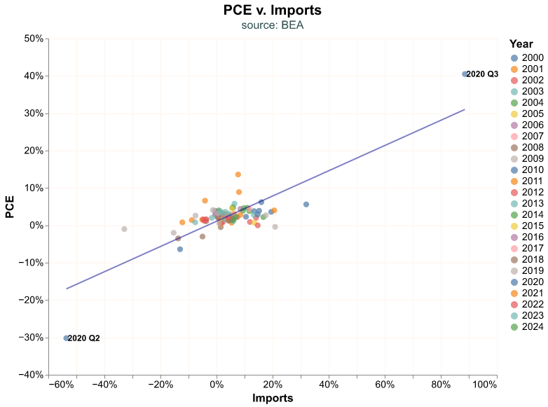
Our extreme observations are from Q2 and Q3 2020, which is when the economy was completely shutdown and then reopened, resulting in extreme quarter-on-quarter fluctuation.
Unsurprisingly, there seems to be a relationship between Imports and PCE; as we buy more stuff, some of the additional products we consume are imported. Let’s add a regression line to the chart to emphasize this relation, this becomes our third layer in the chart. We create this additional layer with the transform_regression function and we add it to the chart as any other layer. One of the reasons we like the altair library is that you can layer as many plots as you like, creating seemingly complicated charts by just layering each one independently.
Recession Use Case
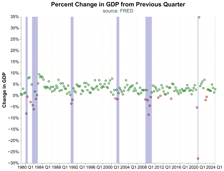
Before we conclude our section on visualization, let’s create a function for adding economic recession shading to our charts, this is quite a common layer in most time series plots.
The first step is to obtain dates when recessions start and end. The National Bureau of Economic Research (NBER) is the official/unofficial entity that assigns recession dates. We can obtain these dates from FRED with the USREC id, the data we pull is a dummy variable (only takes two values) that is 1 when the economy is in a recession and 0 otherwise.
Rec_dt = pdr.get_data_fred('USREC', start = '1979-01-01')
Rec_dt.head()
USREC
DATE
1979-01-01 0
1979-02-01 0
1979-03-01 0
1979-04-01 0
1979-05-01 0To create a recession layer in our charts we need the dates recessions begin and end. The data we obtain from FRED gives us a time series indicator, which is not exactly what we need but we can use it to get there. The trick here is to get the start and end date of the recession as a new dataframe, and then we can pass these dates as the start and end of a rectangle shading.
We find the date when a recession starts by finding the rows in the dataframe where USREC is 1 and its prior value (USREC.shift()) is 0—the prior month was not a recession but this month is—and the end of the recession is found going the other way.
pd.DataFrame({
  'start_dt': Rec_dt.query('(USREC==1) & (USREC.shift()==0)')
                    .reset_index()
                    ['DATE'],
  'end_dt': Rec_dt.query('(USREC==0) & (USREC.shift()==1)')
                  .reset_index()
                  ['DATE']
} )
start_dt end_dt
0 1980-02-01 1980-08-01
1 1981-08-01 1982-12-01
2 1990-08-01 1991-04-01
3 2001-04-01 2001-12-01
4 2008-01-01 2009-07-01
5 2020-03-01 2020-05-01Now we can create a rectangle layer with mark_rect() based on the start (encoding x) and the end (x2) dates of recessions. We create this plot and assign it to an object, recession_shade, and then we can include it in any time series chart by adding it as a layer. Note that we include a value for opacity so that the recession layer does not obstruct the main chart, and a boolean True value for clip so that later we can clip recession_shade to fit smaller x-axis scales (i.e. when we layer it on a series that begins after 2000).
recession_shade = (
  alt.Chart( pd.DataFrame({
    'start_dt': Rec_dt.query('(USREC==1) & (USREC.shift()==0)')
                      .reset_index()
                      ['DATE'],
    'end_dt': Rec_dt.query('(USREC==0) & (USREC.shift()==1)')
                    .reset_index()
                    ['DATE']
    } )
  )
  .mark_rect(opacity = 0.25, clip=True)
  .encode(
    x = 'start_dt:T',
    x2 = 'end_dt:T'
  )
)
Once we have prepared the recession_shade layer, we can add it to a plot just like we would any other layer. Let’s layer it on top of the bubble plot for quarterly GDP changes we did above.
bubble = (
alt.Chart(change_gdp,
    title=alt.Title('Percent Change in GDP from Previous Quarter',
      subtitle='source: FRED')
  )
  .mark_point()
  .encode(
    alt.X ('yearquarter(date):T').title(None),
    alt.Y('percent_change:Q').title('Change in GDP')
         .axis(format='%') ,
    color=alt.condition(
      alt.datum.percent_change > 0,
      alt.value('darkgreen'),
      alt.value('darkred')
    )
  )
)

alt.layer(bubble, recession_shade)
The shaded rectangles work great to highlight recession periods, and this is a classic use in macroeconomic charts. However, keep in mind that the same workflow and layering approach work when we want to highlight other periods or events (such as changes in laws, regulation, geopolitical events, etc.).
Realized vs. Expected GDP
GDP is a crucial macroeconomic indicator, however in financial markets the expected GDP may be even more important. Market participants make decisions today based on where they believe the economy will be tomorrow. Participants make investment decisions based on their current expectations and then may revise their portfolios when the actual (or realized) data is released. How can we estimate the expected GDP? Typically there are two ways: we can survey economic experts and directly ask them what they expect, or we can use a mathematical model that gives us a (hopefully good) forecast. Fortunately for us, we can easily access both types of expected GDP.
Since 1968, the Federal Reserve Bank of Philadelphia conducts a quarterly survey of macroeconomic forecasts, commonly called the Survey of Professional Forecasters (SPF) since all participants are market professionals. The results are posted in the Philadelphia Fed’s website (https://www.philadelphiafed.org/surveys-and-data/real-time-data-research/survey-of-professional-forecasters) as Excel spreadsheets that are easily accessible.
In a more recent effort the Federal Reserve Bank of Atlanta has created a mathematical model to forecast GDP that is updated in real time as other economic indicators are released. The Atlanta Fed call their estimate the GDPNow since it incorporates the most up to date economic information in its construction. The GDPNow is a purely mathematical model and as such it is a great complement to the SPF, more information about its construction can be found in the Atlanta Fed’s website (https://www.atlantafed.org/cqer/research/gdpnow).
Before we move forward and pull data for the SPF and GDPNow we have to make an important point about how the GDP information is released. The BEA releases quarterly GDP data roughly one month after the quarter ended—for the first quarter of the year the BEA would release GDP data on April—but this is called an advanced estimate because some of the GDP components, such as imports and exports, have not been properly collected and are instead being estimated. The advanced estimate goes through two monthly revisions (in May and June in our example of the first quarter), called the Second and Third estimate, until it is considered finalized in a Fourth monthly revision (July). Hence, the first estimate of GDP released to the market can go through multiple revisions that may increase or decrease its value, and in FRED we only have the GDP after its final (or most recent) revision. Thus, the estimate of GDP that market participants see in its first release may be quite different from the one we have in FRED, this is an important point to keep in mind if we are trying to gauge what the market reaction was a particular GDP release.
We will pull the GDPNow estimate from the Atlanta Fed website which makes it available as an Excel file, and in addition it contains the advanced estimate for the realized GDP and the exact date when it was released to the market. The Excel file is in the following url https://www.atlantafed.org/-/media/documents/cqer/researchcq/gdpnow/GDPTrackingModelDataAndForecasts.xlsx, let’s load it into an object (note that we use the backward slash \ because the url is too long for one line)
GDPnow_url='https://www.atlantafed.org/-/media/documents/cqer/researchcq/' \
          'gdpnow/GDPTrackingModelDataAndForecasts.xlsx'
We can read the Excel file into Python directly from its url. In addition, because we only need one spreadsheet (or tab) from the file, the one names TrackRecord, we will read it directly into a dataframe with the read_excel method. To contrast with what we did earlier with the BEA Excel file on GDP, in that case we read the file with all of its spreadsheets using the ExcelFile function and then parsed one specific spreadsheet into a dataframe; this workflow is useful when we need more than one spreadsheet from an Excel file, which is not the case here. Further, we will only read the first four columns of the spreadsheet, columns A to D, and assign them names; this is not absolutely necessary, but it makes for a clean workflow.
GDPnow = (
    pd.read_excel(GDPnow_url,
        sheet_name = 'TrackRecord',
        usecols='A:D',
        names = ['Forecast_period','GDPNow','GDP_Advance','Release_date'])
)

GDPnow.head()
Forecast_period GDPNow GDP_Advance Release_date
0 2024-06-30 2.613167 2.80000 2024-07-25
1 2024-03-31 2.704694 1.58969 2024-04-25
2 2023-12-31 2.383414 3.30000 2024-01-25
3 2023-09-30 5.405217 4.87801 2023-10-26
4 2023-06-30 2.412576 2.41429 2023-07-27Here we have the period for when the forecast is being made, the GDPNow forecast, the realized GDP advanced estimate, and the day when it was released to the market.
Let’s now pull the median forecast for GDP growth from the Philadelphia Fed’s SPF, the Excel file for this forecast is https://www.philadelphiafed.org/-/media/frbp/assets/surveys-and-data/survey-of-professional-forecasters/data-files/files/median_rgdp_growth.xlsx and we can read it directly into a dataframe.
# SPF url
SPF_url='https://www.philadelphiafed.org/-/media/frbp/assets/' \
    'surveys-and-data/survey-of-professional-forecasters/' \
    'data-files/files/median_rgdp_growth.xlsx'

# read to dataframe
GDP_SPF = pd.read_excel(SPF_url)

GDP_SPF.head()
YEAR QUARTER DRGDP2 ... DRGDP4 DRGDP5 DRGDP6
0 1968 4 2.6103 ... 2.2358 4.3318 4.0370
1 1969 1 3.0911 ... 3.3138 4.2332 NaN
2 1969 2 3.0111 ... 2.4387 1.5328 NaN
3 1969 3 1.0399 ... 1.4055 2.4454 NaN
4 1969 4 0.1588 ... 0.5511 2.4729 3.1003
[5 rows x 7 columns]The column strangely named DRGDP2 represents the median forecast for GDP growth for the combination of YEAR and QUARTER. We need to construct a proper YYYY-MM-DD date variable that represents the end period of the YEAR and QUARTER combination, and in addition give a proper name to the DRGDP2 variable. The snippet below achieves that by transforming the YEAR and QUARTER variables to strings, concatenating them, and then adding a QuarterEnd offset that makes the date be the last day of the quarter (otherwise it would be the first day of the quarter).
GDP_SPF = ( GDP_SPF
  .assign(Forecast_period = lambda df: pd.to_datetime(df['YEAR'].astype('str')
                                          + 'Q'
                                          + df['QUARTER'].astype('str'))
                                          + pd.offsets.QuarterEnd() )
  .rename(columns = {'DRGDP2': 'GDP_Philly'})
)
Let’s now merge this forecast from the SPF with the GDPNow and realized value of GDP.
GDP_forecast = pd.merge(
        GDPnow,
        GDP_SPF.filter(items=['Forecast_period','GDP_Philly']),
        on = 'Forecast_period')
Before we make a plot, let’s look at the correlation between the realized GDP and its two expectations.
GDP_forecast.filter(items = ['GDP_Advance','GDPNow','GDP_Philly']).corr().round(4) GDP_Advance GDPNow GDP_Philly
GDP_Advance 1.0000 0.9872 0.9305
GDPNow 0.9872 1.0000 0.9094
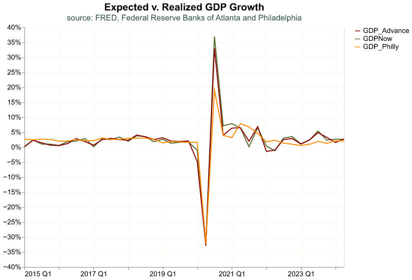
GDP_Philly 0.9305 0.9094 1.0000The two forecasts track the realized value of GDP quite closely, reassuring us that they are good measures of expectations. Nevertheless, the GDPNow estimate seems to track closer the realized GDP.
Let’s now make a plot where we can observe their time series behavior. We will first make the data long—recall that this how altair prefers data—and then chart them beginning in 2015.
# data to long
GDP_forecast_long = ( GDP_forecast
    .melt(id_vars = ['Forecast_period', 'Release_date'],
        var_name = 'Estimate',
        value_name = 'Value')
    .assign(Value = lambda df: df['Value']/100)
)

# plot
(
alt.Chart(GDP_forecast_long.query('Forecast_period>="2015-01-01"'),
        title = alt.Title('Expected v. Realized GDP Growth',
        subtitle = 'source: FRED, Federal Reserve Banks of Atlanta and Philadelphia'))
    .mark_line()
    .encode(
        alt.X('yearquarter(Forecast_period):T').title(None),
        alt.Y('Value:Q').title(None)
            .axis(format='%'),
        alt.Color('Estimate:N').title(None)
            .scale(domain = ['GDP_Advance', 'GDPNow', 'GDP_Philly'],
                  range = ['darkred', 'darkolivegreen', 'darkorange'])
    )
)
Here we can confirm the result from the correlation table. It seems the estimate from the SPF is just slightly off, where it does not track the realized GDP as well since the Covid-19 shock of 2020, whereas the GDPNow expectation is very close to the real value. We will return to this difference between expected and realized GDP growth when we analyze stock market returns and how it reacts to GDP releases that are surprising, that is the expected and realized value differ significantly.
International Comparison
So far we have looked at GDP for only one country, the United States, but this macroeconomic aggregate is fundamental for any economy. In principle, we can replicate the previous workflow for any country, as long as we can find the data.
Lucky for us, international organizations such as the World Bank, the International Monetary Fund, or the Bank for International Settlements, collect a lot of information about the world economy and financial markets. Here we will access the World Bank’s World Development Indicators (WDI) to pull data for GDP growth for international economies. We could access the WDI by visiting its website (https://databank.worldbank.org/home.aspx), but fortunately pandas_datareader allows us to access the WDI directly from our Python environment.
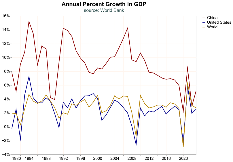
The WDI contains a variety of indicators and all of them have their unique ID, which is a mnemonic that rarely makes sense. We have to navigate to the WDI website and search in its toolbar for the series we need, and we find its ID in its details. The mnemonic for annual GDP is NY.GDP.MKTP.KD.ZG, we’ll pull this series for the United States, China, and the whole world. In the code snippet below, we first import the module that allows us to pull data from the WDI, and then we download the annual GDP growth from 1980 to 2022; note that we provide a list of three countries according to two digit ISO conventions, and the 1W code is for the whole world.
# Module to pull WDI data
from pandas_datareader.wb import download

# pull annual GDP growth
GDP_wb = (
   download(indicator = 'NY.GDP.MKTP.KD.ZG',
            country = ['CN','US','1W'],
            start='1980-01-01',
            end='2023-12-31')
        .reset_index()
        .rename(columns={'NY.GDP.MKTP.KD.ZG': 'GDP_growth'})
        .assign(GDP_growth = lambda df: df['GDP_growth']/100)
)

# first rows
GDP_wb.head()
country year GDP_growth
0 China 2023 0.052000
1 China 2022 0.029891
2 China 2021 0.084485
3 China 2020 0.022386
4 China 2019 0.059505The data we pull is already in long format and thus it’s a cinch to make a chart.
(
alt.Chart(GDP_wb,
    title=alt.Title('Annual Percent Growth in GDP',
      subtitle='source: World Bank')
  )
  .mark_line()
  .encode(
    alt.X ('year:T').title(None),
    alt.Y('GDP_growth:Q').title(None)
        .axis(format='%') ,
    alt.Color('country:N').title(None)
        .scale(domain = ['China', 'United States', 'World'],
              range = ['darkred', 'darkblue', 'darkgoldenrod'])
  )
)
The U.S. growth rate tracks the world’s rate closely, a little bit faster in the 1990s and a little slower in the 2010s, this makes sense since the U.S. is the largest economy in the world. China, on the other hand, grows much faster from the early 1990s to the late 2010s, even reaching double digit GDP growth in several years. However, since the global financial crisis its growth rate has decelerated noticeably.
Important market commentators, such as Michael Pettis and Adam S. Posen, believe that imbalances in the Chinese economy represent an important challenge for its future growth.4 In their view, a serious structural challenge that China faces is that its economic model is based on fixed capital investment (think of this like buildings, roads, bridges, etc.). As a percentage of GDP they invest a lot more than the U.S. or the average country, for most advanced economies consumption is the main driver of GDP but not in China. The challenge is that over time fixed capital investment may suffer from decreasing marginal returns (i.e. bridges to nowhere) which severely impacts overall growth.
A proper analysis of the Chinese macroeconomy is way outside of the scope of this book, but let’s do some quick charts along the lines suggested by Pettis and Posen using data from the WDI. Let’s pull the series for fixed capital investment as a percentage of GDP for China, the U.S., and the world and see how they compare. The ID for this series is NE.GDI.FTOT.ZS
Inv_wb = (
   download(indicator = 'NE.GDI.FTOT.ZS',
            country = ['CN','US','1W'],
            start='1980-01-01',
            end='2023-12-31')
        .reset_index()
        .rename(columns={'NE.GDI.FTOT.ZS': 'Investment'})
        .assign(Investment = lambda df: df['Investment']/100)
)
And now we do a plot.
(
alt.Chart(Inv_wb,
    title=alt.Title('Fixed Capital Investment as Percent of GDP',
      subtitle='source: World Bank')
  )
  .mark_line()
  .encode(
    alt.X ('year:T').title(None),
    alt.Y('Investment:Q').title(None)
        .axis(format='%').scale(zero=False) ,
    alt.Color('country:N').title(None)
        .scale(domain = ['China', 'United States', 'World'],
              range = ['darkred', 'darkblue', 'darkgoldenrod'])
  )
)
Here we see the point that Pettis and others make: China’s fixed capital investment, as percent of GDP, is about twice the U.S. and world’s rate; and this imbalance seems to be growing over time. For completeness sake, let’s now pull household consumption as percent of GDP (the ID is NE.CON.PRVT.ZS) and chart it over the years.
Cons_wb = (
   download(indicator = 'NE.CON.PRVT.ZS',
            country = ['CN','US','1W'],
            start='1980-01-01',
            end='2023-12-31')
        .reset_index()
        .rename(columns={'NE.CON.PRVT.ZS': 'Consumption'})
        .assign(Consumption = lambda df: df['Consumption']/100)
)
(
alt.Chart(Cons_wb,
title=alt.Title('Household Consumption as Percent of GDP',
subtitle='source: World Bank')
)
.mark_line()
.encode(
alt.X ('year:T').title(None),
alt.Y('Consumption:Q').title(None)
.axis(format='%').scale(zero=False) ,
alt.Color('country:N').title(None)
.scale(domain = ['China', 'United States', 'World'],
range = ['darkred', 'darkblue', 'darkgoldenrod'])
)
)Here we observe the opposite story. Household consumption in the U.S. comprises around two thirds of GDP and seems to be growing in importance over time, whereas in China it is close to one third and decreasing over time.
As mentioned above, the purpose of this section is not to make a proper macroeconomic analysis of China and the U.S., but rather to show how, with the right tools, it is quite easy to access data on international economies and get started on such analysis.
Conclusion
This concludes our introduction to GDP data, importing from FRED and the World Bank’s WDI, wrangling and data visualization. The amazing thing to us is that FRED has 800,000 data series and the WDI has over 1,400 series for more than 200 countries, and we can use the exact code flow we just reviewed to work with the majority of them. We will revisit FRED data many more times, but for now let’s move to a different source and type of data and dig into the stock market.
Footnotes
For a primer on GDP see https://www.bea.gov/resources/methodologies/nipa-handbook↩︎
The documentation for
pandascan be found at https://pandas.pydata.org/. The book Python for Data Analysis by Wes McKinney provides an excellent overview of the library.↩︎The documentation for this package is found at https://pandas-datareader.readthedocs.io↩︎
More background can be found in Michael Pettis’ blogpost at https://carnegieendowment.org/chinafinancialmarkets/89466 and the article “The End of China’s Economic Miracle” by Adam S. Posen in the September 2023 edition of Foreign Affairs.↩︎
