# A tibble: 6 × 3
# Groups:   symbol [3]
  symbol date         close
  <chr>  <date>       <dbl>
1 BTC    2016-01-01 434.
2 BTC    2024-09-02  NA
3 ETH    2017-11-09 321.
4 ETH    2024-09-02  NA
5 SOL    2020-04-10   0.951
6 SOL 2024-09-02 NA Crypto
Introduction
Price and Return Histories
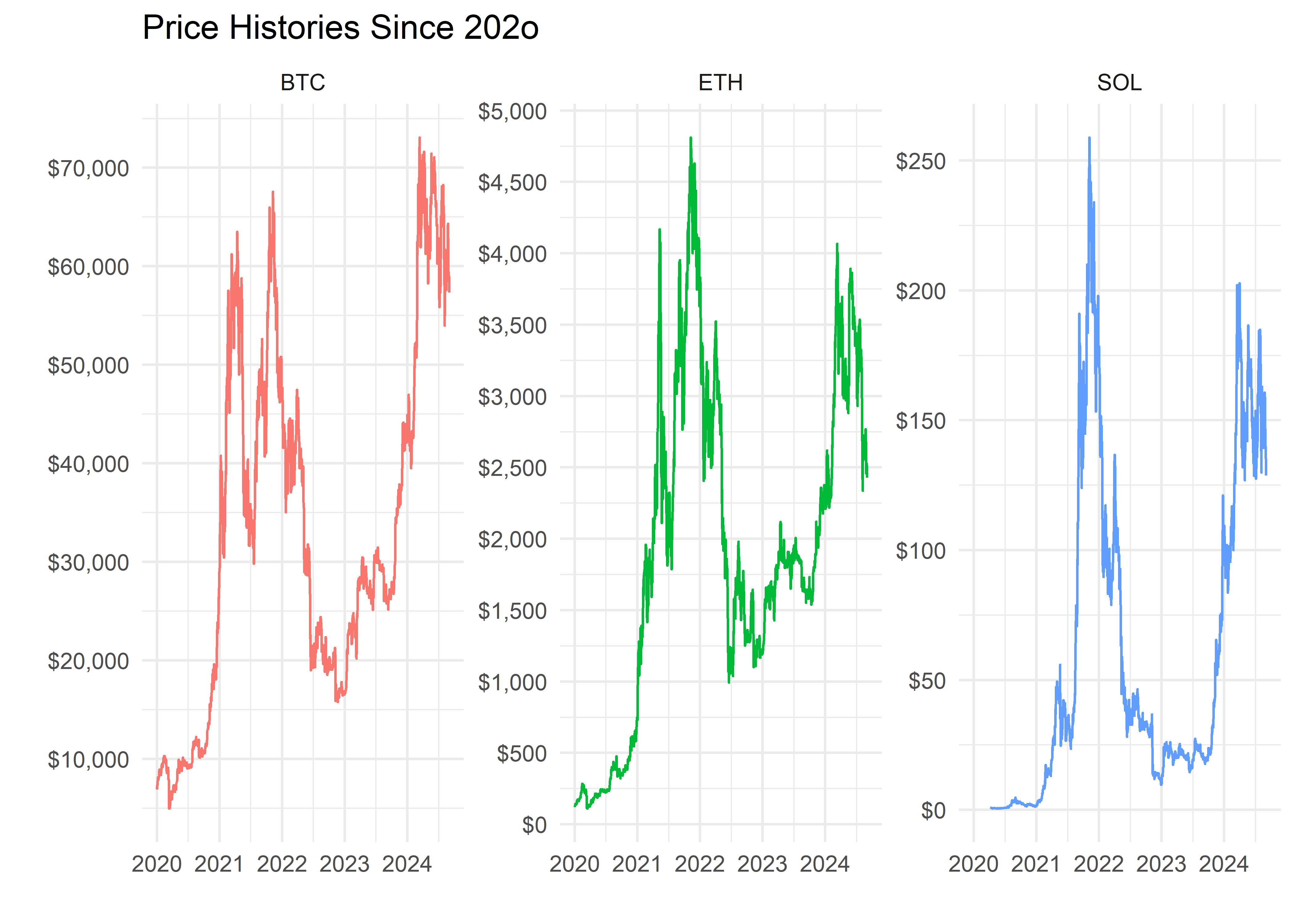
Our ultimate goal is to incorporate these coins into our model portfolios, and that means we would like to investigate the coins’ effect on our portfolio histories. Since we want to reach back in time several years, we will exclude the coins for which we have only one or two years of data. That leaves us with the following set of prices histories:
Note that each of these charts has an independent y-axis, which means that BTC’s move from $30k to $60k looks similar to ETH’s move from $1k to $4k
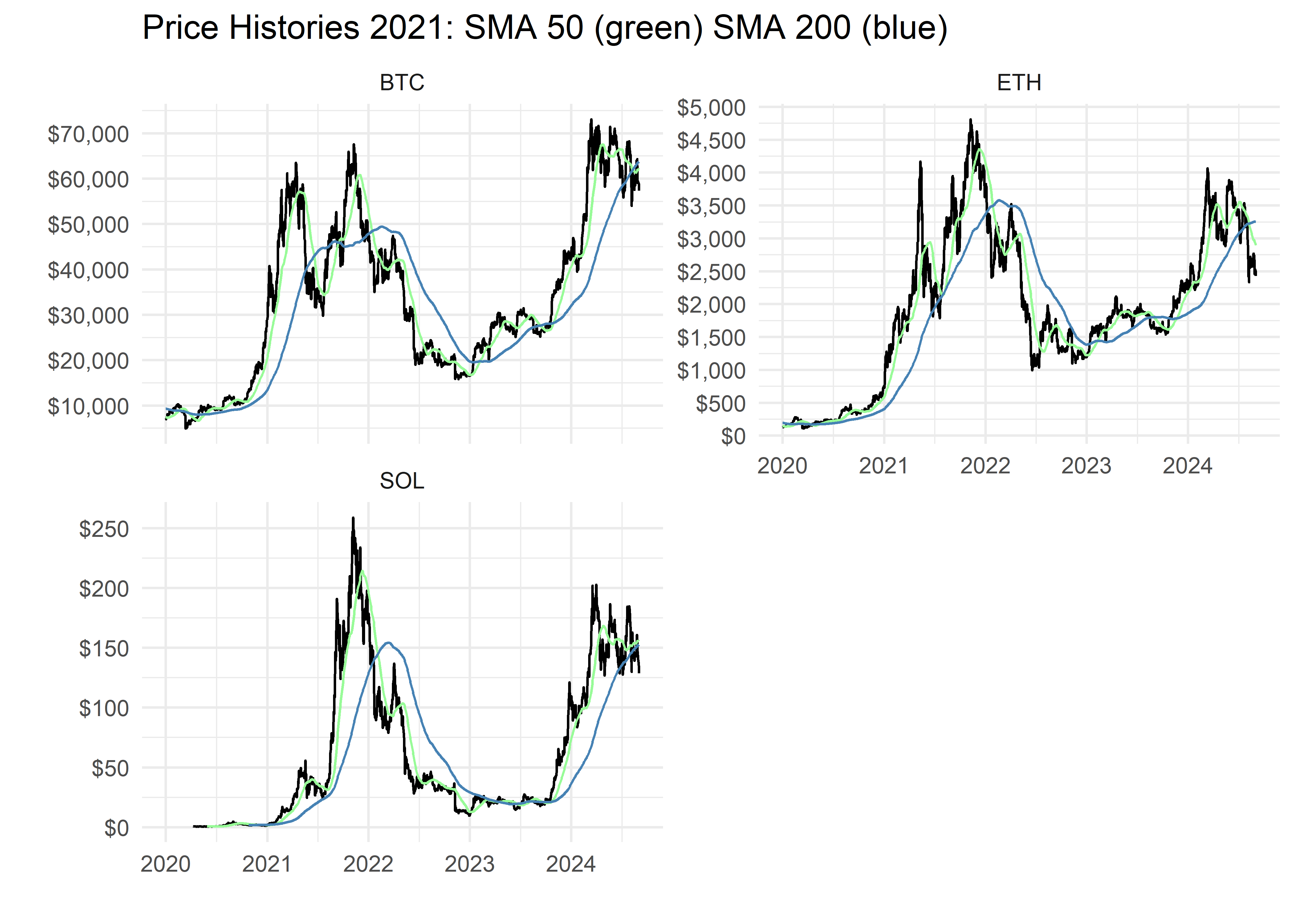
That price action is interesting but we always check in on the 200-day and 50-day moving averages. By way of brief background, when the 50-day price moving average (green line) is above the 200-day moving average (blue line), it’s considered a “Golden Cross” and generally bullish for an asset. If the current price (black line) is also above the 50-day moving average, that’s also bullish as the most current price will slowly pull both moving averages higher.
Price history is instructive but as we construct our portfolios, we will also be concerned with the distribution and volatility of returns. Since these coins trade 7 days per week, but other assets trade only 5 days week, we will start by converting our daily coins prices to weekly returns. This will allow us to examine the distribution of weekly returns, and align our coins’ weekly returns with stock market weekly returns.
Below is a snapshot of the weekly returns of each coin over the past several years. These coins remain volatile but the weekly bars are starting to tighten their ranges.
Adding Stocks and Bonds
Now let’s add stocks and bonds to this analysis. We will use the VOO ETF as a proxy for stocks and the BND ETF as a proxy for bonds. As noted above, we will use weekly bars as our unit of return so we will convert those ETF prices into weekly returns and combine them with our coin data.
# A tibble: 6 × 8
  date            BND       IXN      VOO      BTC     ETH     GLDM      SOL
  <date>        <dbl>     <dbl>    <dbl>    <dbl>   <dbl>    <dbl>    <dbl>
1 2024-07-21  0.00344 -0.0427   -0.0186  -0.00501 -0.0817 -0.00526 -0.00247
2 2024-07-28  0.0189  -0.0432   -0.0215  -0.111   -0.113   0.0229  -0.227
3 2024-08-04 -0.00659  0.0416    0.0308   0.0487  -0.0284  0.00901  0.115
4 2024-08-11  0.00365  0.0666    0.0395   0.0129   0.0240  0.0153   0.00192
5 2024-08-18  0.00552 -0.00314   0.00449  0.0974   0.0597  0.00201  0.127
6 2024-08-25 -0.00415 -0.000614  0.00514 -0.0834  -0.0858 -0.00621 -0.148
SP500 and Rolling Correlations
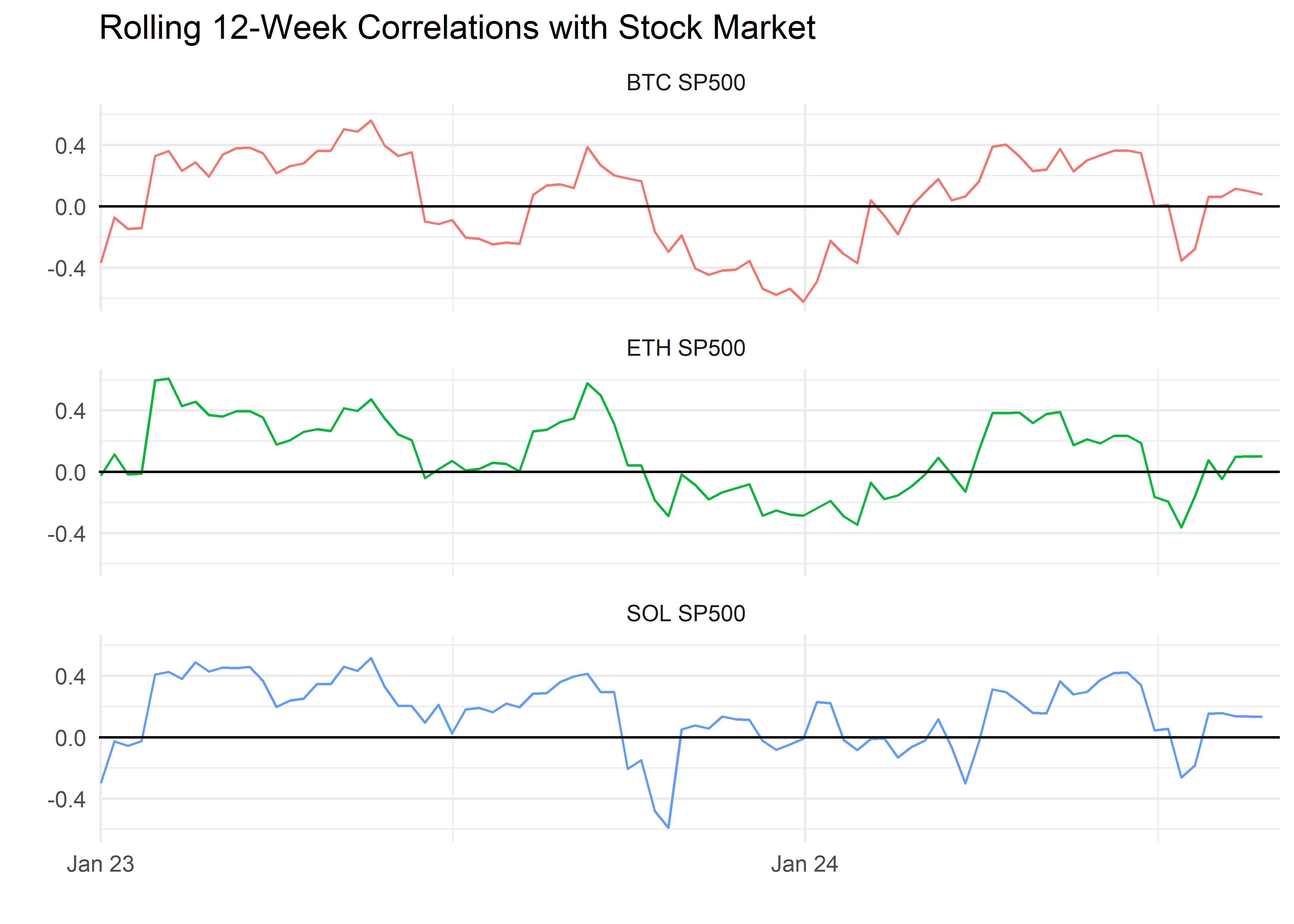
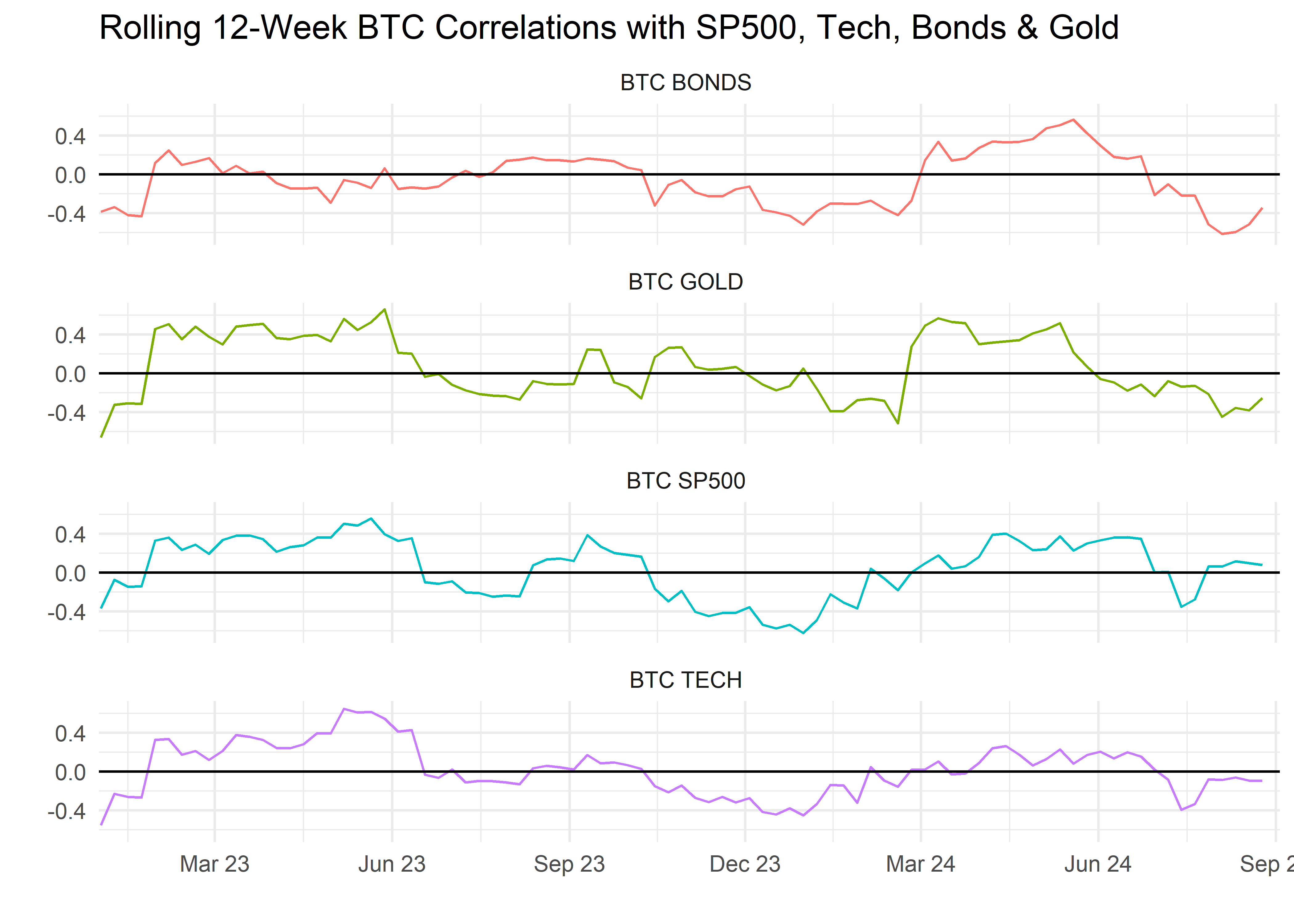
Before we begin building portfolios, let’s glance at rolling correlations with SP500. If the coins were to be consistently at a rolling correlation of 1, we wouldn’t get much in the way of diversification benefits from adding them a portfolio.
All of those charts look promising from a diversification point of view. In the following section we will construct several portfolios with varying weightings to BTC, and then examine the results. The code is constructed in such a way that we can efficiently substitute in another coin, or add another coin, or create an index of coins for the portfolio. Each of those is the subject of future work, but for now we lay the groundwork.
I will not walk through the code and the portfolio construction here, but in short:
1)start with our weekly returns data
2) create a table of various weights, ranging from 0% to 10% allocation to BTC
3) calculate the returns of the portfolios with various BTC weightings
4) chart investment growth in each portfolio
4) calculate and display various returns measures for each portfolio
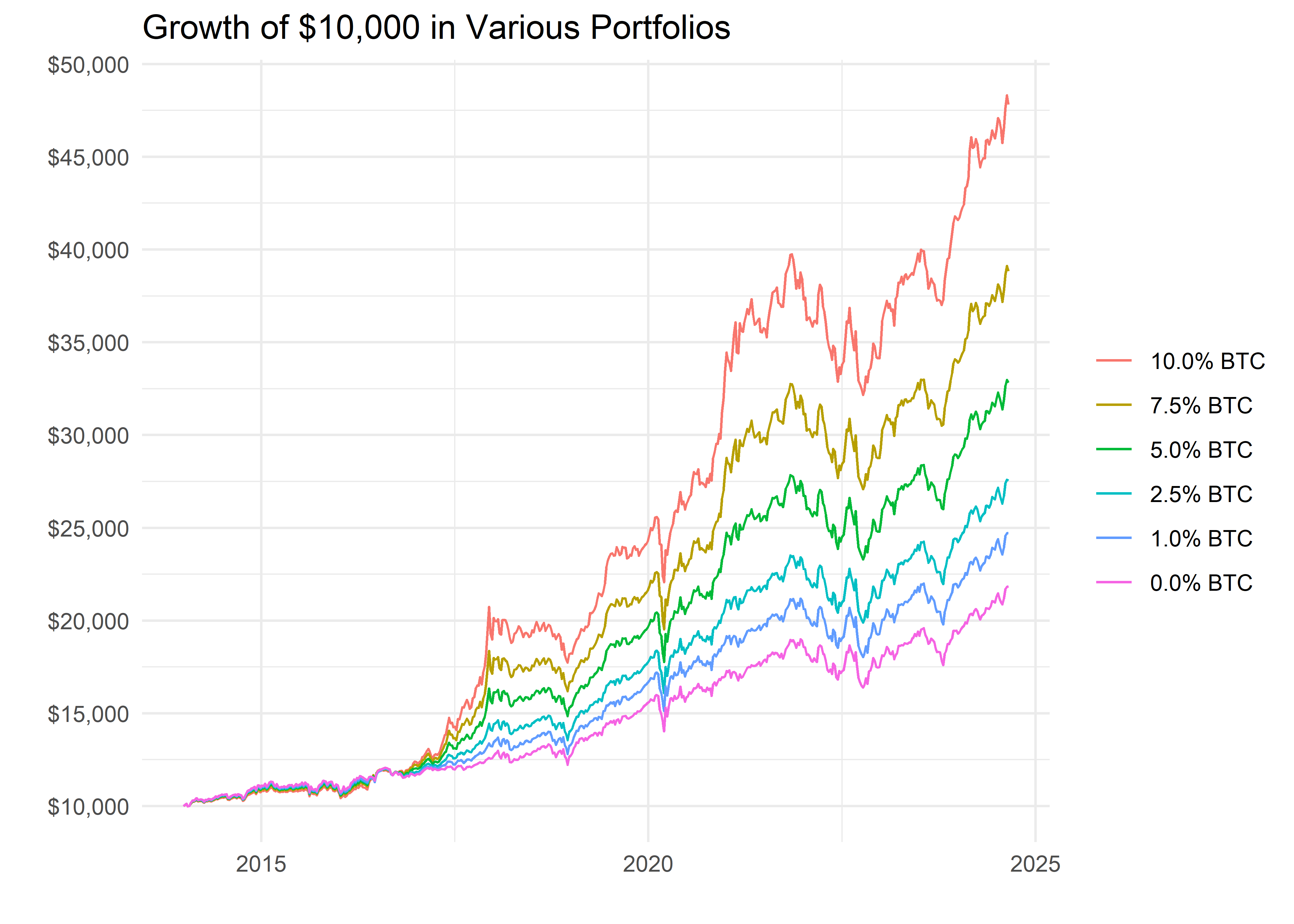
In the chart below, we can see that, in short, the higher the allocation to BTC, the greater the return. That’s not surprising considering that BTC has outperformed other assets in recent years but it’s still instructive to note that even a 1% to 2.5% allocation is meaningful.
Returns, of course, are not everything. We also construct a custom function to calculate and display various portfolio measures that incorporate the volatility of returns, such as the Sharpe Ratio, Sortino Ratio and Max Drawdowns.
| Cumulative Portfolios Stats | ||||||
|---|---|---|---|---|---|---|
| Portfolio | Cumulative Return | Annual Return | Sharpe Ratio | Sortino Ratio | Annualized Volatility | Maximum Drawdown |
| 10.0% BTC | 356% | 6% | 0.11 | 0.16 | 0.20 | −70% |
| 7.5% BTC | 318% | 5% | 0.11 | 0.16 | 0.18 | −68% |
| 5.0% BTC | 269% | 5% | 0.10 | 0.15 | 0.16 | −64% |
| 2.5% BTC | 201% | 4% | 0.10 | 0.14 | 0.12 | −54% |
| 1.0% BTC | 144% | 3% | 0.11 | 0.15 | 0.08 | −39% |
| 0.0% BTC | 91% | 2% | 0.11 | 0.14 | 0.05 | −15% |
| Source: Tiingo data and author calcs | ||||||
Note the higher returns, higher Sharpe and higher Sortino for the 10% BTC portfolio, but also the larger Max Drawdown. The 1% BTC portfolio really stands out here. It’s has almost double the cumulative return as the 0% BTC portfolio, yet a Maximum Drawdown of just 20%, compared to a 13% Max Drawdown for the 0% portfolio. Are we willing to absorb a 7% higher drawdown for near double the return? In hindsight, of course we are, but going forward it’s hard to justify excluding a 1% allocation to BTC.
Rolling Sharpes and Sortinos
The cumulative Sharpe and Sortino Ratio tend to get a lot of attention but I prefer to examine rolling ratios, especially with fast-moving assets reaching new stages of maturity.
Let’s zoom in to just 2023.
That rolling Sharpe Ratio chart is fascinating. The BTC portfolios dominated for the first half of 2021, but recently the traditional portfolio has actually surpassed them, even as BTC has rocketed. Why? The Sharpe Ratio does not distinguish between positive and negative volatility. BTC is getting punished for large daily movements, even though they have been mostly positive in recent weeks. The Sortino Ratio, by contrast, penalizes a portfolio only for downward deviations or volatility. Let’s see how the portfolios compare vis-a-vis rolling Sortinos.
Each BTC portfolio has a rolling Sortino Ratio greater than the 0% BTC allocation, though the gap has been shrinking since October - with the SP500 reaching new highs itself. We can update this chart on a weekly basis and observe any changes through year end.
Conclusion
In this section, we have laid the ground work for exploring, analyzing and allocating to crypto. Our portfolio work focused on BTC, but the code can easily be toggled to other coins. For future projects, we will look at adding ETH, either in place of BTC or in addition to BTC.
We will also construct an index of the top 6 coins and examine them in the context of our portfolios. We did not mention gold or the inflationary/macroeconomic environment in this section, but those will be part of our framework moving forward. Furthermore, we’ll be adding more portfolio stats to our table and rolling charts (like beta to the market and gold) as we gather feedback.
Thanks very much for reading.
